This site uses cookies to improve your experience. To help us insure we adhere to various privacy regulations, please select your country/region of residence. If you do not select a country, we will assume you are from the United States. Select your Cookie Settings or view our Privacy Policy and Terms of Use.
Cookie Settings
Cookies and similar technologies are used on this website for proper function of the website, for tracking performance analytics and for marketing purposes. We and some of our third-party providers may use cookie data for various purposes. Please review the cookie settings below and choose your preference.
Used for the proper function of the website
Used for monitoring website traffic and interactions
Cookie Settings
Cookies and similar technologies are used on this website for proper function of the website, for tracking performance analytics and for marketing purposes. We and some of our third-party providers may use cookie data for various purposes. Please review the cookie settings below and choose your preference.
Strictly Necessary: Used for the proper function of the website
Performance/Analytics: Used for monitoring website traffic and interactions
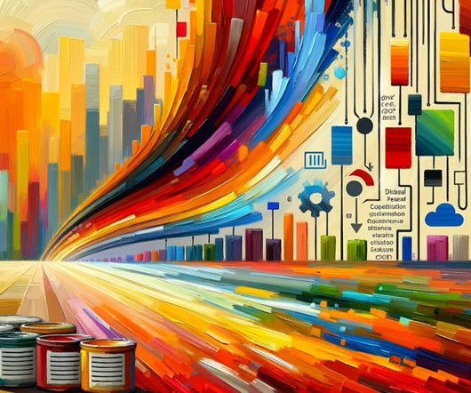
My methods of using GPT-4 to optimize my datavisual workflow For the past 6 months, I have been a heavy daily GPT-4 user. I know it makes me sound like an addict, but I have found many good reasons and many excellent use cases where this tool is an invaluable resource for improving my data workflow.
With applications ranging from genomics to image processing, t-SNE helps bridge the gap between intricate data environments and actionable insights. t-SNE was developed by Laurens van der Maaten and Geoffrey Hinton in 2008 to visualize high-dimensional data. What is t-SNE (t-distributed stochastic neighbor embedding)?
The GPI contains a numerical value indicating the relative peacefulness of 163 countries over a 15 year period (2008–2022). This dataset can be downloaded from the website visionofhumanity.org. This allows users to see how peace levels in different countries have evolved over time.
After the first 10 testing submissions, I realised that there was a concept drift happening between 2007 and 2008. To me, this probably means, the decision rules for grant applications were somehow changed during 2007 and 2008. What tools I used Software/Tools used for modelling and data analysis: Weka 3.7.1
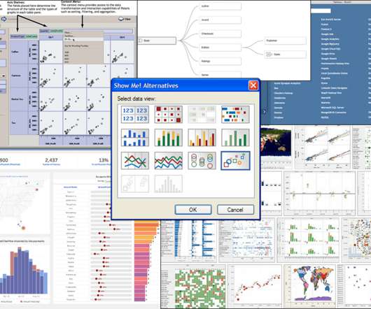
Four reference lines on the x-axis indicate key events in Tableau’s almost two-decade history: The first Tableau Conference in 2008. The first Tableau customer conference was in 2008. Tableau had its IPO at the NYSE with the ticker DATA in 2013. Visual encoding, in particular, tapped the power of the human visual system.
Four reference lines on the x-axis indicate key events in Tableau’s almost two-decade history: The first Tableau Conference in 2008. The first Tableau customer conference was in 2008. Tableau had its IPO at the NYSE with the ticker DATA in 2013. Visual encoding, in particular, tapped the power of the human visual system.
Further Analysis From the first plot, we can see the frequency of content added by Netflix from 2008 to 2021. From the second plot, we can see the top 20 genres that have been added by Netflix from 2008 to 2021. plt.figure(figsize=(12,6)) df[df["type"]=="TV Show"]["release_year"].value_counts()[:20].plot(kind="bar",color="Blue")
We have the IPL data from 2008 to 2017. In this blog, I implemented a Flight Price Prediction model using different techniques and also I performed very frequent datavisualizations to better understand our data. We will also be building a beautiful-looking interactive Flask model.
We have the IPL data from 2008 to 2017. Flight Price Prediction with Flask app — with datavisualizations So guys this is yet another one of the most favorite projects of mine. We will also be building a beautiful-looking interactive Flask model. Working Video of our App [link] 12. Working Video of our App [link] 15.
We have the IPL data from 2008 to 2017. Flight Price Prediction with Flask app — with datavisualizations So guys this is yet another one of the most favorite projects of mine. We will also be building a beautiful-looking interactive Flask model. Working Video of our App [link] 12. Working Video of our App [link] 15.
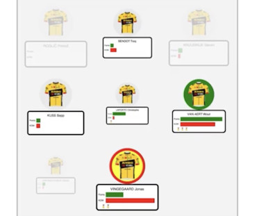
In the lead up to this, my day job as a software developer gave me a break from hard training rides, but my love of cycling sparked a mini side project: building web apps with the datavisualization tools I help to develop, and using them to analyze and visualize Tour de France data.
We have the IPL data from 2008 to 2017. In this blog, I implemented a Flight Price Prediction model using different techniques and also I performed very frequent datavisualizations to better understand our data. We will also be building a beautiful-looking interactive Flask model.
Data Visualisation Saved Lives in the 1800s The earliest recorded use of datavisualization to influence public policy dates back to Florence Nightingale, who used charts to improve hospital sanitation for British soldiers during the Crimean War. Her work demonstrated the power of data in driving social change.
Datavisualization: Creating dashboards and visual reports to clearly communicate findings to stakeholders. Job title history of data scientist The title “data scientist” gained prominence in 2008 when companies like Facebook and LinkedIn utilized it in corporate job descriptions.
For example, instead of writing complex SQL queries, an analyst could simply ask, “How many female patients have been admitted to a hospital in 2008?” This dataset is commonly used for research and development purposes, because it provides a realistic representation of healthcare data without compromising patient privacy.
We organize all of the trending information in your field so you don't have to. Join 17,000+ users and stay up to date on the latest articles your peers are reading.
You know about us, now we want to get to know you!
Let's personalize your content
Let's get even more personalized
We recognize your account from another site in our network, please click 'Send Email' below to continue with verifying your account and setting a password.


Let's personalize your content