This site uses cookies to improve your experience. To help us insure we adhere to various privacy regulations, please select your country/region of residence. If you do not select a country, we will assume you are from the United States. Select your Cookie Settings or view our Privacy Policy and Terms of Use.
Cookie Settings
Cookies and similar technologies are used on this website for proper function of the website, for tracking performance analytics and for marketing purposes. We and some of our third-party providers may use cookie data for various purposes. Please review the cookie settings below and choose your preference.
Used for the proper function of the website
Used for monitoring website traffic and interactions
Cookie Settings
Cookies and similar technologies are used on this website for proper function of the website, for tracking performance analytics and for marketing purposes. We and some of our third-party providers may use cookie data for various purposes. Please review the cookie settings below and choose your preference.
Strictly Necessary: Used for the proper function of the website
Performance/Analytics: Used for monitoring website traffic and interactions
In this project, we’ll dive into the historical data of Google’s stock from 2014-2022 and use cutting-edge anomaly detection techniques to uncover hidden patterns and gain insights into the stock market.
Supported platforms Azure Data Studio is compatible with: Windows Linux macOS It supports SQL Server (2014 and later), Azure SQL Database, and Azure SQL Data Warehouse, making it a versatile choice for a range of database environments. Users can visually group servers and databases, improving organization and accessibility.
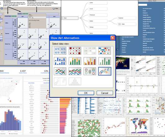
Image by Author Tools The following tools were used to assist the dataanalysis process: Tableau: Used to create the visualizations. JupyterHub: Used to wrangle, clean, and prepare the dataset for visualization. Image by Author Mercedes continues to dominate f1, winning the constructors championship from 2014 to 2021.
Big data has been billed as being the future of business for quite some time. Analysts have found that the market for big data jobs increased 23% between 2014 and 2019. The impact of big data is felt across all sectors of the economy. However, the future is now. The market for Hadoop jobs increased 58% in that timeframe.
The visual encoding allowed domain experts to immediately see that blended data was inappropriate, which is why Blending was useful to people who did not understand joins. . The Data Tab was added in v8.2 June 2014) to give people who understand joins a better experience than a dialog.
Data Scientist LinkedIn Profile Example Marla Smith, Senior Data Scientist at ABC Company Summary: Experienced data scientist with a strong background in statistical analysis, machine learning, and datavisualization. Wrapping it up !!!
The visual encoding allowed domain experts to immediately see that blended data was inappropriate, which is why Blending was useful to people who did not understand joins. . The Data Tab was added in v8.2 June 2014) to give people who understand joins a better experience than a dialog.
This article explores the rich landscape of time series analysis in machine learning, focusing on how Comet, a powerful machine learning experiment management platform, can enhance the process. What is Time Series Analysis? In essence, it deals with sequences of data ordered chronologically.
As a data scientist at Cars4U, I had to come up with a pricing model that can effectively predict the price of used cars and can help the business in devising profitable strategies using differential pricing. In this analysis, I: provided summary statistics and exploratory dataanalysis of the data.
Data science methodologies and skills can be leveraged to design these experiments, analyze results, and iteratively improve prompt strategies. Using skills such as statistical analysis and datavisualization techniques, prompt engineers can assess the effectiveness of different prompts and understand patterns in the responses.
We organize all of the trending information in your field so you don't have to. Join 17,000+ users and stay up to date on the latest articles your peers are reading.
You know about us, now we want to get to know you!
Let's personalize your content
Let's get even more personalized
We recognize your account from another site in our network, please click 'Send Email' below to continue with verifying your account and setting a password.


Let's personalize your content