This site uses cookies to improve your experience. To help us insure we adhere to various privacy regulations, please select your country/region of residence. If you do not select a country, we will assume you are from the United States. Select your Cookie Settings or view our Privacy Policy and Terms of Use.
Cookie Settings
Cookies and similar technologies are used on this website for proper function of the website, for tracking performance analytics and for marketing purposes. We and some of our third-party providers may use cookie data for various purposes. Please review the cookie settings below and choose your preference.
Used for the proper function of the website
Used for monitoring website traffic and interactions
Cookie Settings
Cookies and similar technologies are used on this website for proper function of the website, for tracking performance analytics and for marketing purposes. We and some of our third-party providers may use cookie data for various purposes. Please review the cookie settings below and choose your preference.
Strictly Necessary: Used for the proper function of the website
Performance/Analytics: Used for monitoring website traffic and interactions
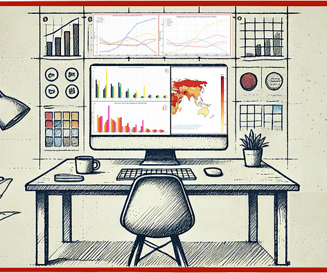
Can it do decent quantitative analysis from a datavisualization? For me, one of the most useful GPT-4 tools is the ability to analyze and interpret image data. But how good it this tool now with charting data and with map images? Join thousands of data leaders on the AI newsletter. This member-only story is on us.
Can it do decent quantitative analysis from a datavisualization? For me, one of the most useful GPT-4 tools is the ability to analyze and interpret image data. But how good it this tool now with charting data and with map images? Join thousands of data leaders on the AI newsletter. This member-only story is on us.
Giorgia Lupi, known for using datavisualization to connect real life and numbers, has been dealing with long Covid for the past three years. In a visual guest essay for NYT Opinion, Lupi describes her experience of fear, pain, and hope using a spreadsheet and a diary of brush strokes. Still, I couldn’t stop tracking.
This post looks at some of the open source datavisualization tools our customers tell us theyve tried before upgrading to our fully-supported toolkits for their analysis apps. Teams working on datavisualization applications always aim to build the best product they can. js) GraphViz Viz.js
Data was taken for the last five years as Max Verstappen only joined f1 in 2015. His debut was in the 2015 Australian Grand Prix when he was 17, making him the youngest driver to compete in f1. Hamilton has been dominating for the past seven years, and he was the world champion in 2015, 2017, 2018, 2019, and 2020.
Here are some of the key features of open source BI software: Data integration: Open source BI software can pull data from various sources, such as databases, spreadsheets, and cloud services, and integrate it into a single location for analysis.
Established in 2015, Getir has positioned itself as the trailblazer in the sphere of ultrafast grocery delivery. He worked at Turkcell, mainly focused on time series forecasting, datavisualization, and network automation. This is a guest post co-authored by Nafi Ahmet Turgut, Hasan Burak Yel, and Damla Şentürk from Getir.
Rumelhart Prize in 2015, and the ACM/AAAI Allen Newell Award in 2009. He received the Ulf Grenander Prize from the American Mathematical Society in 2021, the IEEE John von Neumann Medal in 2020, the IJCAI Research Excellence Award in 2016, the David E.
Gilead Sciences provided a rich, real-world dataset that contains information about demographics, diagnosis and treatment options, and insurance provided to patients who were diagnosed with breast cancer from 2015–2018. The dataset originated from Health Verity, one of the largest healthcare data ecosystems in the US.
Getir was founded in 2015 and operates in Turkey, the UK, the Netherlands, Germany, and the United States. He worked at Turkcell, mainly focused on time series forecasting, datavisualization, and network automation. Getir is the pioneer of ultrafast grocery delivery.
It is the process of converting raw data into relevant and practical knowledge to help evaluate the performance of businesses, discover trends, and make well-informed choices. Data gathering, data integration, data modelling, analysis of information, and datavisualization are all part of intelligence for businesses.
Incredible growth started in 2005 with the company roughly doubling in size every year until 2015. Tableau had its IPO at the NYSE with the ticker DATA in 2013. Visual encoding, in particular, tapped the power of the human visual system. The first Tableau customer conference was in 2008.
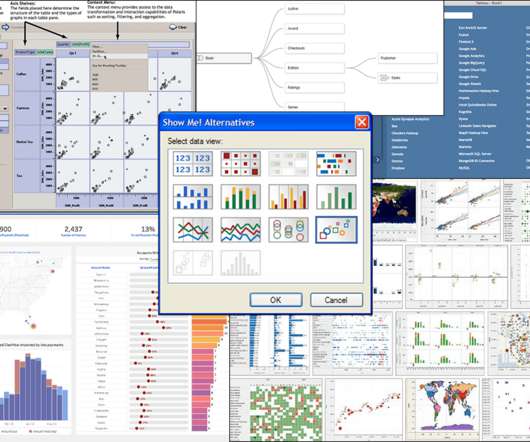
The ultimate guide to graph visualization Everything you need to start designing your best graph visualization application. Download the guide With our datavisualization toolkits , you’re not restricted by your choice of technology: they’re compatible with every framework.
Getir was founded in 2015 and operates in Turkey, the UK, the Netherlands, Germany, France, Spain, Italy, Portugal, and the United States. He worked at Turkcell, mainly focused on time series forecasting, datavisualization, and network automation. Getir is the pioneer of ultrafast grocery delivery.
This dataset contains the data obtained from the number of traffic stops made by US police and what happened during these stops. The data ranges from 2005 to 2015. The purpose of collecting this data was to monitor and enhance the interactions between law enforcement and the public in the country. head() method.
Incredible growth started in 2005 with the company roughly doubling in size every year until 2015. Tableau had its IPO at the NYSE with the ticker DATA in 2013. Visual encoding, in particular, tapped the power of the human visual system. The first Tableau customer conference was in 2008.
Two of the platforms that we see emerging as a popular combination of data warehousing and business intelligence are the Snowflake Data Cloud and Power BI. Debuting in 2015, Power BI has undergone meaningful updates that have made it a leader not just in datavisualization, but in the business intelligence space as well.
TensorBoard, a large package that is typically overlooked, is included within TensorFlow and is used for datavisualization. When working with shareholders, TensorBoard makes it easier to visually represent the data. It is an open source framework that has been available since April 2015.
The plot shows that there has been a steady increase in the number of titles added each year, with a notable jump in 2015. Further Analysis From the first plot, we can see the frequency of content added by Netflix from 2008 to 2021. From the second plot, we can see the top 20 genres that have been added by Netflix from 2008 to 2021.
We updated the library, models and demo to compare 2015 and 2019 using contextually-keyed word vectors trained on billions of words from Reddit comments. The projects include 1000 annotated examples each, training/evaluation scripts, results, datavisualizers and some powerful tok2vec weights trained on Reddit to initialize models. ?
The Art of Forecasting in the Retail Industry Part I : Exploratory Data Analysis & Time Series Analysis In this article, I will conduct exploratory data analysis and time series analysis using a dataset consisting of product sales in different categories from a store in the US between 2015 and 2018.
Census Bureau who are using Tableau to visualize race and ethnicity data from the 2020 Decennial Census. What learnings from 2010 informed the direction you took with regard to developing these datavisualizations? The answer: datavisualizations. A closer look at the new dashboards. DI in 2010.
Census Bureau who are using Tableau to visualize race and ethnicity data from the 2020 Decennial Census. What learnings from 2010 informed the direction you took with regard to developing these datavisualizations? The answer: datavisualizations. A closer look at the new dashboards. DI in 2010.
We organize all of the trending information in your field so you don't have to. Join 17,000+ users and stay up to date on the latest articles your peers are reading.
You know about us, now we want to get to know you!
Let's personalize your content
Let's get even more personalized
We recognize your account from another site in our network, please click 'Send Email' below to continue with verifying your account and setting a password.


Let's personalize your content