Remove 2018 Remove Data Analysis Remove Tableau
article thumbnail

Hospitality Accelerator Tableau Dashboard Example

phData

Hospitality Accelerator Tableau Dashboard Example Stanley Joseph May 12, 2023 View Dashboard in Tableau Public The data used in this Accelerator originates from one of Tableau’s accelerator dashboards: Rooms Revenue. Our team of Tableau experts is here to ensure a powerful and relevant solution tailored to your needs.

Tableau 52
article thumbnail

Who are the Tableau User Group Ambassadors?

Tableau

Britt Staniar Senior Community Program Manager, Recognition Programs Brittni McCafferty Community Global Program Manager – User Groups Sarah Molina March 3, 2023 - 9:04pm March 4, 2023 Tableau Ambassadors teach and share while fostering a positive and supportive space within the community. What do Tableau User Group Ambassadors do?

Tableau 97
professionals

Sign Up for our Newsletter

This site is protected by reCAPTCHA and the Google Privacy Policy and Terms of Service apply.

Trending Sources

article thumbnail

Who are the Tableau User Group Ambassadors?

Tableau

Britt Staniar Senior Community Program Manager, Recognition Programs Brittni McCafferty Community Global Program Manager – User Groups Sarah Molina March 3, 2023 - 9:04pm March 4, 2023 Tableau Ambassadors teach and share while fostering a positive and supportive space within the community. What do Tableau User Group Ambassadors do?

Tableau 87
article thumbnail

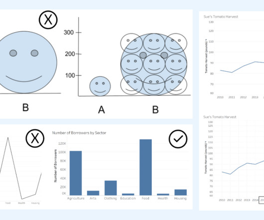
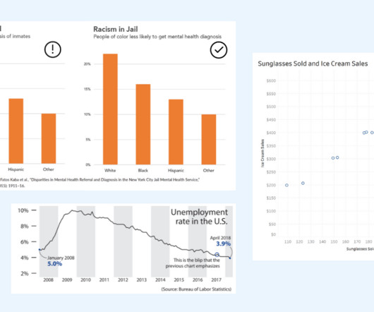
How to Spot Misleading Charts, a Checklist

Tableau

Alyssa Jenson November 14, 2023 - 6:59pm Sue Kraemer Senior Data Skills Curriculum Strategy Manager, Tableau Charts are all around us. In today’s world, the ability to swiftly make decisions and act on data is crucial. Two line graphs showing the same data with different intervals on the axis. Do the axes start at zero?

article thumbnail

Introduction

Towards AI

Exploratory Data Analysis Next, we will create visualizations to uncover some of the most important information in our data. On the other hand, the purple line shows the trend of the data. At the same time, the number of rows decreased slightly to 160,454, a result of duplicate removal.

article thumbnail

Beyond the Checkered Flag: F1 Statistics Explored

Towards AI

Image by Author Tools The following tools were used to assist the data analysis process: Tableau: Used to create the visualizations. Analysis Image by Author The visualization clearly shows the history of F1, starting from the inaugural season of 1950 to the current season. Remove erroneous values.

Tableau 101
article thumbnail

How To Spot Misleading Charts: Review the Message

Tableau

Ateken Abla November 14, 2023 - 6:59pm Sue Kraemer Senior Data Skills Curriculum Strategy Manager, Tableau Charts exist everywhere. Viewing a chart instead of a table of numbers helps us quickly understand data, see patterns, and make better decisions. In today’s world, swift decision-making with data is crucial.