This site uses cookies to improve your experience. To help us insure we adhere to various privacy regulations, please select your country/region of residence. If you do not select a country, we will assume you are from the United States. Select your Cookie Settings or view our Privacy Policy and Terms of Use.
Cookie Settings
Cookies and similar technologies are used on this website for proper function of the website, for tracking performance analytics and for marketing purposes. We and some of our third-party providers may use cookie data for various purposes. Please review the cookie settings below and choose your preference.
Used for the proper function of the website
Used for monitoring website traffic and interactions
Cookie Settings
Cookies and similar technologies are used on this website for proper function of the website, for tracking performance analytics and for marketing purposes. We and some of our third-party providers may use cookie data for various purposes. Please review the cookie settings below and choose your preference.
Strictly Necessary: Used for the proper function of the website
Performance/Analytics: Used for monitoring website traffic and interactions
Clicking into each viz, you’ll land on Tableau Public , Tableau’s free online platform used to explore, create and publicly share datavisualizations. See the curated collection below showcasing some incredible American football vizzes from the Tableau Community.
Clicking into each viz, you’ll land on Tableau Public , Tableau’s free online platform used to explore, create and publicly share datavisualizations. See the curated collection below showcasing some incredible American football vizzes from the Tableau Community.
Working with a group of visionary educators, we’ve been able to achieve amazing milestones, such as introducing Tableau to all first year students at Nanyang Technological University in Singapore in 2018. In partnership with AICTE, we will help equip the future workforce of India with these critical data skills.
Here are some of the key types of cloud analytics: Descriptive analytics: This type focuses on summarizing historical data to provide insights into what has happened in the past. It helps organizations understand trends, patterns, and anomalies in their data. Poor data integration can lead to inaccurate insights.
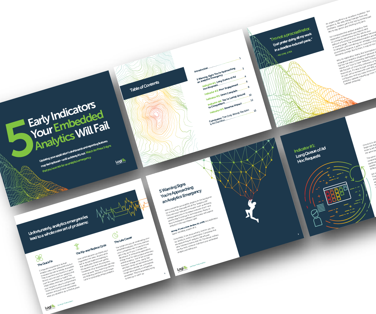
Many application teams leave embedded analytics to languish until something—an unhappy customer, plummeting revenue, a spike in customer churn—demands change. But by then, it may be too late. In this White Paper, Logi Analytics has identified 5 tell-tale signs your project is moving from “nice to have” to “needed yesterday.".
Similar to the advancements in telescope technology, datavisualizations 10 years ago were no where near the art they’ve become today. Vizzes advance as the industry learns more about accessibility and human cognition, and as improved data literacy pushes the world to be more data driven. Go TEAM DATA!
In 2018, ISTE and General Motors launched a professional development course to train educators on how to use AI for teaching and learning. In his other class, an undergraduate course on datavisualization, students worked together to create a basic web application using the platform R Shiny, a tool for building interactive web apps from code.
Working with a group of visionary educators, we’ve been able to achieve amazing milestones, such as introducing Tableau to all first year students at Nanyang Technological University in Singapore in 2018. In partnership with AICTE, we will help equip the future workforce of India with these critical data skills.
Bar Graphs : Used to compare different categories of datavisually. Line Graphs : Useful for displaying trends over time by connecting data points with lines. Frequently Asked Questions Why Is DataVisualization Important in Data Interpretation?
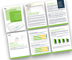
Why do some embedded analytics projects succeed while others fail? We surveyed 500+ application teams embedding analytics to find out which analytics features actually move the needle. Read the 6th annual State of Embedded Analytics Report to discover new best practices. Brought to you by Logi Analytics.
Similar to the advancements in telescope technology, datavisualizations 10 years ago were no where near the art they’ve become today. Vizzes advance as the industry learns more about accessibility and human cognition, and as improved data literacy pushes the world to be more data driven. Go TEAM DATA!
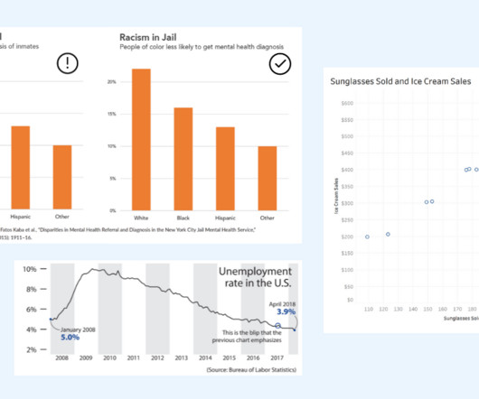
Alberto Cairo, datavisualization expert and author of How Charts Lie Whether you are reading a social post, news article or business report, it’s important to know and evaluate the source of the data and charts that you view. Two line graphs showing the same data with different intervals on the axis. Know the Source.
The industry has evolved from relying on tools like SAS and R to placing a spotlight on datavisualization tools like Tableau and PowerBI. Later, Python gained momentum and surpassed all programming languages, including Java, in popularity around 2018–19.
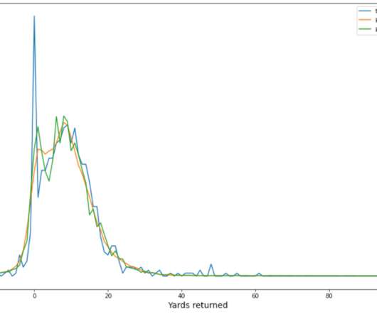
The player tracking data contains the player’s position, direction, acceleration, and more (in x,y coordinates). There are around 3,000 and 4,000 plays from four NFL seasons (2018–2021) for punt and kickoff plays, respectively. The data distribution for punt and kickoff are different.
While this requires technology – AI, machine learning, log parsing, natural language processing,metadata management, this technology must be surfaced in a form accessible to business users – the data catalog. The Forrester Wave : Machine Learning Data Catalogs, Q2 2018. Subscribe to Alation's Blog.
Average Price by Town — Image by Author Monthly Average Price Since our main goal in this blog is to showcase how time-series analysis can enhance regression models, it is imperative to show the time-series aspect of the datavisualizations. On the other hand, the purple line shows the trend of the data.
July 5, 2018 - 9:55pm. While there is no single way to accelerate your data skills, all roads lead through the Tableau Community. Within the Community, you’ll find a collection of resources and activities designed to further your data journey and connect you with like-minded people. . Andrew Grinaker. Marissa Michelotti.
July 5, 2018 - 9:55pm. While there is no single way to accelerate your data skills, all roads lead through the Tableau Community. Within the Community, you’ll find a collection of resources and activities designed to further your data journey and connect you with like-minded people. . Andrew Grinaker. Marissa Michelotti.
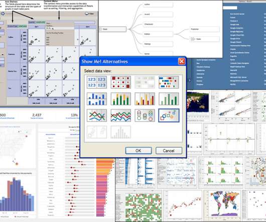
The Data Tab was integrated with the connection experience and supported the scenario of adding additional data sources during exploration. April 2018), which focused on users who do understand joins and curating federated data sources. Another key data computation moment was Hyper in v10.5 (Jan
Gilead Sciences provided a rich, real-world dataset that contains information about demographics, diagnosis and treatment options, and insurance provided to patients who were diagnosed with breast cancer from 2015–2018. The dataset originated from Health Verity, one of the largest healthcare data ecosystems in the US.
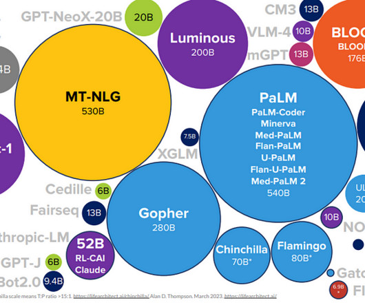
Introduction of Large Language Models One of the most influential LLMs is the GPT (Generative Pre-trained Transformer) model, which was first introduced by OpenAI in 2018. The GPT model is based on a deep learning architecture called a transformer, which is designed to process sequences of data, such as natural language text.
Hamilton has been dominating for the past seven years, and he was the world champion in 2015, 2017, 2018, 2019, and 2020. Image by Author Max Verstappen is the current world f1 champion, ending the era of domination by Lewis Hamilton.
According to the IT Sustainability Beyond the Data Center report from the IBM Institute for Business Value, some estimates suggest that there has been a 43% absolute increase in the power capacity demand by data center operators between 2018 and 2021, and that the global data center market will grow by more than 30% between 2021 and 2027.
The key is to think critically and take time to evaluate the interpretations of data portrayed in charts. DataVisualization expert and author Kathy Rowell says that we should always ask “Compared to What?” Unemployment rate shown over multiple years, showing a downward overall trend from 2009 to 2018.
More than 145,000 of you brought your passion, love, and data magic to our all-virtual Tableau Conference-ish. You continue to share your work on Tableau Public , making it the world’s largest repository for datavisualization.
Initial prototypes in 2017 and 2018 focused on Santa Fe, New Mexico, and Austin, Texas , respectively. “We We worked really closely with leaders on the ground in both of those places,” according to Kelly, “and we used local data and information to inform those visualizations. Prototypes to final product.
Presenters and participants had the opportunity to hear about and evaluate the pros and cons of different back end technologies and data formats for different uses such as web-mapping, datavisualization, and the sharing of meta-data. Earth observation data cubes for Brazil: Requirements, methodology and products.
The Data Tab was integrated with the connection experience and supported the scenario of adding additional data sources during exploration. April 2018), which focused on users who do understand joins and curating federated data sources. Another key data computation moment was Hyper in v10.5 (Jan
Deeper Insights has six years of experience in building AI solutions for large enterprise and scale-up clients, a suite of AI models, and datavisualization dashboards that enable them to quickly analyze and share insights.
Data Scientist LinkedIn Profile Example Marla Smith, Senior Data Scientist at ABC Company Summary: Experienced data scientist with a strong background in statistical analysis, machine learning, and datavisualization. Passionate about leveraging data to drive business decisions and improve customer experience.
Initial prototypes in 2017 and 2018 focused on Santa Fe, New Mexico, and Austin, Texas , respectively. “We We worked really closely with leaders on the ground in both of those places,” according to Kelly, “and we used local data and information to inform those visualizations. Prototypes to final product.
It is clear that we are only measuring the total number of orders placed each year from 2018-2022. You can also add data labels and reference marks plus indicate the size of gaps between each bar, reference mark, and trend line. Good bar charts stick to an easy-to-follow style that clearly emphasizes the key data points.
I just started vizzing for fun earlier this year, and I thought putting together a submission for Iron Viz would be a great way to enhance my skills, connect with others in the community, and have fun with data. Pradeep Kumar G : I have been entering Iron Viz since 2018 (feeder 3). It's such a cool integration of data and art.
I just started vizzing for fun earlier this year, and I thought putting together a submission for Iron Viz would be a great way to enhance my skills, connect with others in the community, and have fun with data. Pradeep Kumar G : I have been entering Iron Viz since 2018 (feeder 3). It's such a cool integration of data and art.
The foundations for today’s generative language applications were elaborated in the 1990s ( Hochreiter , Schmidhuber ), and the whole field took off around 2018 ( Radford , Devlin , et al.). Image credit: Yang, Jingfeng et.
Two of the platforms that we see emerging as a popular combination of data warehousing and business intelligence are the Snowflake Data Cloud and Power BI. Debuting in 2015, Power BI has undergone meaningful updates that have made it a leader not just in datavisualization, but in the business intelligence space as well.
In our example, we will use LiDAR point cloud data to analyze changes in the landscape after category 5 Hurricane Michael blew through the Florida Panhandle in 2018. The distance from the Earth to the Moon can be calculated to millimeter precision using LiDAR pulses bounced off mirrors left on the Moon during the Apollo missions.
We had already decided at the end of 2018 that we wanted to do this and after seven months of planning and hard work, we couldn’t have been happier with the result. Through his longstanding working relationship with Ines, he began to freelance for Explosion in small capacities in 2018.
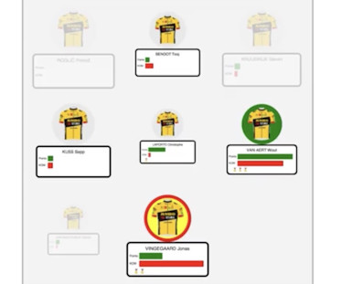
In the lead up to this, my day job as a software developer gave me a break from hard training rides, but my love of cycling sparked a mini side project: building web apps with the datavisualization tools I help to develop, and using them to analyze and visualize Tour de France data.
More than 145,000 of you brought your passion, love, and data magic to our all-virtual Tableau Conference-ish. You continue to share your work on Tableau Public , making it the world’s largest repository for datavisualization.
In 2018–2019, while new car sales were recorded at 3.6 These are common Python libraries used for data analysis and visualization. As sales of new cars have slowed down in the recent past, the pre-owned car market has continued to grow over the past years and is larger than the new car market now.
The Art of Forecasting in the Retail Industry Part I : Exploratory Data Analysis & Time Series Analysis In this article, I will conduct exploratory data analysis and time series analysis using a dataset consisting of product sales in different categories from a store in the US between 2015 and 2018.
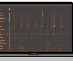
The best way to make sense of this data is to visualize it all in one place in a fully interactive way. In this blog post, we use crime datavisualization to demonstrate how best to display multiple sources of information about events that took place over disparate time periods in a real UK Counter Terrorism Police investigation.
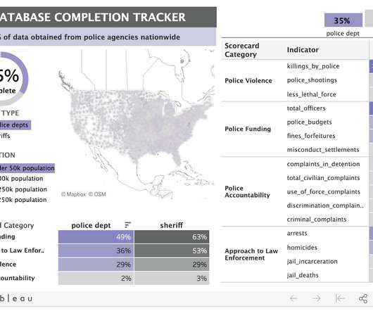
The underlying dataset for Police Scorecard is massive: over 13 million cells of data and counting. To provide a way into understanding it, Sinyangwe and his team relied on Tableau datavisualizations to highlight key trends in the data. The role of visualization. How to understand Police Scorecard.
We organize all of the trending information in your field so you don't have to. Join 17,000+ users and stay up to date on the latest articles your peers are reading.
You know about us, now we want to get to know you!
Let's personalize your content
Let's get even more personalized
We recognize your account from another site in our network, please click 'Send Email' below to continue with verifying your account and setting a password.


Let's personalize your content