This site uses cookies to improve your experience. To help us insure we adhere to various privacy regulations, please select your country/region of residence. If you do not select a country, we will assume you are from the United States. Select your Cookie Settings or view our Privacy Policy and Terms of Use.
Cookie Settings
Cookies and similar technologies are used on this website for proper function of the website, for tracking performance analytics and for marketing purposes. We and some of our third-party providers may use cookie data for various purposes. Please review the cookie settings below and choose your preference.
Used for the proper function of the website
Used for monitoring website traffic and interactions
Cookie Settings
Cookies and similar technologies are used on this website for proper function of the website, for tracking performance analytics and for marketing purposes. We and some of our third-party providers may use cookie data for various purposes. Please review the cookie settings below and choose your preference.
Strictly Necessary: Used for the proper function of the website
Performance/Analytics: Used for monitoring website traffic and interactions
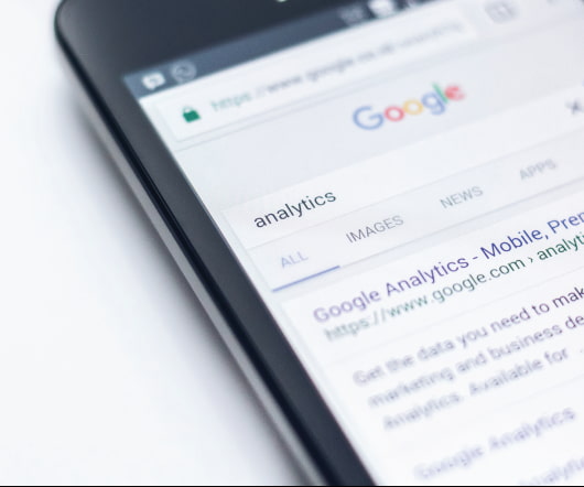
Visually-displayed data is much more accessible, and it’s criticalto promptly identify the weaknesses of an organization, accurately forecasttrading volumes and sale prices, or make the right business choices.
As a data scientist, your most important skill is creating meaningful visualizations to disseminate knowledge and impact your organization or client. These seven principals will guide you toward developing charts with clarity, as exemplified with data from a recent KDnuggets poll.
According to Scalegrid’s 2019 database trends report, SQL is the most popular database form, with more than 60% of its use. Introduction What kind of database did you use to build your most recent application? It is followed by NoSQL databases with more than 39% use.
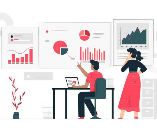
Producing accessible datavisualizations is a key data science skill. The following guidelines will help you create the best representations of your data using R and Python's Pandas library.
The focus of the event is data in the cloud (migrating, storing and machine learning). Some of the topics from the summit include: Data Science IoT Streaming Data AI DataVisualization. Join your peers to see how their data platforms knocked down the old barriers and transformed how they work.
Also: Types of Bias in Machine Learning; Deep Learning Next Step: Transformers and Attention Mechanism; New Poll: Data Science Skills; R Users Salaries from the 2019 Stackoverflow Survey; How to Sell Your Boss on the Need for Data Analytics.
Here’s how Big Data can help you double up your sales in 2019: Use Big Data effectively to understand who you are targeting. One of the major applications of Big Data is to help companies understand the target audience. Big Data is helping the businesses grow in many ways.
This week: The Future of Careers in Data Science & Analysis; Task-based effectiveness of basic visualizations; Open Source Projects by Google, Uber and Facebook for Data Science and AI; Getting Started with Automated Text Summarization; A Non-Technical Reading List for Data Science; and much more!
Also: Kannada-MNIST: A new handwritten digits dataset in ML town; Math for Programmers; The 4 Quadrants of Data Science Skills and 7 Principles for Creating a Viral DataVisualization; The Last SQL Guide for Data Analysis You’ll Ever Need.
This post looks at some of the open source datavisualization tools our customers tell us theyve tried before upgrading to our fully-supported toolkits for their analysis apps. Teams working on datavisualization applications always aim to build the best product they can. js) GraphViz Viz.js
Read a comprehensive SQL guide for data analysis; Learn how to choose the right clustering algorithm for your data; Find out how to create a viral DataViz using the data from Data Science Skills poll; Enroll in any of 10 Free Top Notch Natural Language Processing Courses; and more.
Also: Activation maps for deep learning models in a few lines of code; The 4 Quadrants of Data Science Skills and 7 Principles for Creating a Viral DataVisualization; OpenAI Tried to Train AI Agents to Play Hide-And-Seek but Instead They Were Shocked by What They Learned; 10 Great Python Resources for Aspiring Data Scientists.
Several stages of analysis are needed to find insights and make the right decisions related to data, one of which is datavisualization. Datavisualization is an essential part of the data analysis process, as it helps to make sense of large and complex data sets. Matplotlib anatomy and terminology 2.
As 2019 draws to a close and we step into the 2020s, we thought we’d take a look back at the year and all we’ve accomplished. was released – our first major upgrade to Prodigy for 2019. Sep 15: Adriane Boyd makes up the second spaCy developer team hire in 2019. Got a question? ✨ Feb 18: Finally in February, Prodigy v1.7.0
Here are some of the key types of cloud analytics: Descriptive analytics: This type focuses on summarizing historical data to provide insights into what has happened in the past. It helps organizations understand trends, patterns, and anomalies in their data.
Open source is becoming the standard for sharing and improving technology. Some of the largest organizations in the world namely: Google, Facebook and Uber are open sourcing their own technologies that they use in their workflow to the public.
Factors Influencing the Choice Between Jupyter Notebooks and VS Code How to find new extensions for vs code for data science and machine learning. My story (The Shift from Jupyter Notebooks to VS Code) Throughout early to mid-2019, when I started my data science career, Jupyter Notebooks were my constant companions. Conclusion.
Headwaters has been able to produce powerful visualizations to help communities make sense of complex climate change data and issues. They use Tableau to provide powerful, easily understandable datavisualizations to local governments, decision-makers, and community leaders to inform community development and land management decisions.
Headwaters has been able to produce powerful visualizations to help communities make sense of complex climate change data and issues. They use Tableau to provide powerful, easily understandable datavisualizations to local governments, decision-makers, and community leaders to inform community development and land management decisions.
The Data Scientist profession today is often considered to be one of the most promising and lucrative. The Bureau of Labor Statistics estimates that the number of data scientists will increase from 32,700 to 37,700 between 2019 and 2029. Data Mining Techniques and DataVisualization.
Can you picture a world where data storytelling does no harm? The Tableau Foundation has collaborated with The Urban Institute to bring to you the Do No Harm Guide : Applying Equity Awareness in DataVisualization. It addresses the responsibility we all share in using data ethically to advance equity in our society.
When you want to explore, create, and share datavisualizations, we're happy to share that you can start creating vizzes directly from a browser on Tableau Public with the web authoring beta. We believe that focus should be on data exploration, analysis, and storytelling, and not on installations and updates. Kristin Adderson.
The Salesforce purchase in 2019. Tableau had its IPO at the NYSE with the ticker DATA in 2013. The Salesforce acquisition in August 2019 ended the Tableau board and the last formal Tableau roles for Chris, Pat, and Christian. VizQL: A domain-specific language for visual, self-service analysis. Sept 2019).
Building bridges : Think of a young developer who attended an AI conference back in 2019. Link to event -> Generative AI and Data Storytelling Here are some of the key takeaways from the article: Generative AI is a type of artificial intelligence that can create new content, such as text, images, and music.
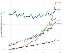
We identify two main groups of Data Science skills: A: 13 core, stable skills that most respondents have and B: a group of hot, emerging skills that most do not have (yet) but want to add. See our detailed analysis.
Python's plotting libraries such as matplotlib and seaborn does allow the user to create elegant graphics as well, but lack of a standardized syntax for implementing the grammar of graphics compared to the simple, readable and layering approach of ggplot2 in R makes it more difficult to implement in Python.
I’m now part of Tableau (having joined in 2019) and recently created Real World Fake Data (RWFD) to scratch an itch for business-ready dashboards for the DataFam community. So the next time you have a notion about datavisualization, process, data, or you find something you think is amazing, let it out in a blog!
Creating effective data visualisations is a core skill for data scientists. This tutorial will guide you through how to easily develop interactive visualisations using the Python library plotly.
He joined Getir in 2019 and currently works as a Senior Data Science & Analytics Manager. His team is responsible for designing, implementing, and maintaining end-to-end machine learning algorithms and data-driven solutions for Getir. He then joined Getir in 2019 and currently works as Data Science & Analytics Manager.
It can also tell you if your data is symmetrical, how tightly your data is grouped, and if and how your data is skewed. It can tell you about your outliers and what their values are.
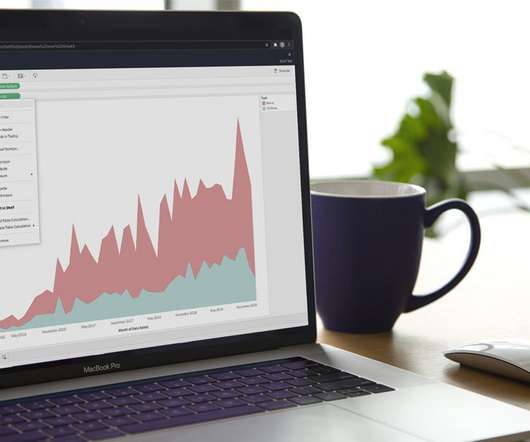
Average Price by Town — Image by Author Monthly Average Price Since our main goal in this blog is to showcase how time-series analysis can enhance regression models, it is imperative to show the time-series aspect of the datavisualizations. Therefore, below is the monthly average price of HDB flats from January 2017 to August 2023.
Since the program’s start in 2019, the Tableau for Students team has supported more than 200 students around the globe—evangelizing Tableau and nurturing the data rockstars of tomorrow. Create datavisualization tips and tricks geared toward students and new learners. What can they offer you?
Big data has been billed as being the future of business for quite some time. Analysts have found that the market for big data jobs increased 23% between 2014 and 2019. The impact of big data is felt across all sectors of the economy. However, the future is now. The market for Hadoop jobs increased 58% in that timeframe.
I think in physics one of the things that attracted me most to the field that I studied, which was particle physics, was the ability to leverage computer science mathematical modeling and datavisualization to solve big questions. He asks, “How important is SQL in comparison to Python in 2019?”. However, you have to know SQL.
He joined Getir in 2019 and currently works as a Senior Data Science & Analytics Manager. His team is responsible for designing, implementing, and maintaining end-to-end machine learning algorithms and data-driven solutions for Getir. His focus was building machine learning algorithms to simulate nervous network anomalies.
He joined Getir in 2019 and currently works as a Senior Data Science & Analytics Manager. His team is responsible for designing, implementing, and maintaining end-to-end machine learning algorithms and data-driven solutions for Getir. He then joined Getir in 2019 and currently works as Data Science & Analytics Manager.
Vega and Vega-lite follow in a long line of work that can trace its roots back to Wilkinson’s ‘The Grammar of Graphics.’ Since then VegaLite has come into existence, bringing high-level specification of interactive visualisations to the Vega-Lite world.
The Salesforce purchase in 2019. Tableau had its IPO at the NYSE with the ticker DATA in 2013. The Salesforce acquisition in August 2019 ended the Tableau board and the last formal Tableau roles for Chris, Pat, and Christian. VizQL: A domain-specific language for visual, self-service analysis. Sept 2019).
Hamilton has been dominating for the past seven years, and he was the world champion in 2015, 2017, 2018, 2019, and 2020. Image by Author Max Verstappen is the current world f1 champion, ending the era of domination by Lewis Hamilton.
I’m now part of Tableau (having joined in 2019) and recently created Real World Fake Data (RWFD) to scratch an itch for business-ready dashboards for the DataFam community. So the next time you have a notion about datavisualization, process, data, or you find something you think is amazing, let it out in a blog!
To achieve this goal, starting from 2017, we launched the Amazon SageMaker notebook instance —a fully managed compute instance running Jupyter that includes all the popular data science and ML packages.
This is a summary of a recent paper on an age-old topic: what visualisation should I use? No prizes for guessing “it depends!” Is this the paper to finally settle the age-old debate surrounding pie-charts??
When you want to explore, create, and share datavisualizations, we're happy to share that you can start creating vizzes directly from a browser on Tableau Public with the web authoring beta. We believe that focus should be on data exploration, analysis, and storytelling, and not on installations and updates. Kristin Adderson.
We organize all of the trending information in your field so you don't have to. Join 17,000+ users and stay up to date on the latest articles your peers are reading.
You know about us, now we want to get to know you!
Let's personalize your content
Let's get even more personalized
We recognize your account from another site in our network, please click 'Send Email' below to continue with verifying your account and setting a password.


Let's personalize your content