This site uses cookies to improve your experience. To help us insure we adhere to various privacy regulations, please select your country/region of residence. If you do not select a country, we will assume you are from the United States. Select your Cookie Settings or view our Privacy Policy and Terms of Use.
Cookie Settings
Cookies and similar technologies are used on this website for proper function of the website, for tracking performance analytics and for marketing purposes. We and some of our third-party providers may use cookie data for various purposes. Please review the cookie settings below and choose your preference.
Used for the proper function of the website
Used for monitoring website traffic and interactions
Cookie Settings
Cookies and similar technologies are used on this website for proper function of the website, for tracking performance analytics and for marketing purposes. We and some of our third-party providers may use cookie data for various purposes. Please review the cookie settings below and choose your preference.
Strictly Necessary: Used for the proper function of the website
Performance/Analytics: Used for monitoring website traffic and interactions
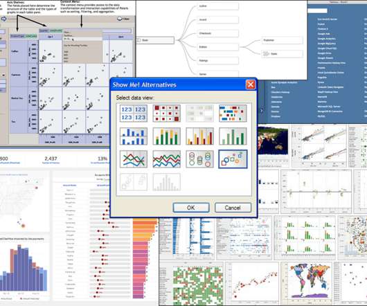
Technical Fellow, Tableau. Innovation is necessary to use data effectively in the pursuit of a better world, particularly because data continues to increase in size and richness. I am proud to announce that my History of Tableau Innovation viz is now published to Tableau Public. The Salesforce purchase in 2019.
Editor's note: This article originally appeared in Tableau Public. When you want to explore, create, and share datavisualizations, we're happy to share that you can start creating vizzes directly from a browser on Tableau Public with the web authoring beta. If you don’t have a Tableau Public profile, create one for free.
Technical Fellow, Tableau. Innovation is necessary to use data effectively in the pursuit of a better world, particularly because data continues to increase in size and richness. I am proud to announce that my History of Tableau Innovation viz is now published to Tableau Public. The Salesforce purchase in 2019.
Welcome to my first edition of Best of the Tableau Web (BOTW), where I’ll recap highlights from last month. For me, the Tableau Community has been a treasure trove of content that’s both highly inspirational and technically deep. In fact, the first piece of Tableau content that I found online in 2012 was the first edition of BOTW.
Academic Program Senior Specialist, Tableau. Tableau Ambassadors teach and share while fostering a positive and supportive space within the data community. Tableau Ambassadors serve one-year terms in one of seven branches: Forums, User Groups, Student, DataDev, Public, Social, and CRM Analytics. Bergen Schmetzer.
Global Head of the Tableau Foundation. That is precisely what a trio of our Tableau Foundation partners are doing—driving local conversations about climate change. In 2016, Headwaters Economics began partnering with Tableau Foundation to build their data capacity to identify and solve problems related to the use of natural resources.
Global Head of the Tableau Foundation. That is precisely what a trio of our Tableau Foundation partners are doing—driving local conversations about climate change. In 2016, Headwaters Economics began partnering with Tableau Foundation to build their data capacity to identify and solve problems related to the use of natural resources.
Welcome to my first edition of Best of the Tableau Web (BOTW), where I’ll recap highlights from last month. For me, the Tableau Community has been a treasure trove of content that’s both highly inspirational and technically deep. In fact, the first piece of Tableau content that I found online in 2012 was the first edition of BOTW.
Editor's note: This article originally appeared in Tableau Public. When you want to explore, create, and share datavisualizations, we're happy to share that you can start creating vizzes directly from a browser on Tableau Public with the web authoring beta. If you don’t have a Tableau Public profile, create one for free.
Senior Manager Inclusive Marketing, Tableau. Can you picture a world where data storytelling does no harm? The Tableau Foundation has collaborated with The Urban Institute to bring to you the Do No Harm Guide : Applying Equity Awareness in DataVisualization. SENIOR DATA SCIENTIST, NATERA. Kristin Adderson.
Director, Tableau Community. In the journey to become data-driven, even data-leading, organizations traditionally viewed technology as the golden ticket. But adopting the right analytics platform isn’t enough: The ultimate accelerator of your data investments is community. Kristin Adderson. November 13, 2021 - 1:12am.
Director, Tableau Community . In the journey to become data-driven, even data-leading, organizations traditionally viewed technology as the golden ticket. But adopting the right analytics platform isn’t enough: The ultimate accelerator of your data investments is community. Kristin Adderson. November 13, 2021 - 1:12am.
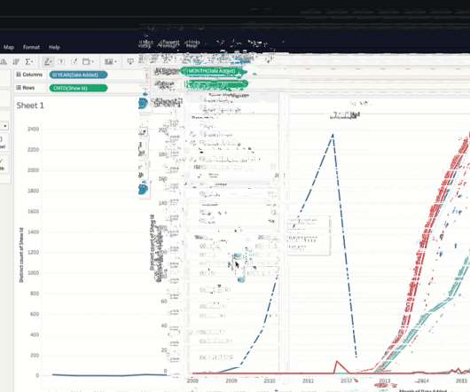
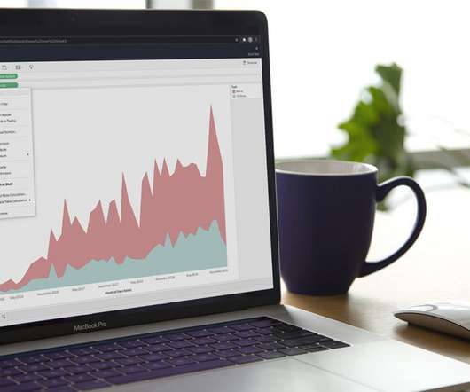
While I created the visuals mainly in Jupyter Notebook using Matplotlib and Seaborn for direct analysis and its flexibility, in this part of the blog I also use images generated by Tableau for a polished and reader-friendly presentation. Therefore, below is the monthly average price of HDB flats from January 2017 to August 2023.
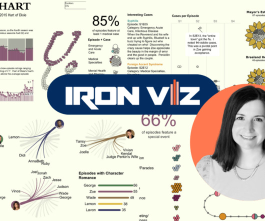
Iron Viz is a chance to prove to the world and myself what I'm capable of, and each time I learn something new about Tableau, data collection, and transformation.” Making it through to the finals at Tableau Conference makes the Iron Viz experience much more intense, she adds. The biggest thing about Tableau is the support.
To influence change and advance the understanding of what it means to use data with empathy and fairness, the Urban Institute, in partnership with Tableau Foundation , created the “ Do No Harm Guide: Applying Equity Awareness in DataVisualization. Urban Institute, recreated from Tableau dashboard].
To influence change and advance the understanding of what it means to use data with empathy and fairness, the Urban Institute, in partnership with Tableau Foundation , created the “ Do No Harm Guide: Applying Equity Awareness in DataVisualization. Urban Institute, recreated from Tableau dashboard].
Image by Author Tools The following tools were used to assist the data analysis process: Tableau: Used to create the visualizations. JupyterHub: Used to wrangle, clean, and prepare the dataset for visualization. Remove erroneous values. Create a new CSV file based on the newly cleaned dataset.
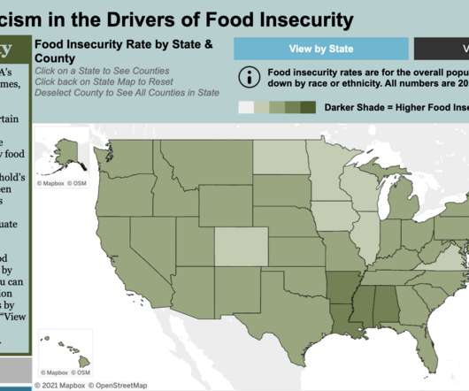
In 2019, 35 million people —10.9% Our data has shown, year over year, that people of color in the US are disproportionately likely to face difficulty in accessing adequate and healthy food for their families. . National Food Insecurity Estimates by Race or Ethnicity, 2019. . Lauren Lapinski. Analytics Manager, Feeding America.
Global Head of the Tableau Foundation. As you can imagine, meeting such a massive challenge data has become an invaluable part of that effort. Tableau Foundation and FSC partnered for the first time in December 2019 to create a vision for establishing a data-first approach to protect global forests. Neal Myrick.
Director, Community Programs & Engagement at Tableau. We are just weeks away from Tableau Conference and the ultimate visualization showdown —Iron Viz 2021—where three fierce contestants will take the virtual stage for an intense lightning round of live viz-tastic storytelling. . Andrew Grinaker. Ateken Abla. October 21, 2021.
Director, Community Programs & Engagement at Tableau. We are just weeks away from Tableau Conference and the ultimate visualization showdown —Iron Viz 2021—where three fierce contestants will take the virtual stage for an intense lightning round of live viz-tastic storytelling. . Andrew Grinaker. Ateken Abla. October 21, 2021.
Senior Manager Inclusive Marketing, Tableau. Can you picture a world where data storytelling does no harm? The Tableau Foundation has collaborated with The Urban Institute to bring to you the Do No Harm Guide : Applying Equity Awareness in DataVisualization. SENIOR DATA SCIENTIST, NATERA. Kristin Adderson.
Two of the platforms that we see emerging as a popular combination of data warehousing and business intelligence are the Snowflake Data Cloud and Power BI. Debuting in 2015, Power BI has undergone meaningful updates that have made it a leader not just in datavisualization, but in the business intelligence space as well.
In 2019, 35 million people —10.9% Our data has shown, year over year, that people of color in the US are disproportionately likely to face difficulty in accessing adequate and healthy food for their families. . National Food Insecurity Estimates by Race or Ethnicity, 2019. . Lauren Lapinski. Analytics Manager, Feeding America.
We recently connected with three data experts at the U.S. Census Bureau who are using Tableau to visualize race and ethnicity data from the 2020 Decennial Census. Tableau: What were your primary goals in creating the new race and ethnicity dashboards? The answer: datavisualizations.
We recently connected with three data experts at the U.S. Census Bureau who are using Tableau to visualize race and ethnicity data from the 2020 Decennial Census. Tableau: What were your primary goals in creating the new race and ethnicity dashboards? The answer: datavisualizations.
We organize all of the trending information in your field so you don't have to. Join 17,000+ users and stay up to date on the latest articles your peers are reading.
You know about us, now we want to get to know you!
Let's personalize your content
Let's get even more personalized
We recognize your account from another site in our network, please click 'Send Email' below to continue with verifying your account and setting a password.


Let's personalize your content