This site uses cookies to improve your experience. To help us insure we adhere to various privacy regulations, please select your country/region of residence. If you do not select a country, we will assume you are from the United States. Select your Cookie Settings or view our Privacy Policy and Terms of Use.
Cookie Settings
Cookies and similar technologies are used on this website for proper function of the website, for tracking performance analytics and for marketing purposes. We and some of our third-party providers may use cookie data for various purposes. Please review the cookie settings below and choose your preference.
Used for the proper function of the website
Used for monitoring website traffic and interactions
Cookie Settings
Cookies and similar technologies are used on this website for proper function of the website, for tracking performance analytics and for marketing purposes. We and some of our third-party providers may use cookie data for various purposes. Please review the cookie settings below and choose your preference.
Strictly Necessary: Used for the proper function of the website
Performance/Analytics: Used for monitoring website traffic and interactions
The post 6 Top Tools for Analytics and Business Intelligence in 2020 appeared first on Analytics Vidhya. Overview Analytics and Business Intelligence provide comprehensible view of the company and derive actionable insights. We’ll discuss 6 top business intelligence tools that you.
ArticleVideo Book This article was published as a part of the Data Science Blogathon. Introduction Machine Learning is the trending digital technology in today’s world, The post Bar Chart Race of World Population by 2020 in Python appeared first on Analytics Vidhya.
A plethora of data science and business intelligence professionals and organizations have asked. The post Gartner’s 2020 Magic Quadrant is Out! What’s the best Business Intelligence and Analytics tool in the market? Check out the latest developments in Best Analytics Tools appeared first on Analytics Vidhya.
The World Happiness Report rates happiness on six indicators: positive emotions, […] The post Analysing World Happiness Report (2020-2022) appeared first on Analytics Vidhya. In line with the latest World Happiness Report, it is evident that being happy has become a worldwide priority.
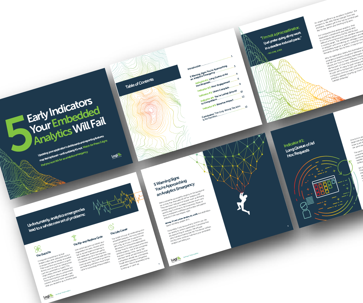
Many application teams leave embedded analytics to languish until something—an unhappy customer, plummeting revenue, a spike in customer churn—demands change. But by then, it may be too late. In this White Paper, Logi Analytics has identified 5 tell-tale signs your project is moving from “nice to have” to “needed yesterday.".
Introduction to DataVisualization & Storytelling;The Data Science Interview Study Guide; Why Kaggle will NOT make you a great Data Scientist; Cartoon: Teaching Ethics to AI.
My methods of using GPT-4 to optimize my datavisual workflow For the past 6 months, I have been a heavy daily GPT-4 user. I know it makes me sound like an addict, but I have found many good reasons and many excellent use cases where this tool is an invaluable resource for improving my data workflow.
In the age of data-driven insights, it's fitting to explore how datavisualization can be a powerful tool in telling the stories of women's achievements, struggles, and progress. You could also visualize social issues that impact women such as the gender pay gap, healthcare, or female representation in politics."
These can help a developer find a career in the data science field. Software developers will also want to take classes in datavisualization and data mining. Taking coursework now can help developers gain an edge on competitors in a demanding market that will require knowledgeable big data professionals.
I haven’t reviewed a year on FlowingData since 2020, which seems like a serious oversight in the system (me). To my credit, I pushed out the picks for best datavisualization projects of the year , but I guess it’s time to push the attention inwards.
Datavisualization is a collaborative exercise. As James Madison University (JMU) prepared for Fall 2020 classes, freshman parent and Tableau Partner, Lee Feinberg, volunteered to help improve the school’s Stop The Spread dashboard. Kristin Adderson. February 17, 2021 - 7:09pm. February 17, 2021. By Khalil Garriott (’04).
Wells, a prominent journalist, activist, and researcher in the late 19th and early 20th centuries who pioneered data journalism. Community DataVisualization Challenges: The DataFam has launched a series of data challenges celebrating Black History Month. Data Superstar : Get ready for a datavisualization extravaganza!
Wells, a prominent journalist, activist, and researcher in the late 19th and early 20th centuries who pioneered data journalism. Community DataVisualization Challenges: The DataFam has launched a series of data challenges celebrating Black History Month. Data Superstar : Get ready for a datavisualization extravaganza!
Josh Bersin & Marc Zao-Sanders, Harvard Business Review (2020). Today, I’m excited to announce our Data Literacy Two course curriculum, available to academic faculty for free! This course follows Data Literacy One, which we released in February 2020. This course covers: The meaning of data literacy.
We also analyze KDnuggets Poll results - the scale of change to online and how Data Science work is likely to increase or drop in different regions. We examine the growth of coronavirus daily cases in most affected countries, and show evidence that social distancing works in reducing the rate of spread.
The Lab, which PolicyLink CEO Michael McAfee announced at Tableau Conference 2020 , is built with Tableau to allow Atlas users to produce their own visualizations using Atlas data. The Lab is designed as a comprehensive datavisualization resource for organizers working for racial equity and justice.
Year after year, the volume of data in eLearning (and the need to analyze it) increases. corporations were using eLearning , and 98% planned to adopt it by 2020. In turn, Edtech companies will get immense possibilities (backed up by big data analytics) for improving their services. In 2017, 77% of U.S. between 2022 and 2030.
The post Top Data Science Guest Authors of 2021 appeared first on Analytics Vidhya. Introduction Analytics Vidhya has been at the helm when it comes to publishing high-quality content since the beginning of its inception. And this would not have been possible without leveraging the power of the […].
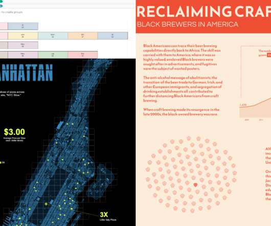
Co-lead of Tableau Foundation’s Racial Justice Data Initiative. A data tool for budget accountability and transparency. This MPD DataVisualization Tool illustrates that the MPD budget has gradually decreased in recent years. Policing in school data was impacted by Covid-19 and schools being closed.
Co-lead of Tableau Foundation’s Racial Justice Data Initiative. A data tool for budget accountability and transparency. This MPD DataVisualization Tool illustrates that the MPD budget has gradually decreased in recent years. Policing in school data was impacted by Covid-19 and schools being closed.
Average Price by Town — Image by Author Monthly Average Price Since our main goal in this blog is to showcase how time-series analysis can enhance regression models, it is imperative to show the time-series aspect of the datavisualizations. Therefore, below is the monthly average price of HDB flats from January 2017 to August 2023.
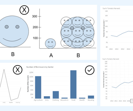
Alberto Cairo, datavisualization expert and author of How Charts Lie Whether you are reading a social post, news article or business report, it’s important to know and evaluate the source of the data and charts that you view. DataVisualization expert and author Kathy Rowell says that we should always ask “Compared to What?”,
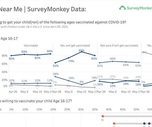
Since late 2020, COVID-19 vaccination programs have been rolling out across the globe. We will also be adding additional COVID-19 long hauler data that we haven’t added to the dashboard yet. Second, we actually want to bring this kind of datavisualization experience natively to Inspire. Audrey Strohm. Kristin Adderson.
With your input, we released more than 200 new capabilities across the Tableau platform in 2020. In every release, we're making Tableau easier to use, more powerful, and simpler to deploy to support governed data and analytics at scale. In 2020, we added the ability to write to external databases so you can use clean data anywhere.
While the 2020 election is over, the need for broad, in-depth public opinion data is not. . SurveyMonkey is looking to track and visualizedata on opinions around mask wearing, for instance, as official guidance from the CDC and many states and local governments quickly change. .
Datavisualization is a collaborative exercise. As James Madison University (JMU) prepared for Fall 2020 classes, freshman parent and Tableau Partner, Lee Feinberg, volunteered to help improve the school’s Stop The Spread dashboard. Kristin Adderson. February 17, 2021 - 7:09pm. February 17, 2021. By Khalil Garriott (’04).
When machine learning tools are developed by technology first, they risk failing to deliver on what users actually need. It can also be difficult for development teams to establish meaningful direction.
Silva , have been honored with one of these awards for their groundbreaking paper on urban datavisualization. Freire and Silva’s awarded paper, titled “ Visual Exploration of Big Spatio-Temporal Urban Data: A Study of New York City Taxi Trips ,” co-authored with Nivan Ferreira, Jorge Poco, Huy T.
With my background in web development and JavaScript, I had options – but an internship with Cambridge Intelligence was special as it promised to immerse me in the fascinating world of datavisualization, a field I had explored during my research projects at Loughborough University.
According to Global Knowledge’s 2020 IT Skills and Salary Report , learning a new skill or earning certification can result in a raise upwards of $12,000 a year. You might be surprised by a new-found passion or specialty that’s uncovered while preparing for an exam. . Increase your earning potential .
Josh Bersin & Marc Zao-Sanders , Harvard Business Review (2020). . Today, I’m excited to announce our Data Literacy Two course curriculum, available to academic faculty for free! This course follows Data Literacy One, which we released in February 2020. This course covers: The meaning of data literacy.
According to Global Knowledge’s 2020 IT Skills and Salary Report , learning a new skill or earning certification can result in a raise upwards of $12,000 a year. You might be surprised by a new-found passion or specialty that’s uncovered while preparing for an exam. . Increase your earning potential .
Ness: Accelerating AI capabilities Ness, an AWS Premier Partner since 2020, participated in the Generative AI TTM in Q1 2024 to accelerate their AI capabilities and deploy generative AI solutions for their public sector clients.
The key is to think critically and take time to evaluate the interpretations of data portrayed in charts. DataVisualization expert and author Kathy Rowell says that we should always ask “Compared to What?” Image from the Do No Harm Guide: Applying Equity Awareness to DataVisualization by Jonathan Schwabish and Alice Feng.
He received the Ulf Grenander Prize from the American Mathematical Society in 2021, the IEEE John von Neumann Medal in 2020, the IJCAI Research Excellence Award in 2016, the David E. His research interests bridge the computational, statistical, cognitive, biological, and social sciences.
The Lab, which PolicyLink CEO Michael McAfee announced at Tableau Conference 2020 , is built with Tableau to allow Atlas users to produce their own visualizations using Atlas data. The Lab is designed as a comprehensive datavisualization resource for organizers working for racial equity and justice.
billion social media users worldwide in 2021, which marks a five percent increase from 2020. Other platforms such as YouTube reported reaching two billion users in October 2020 with a revenue of USD 19.8 Million in 2020 as per [2]. Twitter reported 186 million users in 2020, with a revenue of USD 3.7 billion in 2017 to 3.78
This post presents an analysis of Berlin online real estate listings, investigating a controversial law capping rents in the state, which went into effect on February 23. Are current landlords already respecting the new rent cap?
Hamilton has been dominating for the past seven years, and he was the world champion in 2015, 2017, 2018, 2019, and 2020. Image by Author Max Verstappen is the current world f1 champion, ending the era of domination by Lewis Hamilton.
April 2018), which focused on users who do understand joins and curating federated data sources. May 2020) shifted sheets to a multiple-table data model, where the sheet’s fields allow the computer to write much more efficient queries to the data sources. Relationships in Tableau 2020.2 (May Beginning in Tableau 2020.2,
While the 2020 election is over, the need for broad, in-depth public opinion data is not. . SurveyMonkey is looking to track and visualizedata on opinions around mask wearing, for instance, as official guidance from the CDC and many states and local governments quickly change. .
Since late 2020, COVID-19 vaccination programs have been rolling out across the globe. We will also be adding additional COVID-19 long hauler data that we haven’t added to the dashboard yet. Second, we actually want to bring this kind of datavisualization experience natively to Inspire. Audrey Strohm. Kristin Adderson.
DataRobot Visual AI. In 2020, our team launched DataRobot Visual AI. We embedded best practices and various deep learning models to support image data. Image recognition has a lot of applications in industries and businesses. Our first step was to include images into the supervised machine learning pipeline.
We organize all of the trending information in your field so you don't have to. Join 17,000+ users and stay up to date on the latest articles your peers are reading.
You know about us, now we want to get to know you!
Let's personalize your content
Let's get even more personalized
We recognize your account from another site in our network, please click 'Send Email' below to continue with verifying your account and setting a password.


Let's personalize your content