This site uses cookies to improve your experience. To help us insure we adhere to various privacy regulations, please select your country/region of residence. If you do not select a country, we will assume you are from the United States. Select your Cookie Settings or view our Privacy Policy and Terms of Use.
Cookie Settings
Cookies and similar technologies are used on this website for proper function of the website, for tracking performance analytics and for marketing purposes. We and some of our third-party providers may use cookie data for various purposes. Please review the cookie settings below and choose your preference.
Used for the proper function of the website
Used for monitoring website traffic and interactions
Cookie Settings
Cookies and similar technologies are used on this website for proper function of the website, for tracking performance analytics and for marketing purposes. We and some of our third-party providers may use cookie data for various purposes. Please review the cookie settings below and choose your preference.
Strictly Necessary: Used for the proper function of the website
Performance/Analytics: Used for monitoring website traffic and interactions
The post 6 Top Tools for Analytics and Business Intelligence in 2020 appeared first on Analytics Vidhya. Overview Analytics and Business Intelligence provide comprehensible view of the company and derive actionable insights. We’ll discuss 6 top business intelligence tools that you.
A plethora of data science and business intelligence professionals and organizations have asked. The post Gartner’s 2020 Magic Quadrant is Out! What’s the best Business Intelligence and Analytics tool in the market? Check out the latest developments in Best Analytics Tools appeared first on Analytics Vidhya.
Technical Fellow, Tableau. Innovation is necessary to use data effectively in the pursuit of a better world, particularly because data continues to increase in size and richness. I am proud to announce that my History of Tableau Innovation viz is now published to Tableau Public. Jock Mackinlay. Bronwen Boyd.
Tableau Academic Programs Instructional Designer. Bridge the data literacy gap for students in academia. Working with data is a necessity for most jobs, and analytical skills can be a huge differentiator for success across all kinds of work—whether corporate, nonprofit, or academic. Learning how to communicate with data .
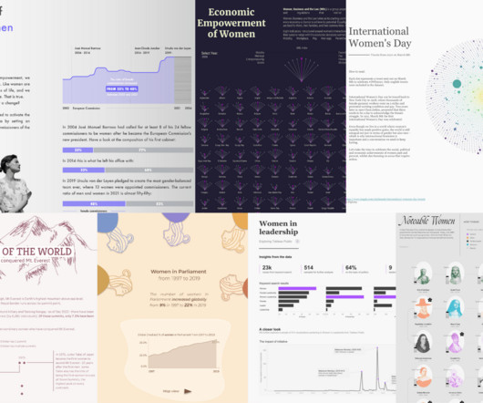
In the age of data-driven insights, it's fitting to explore how datavisualization can be a powerful tool in telling the stories of women's achievements, struggles, and progress. Don’t forget to star your favorites and follow these authors on Tableau Public. For example, this month's Iron Quest theme is women.
Gartner has again recognized Tableau as a Leader—for our ninth consecutive year. . I first want to thank you, the Tableau Community, for your continued support and your commitment to data, to Tableau, and to each other. With your input, we released more than 200 new capabilities across the Tableau platform in 2020.
As a result, many prioritized and elevated the focus on data skills to nurture and strengthen their organizational behaviors, processes, and mindsets to become data-leading instead of data-lagging. . Learn the data skills that are in demand . Employers are looking for data skills; in fact they’re hungry for them.
As a result, many prioritized and elevated the focus on data skills to nurture and strengthen their organizational behaviors, processes, and mindsets to become data-leading instead of data-lagging. . Learn the data skills that are in demand . Employers are looking for data skills; in fact they’re hungry for them.
Technical Fellow, Tableau. Innovation is necessary to use data effectively in the pursuit of a better world, particularly because data continues to increase in size and richness. I am proud to announce that my History of Tableau Innovation viz is now published to Tableau Public. Jock Mackinlay. Bronwen Boyd.
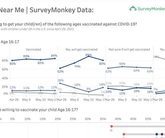
Director, Public Affairs at Tableau. A new Tableau dashboard featuring data from a poll conducted by SurveyMonkey and Outbreaks Near Me , an initiative of Boston Children’s Hospital, captures parents’ opinions—and how they are changing over time. —to Steve Schwartz. Kristin Adderson. May 25, 2021 - 2:44am. May 25, 2021.
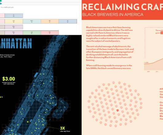
Black History Month with the Tableau Community Alisha Dhillon: Formatting KPIs in TableauData + Diversity Event: “The Life and Impact of Ida B. Wells, a prominent journalist, activist, and researcher in the late 19th and early 20th centuries who pioneered data journalism. Find the content submission form here.
Black History Month with the Tableau Community Alisha Dhillon: Formatting KPIs in TableauData + Diversity Event: “The Life and Impact of Ida B. Wells, a prominent journalist, activist, and researcher in the late 19th and early 20th centuries who pioneered data journalism. Find the content submission form here.
Datavisualization is a collaborative exercise. As James Madison University (JMU) prepared for Fall 2020 classes, freshman parent and Tableau Partner, Lee Feinberg, volunteered to help improve the school’s Stop The Spread dashboard. He has been working with the Tableau Foundation for almost nine years.
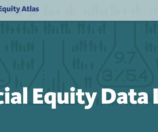
Global Head of the Tableau Foundation. Developed with USC’s Equity Research Institute , the Atlas is one of the most powerful resources for data on racial inequities in the country. Tableau Foundation is proud to support the latest addition to the Atlas’s already robust set of resources: the Racial Equity Data Lab.
Marketing Specialist, Tableau. Since late 2020, COVID-19 vaccination programs have been rolling out across the globe. Tableau: Tell us about why you built this dashboard. Tableau: You’re touching on something really powerful— that disaggregation can help humanize COVID-19 data. Audrey Strohm. Kristin Adderson.
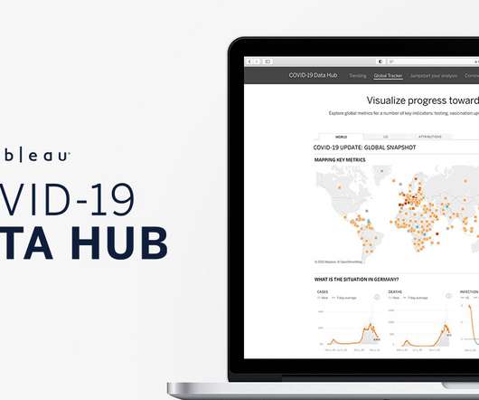
Director, Tableau. Today, on the Tableau COVID-19 Data Hub , we launch a new Global Tracker that combines and visualizes the key metrics that measure our return to normalcy. The evolution of the Tableau COVID-19 Global Tracker. How we choose data sources for the new Global Tracker. Jeremy Blaney.
Senior DataVisualization Lead, Excella. Once we find issues of inequality in data, it’s also our responsibility to spend time to understand the causes of those inequalities.” - Amanda Makulec. At no point in recent memory has the sheer quantity of available data and datavisualizations on a single topic evolved so quickly.
Tableau Academic Programs Instructional Designer. Bridge the data literacy gap for students in academia. Working with data is a necessity for most jobs, and analytical skills can be a huge differentiator for success across all kinds of work—whether corporate, nonprofit, or academic. Learning how to communicate with data .
Senior Solution Architect, Tableau. September 11, 2020 - 6:35pm. With data a known keystone of digital transformation, modernizing your analytics is a vital move in our digital age. Start with Tableau Blueprint. The next step of Tableau Blueprint is to identify Executive Advocacy and Project Teams. Jennifer Clark.
Senior Solution Architect, Tableau. September 11, 2020 - 6:35pm. With data a known keystone of digital transformation, modernizing your analytics is a vital move in our digital age. Start with Tableau Blueprint. The next step of Tableau Blueprint is to identify Executive Advocacy and Project Teams. Jennifer Clark.
Senior Solution Architect, Tableau. September 11, 2020 - 6:35pm. With data a known keystone of digital transformation, modernizing your analytics is a vital move in our digital age. Start with Tableau Blueprint. The next step of Tableau Blueprint is to identify Executive Advocacy and Project Teams. Jennifer Clark.
Gartner has again recognized Tableau as a Leader—for our ninth consecutive year. . I first want to thank you, the Tableau Community, for your continued support and your commitment to data, to Tableau, and to each other. With your input, we released more than 200 new capabilities across the Tableau platform in 2020.
Director, Public Affairs at Tableau. A new Tableau dashboard featuring data from a poll conducted by SurveyMonkey and Outbreaks Near Me , an initiative of Boston Children’s Hospital, captures parents’ opinions—and how they are changing over time. —to Steve Schwartz. Kristin Adderson. May 25, 2021 - 2:44am. May 25, 2021.
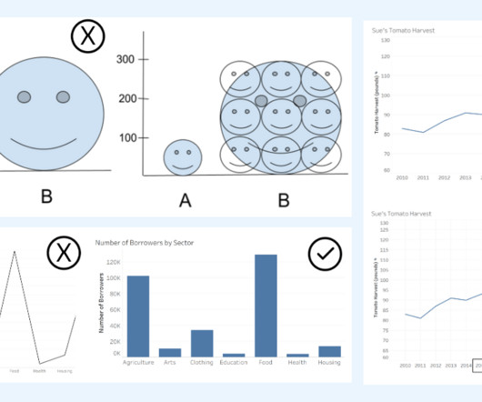
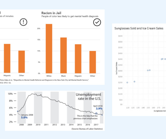
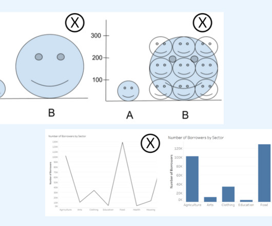
Alyssa Jenson November 14, 2023 - 6:59pm Sue Kraemer Senior Data Skills Curriculum Strategy Manager, Tableau Charts are all around us. In today’s world, the ability to swiftly make decisions and act on data is crucial. DataVisualization expert and author Kathy Rowell says that we should always ask “Compared to What?”,
Co-lead of Tableau Foundation’s Racial Justice Data Initiative. A data tool for budget accountability and transparency. This MPD DataVisualization Tool illustrates that the MPD budget has gradually decreased in recent years. Policing in school data was impacted by Covid-19 and schools being closed.
Co-lead of Tableau Foundation’s Racial Justice Data Initiative. A data tool for budget accountability and transparency. This MPD DataVisualization Tool illustrates that the MPD budget has gradually decreased in recent years. Policing in school data was impacted by Covid-19 and schools being closed.
Datavisualization is a collaborative exercise. As James Madison University (JMU) prepared for Fall 2020 classes, freshman parent and Tableau Partner, Lee Feinberg, volunteered to help improve the school’s Stop The Spread dashboard. He has been working with the Tableau Foundation for almost nine years.
Global Head of the Tableau Foundation. Developed with USC’s Equity Research Institute , the Atlas is one of the most powerful resources for data on racial inequities in the country. Tableau Foundation is proud to support the latest addition to the Atlas’s already robust set of resources: the Racial Equity Data Lab.
While I created the visuals mainly in Jupyter Notebook using Matplotlib and Seaborn for direct analysis and its flexibility, in this part of the blog I also use images generated by Tableau for a polished and reader-friendly presentation. Therefore, below is the monthly average price of HDB flats from January 2017 to August 2023.
Director, Tableau. Today, on the Tableau COVID-19 Data Hub , we launch a new Global Tracker that combines and visualizes the key metrics that measure our return to normalcy. The evolution of the Tableau COVID-19 Global Tracker. How we choose data sources for the new Global Tracker. Jeremy Blaney.
Marketing Specialist, Tableau. Since late 2020, COVID-19 vaccination programs have been rolling out across the globe. Tableau: Tell us about why you built this dashboard. Tableau: You’re touching on something really powerful— that disaggregation can help humanize COVID-19 data. Audrey Strohm. Kristin Adderson.
To influence change and advance the understanding of what it means to use data with empathy and fairness, the Urban Institute, in partnership with Tableau Foundation , created the “ Do No Harm Guide: Applying Equity Awareness in DataVisualization. Urban Institute, recreated from Tableau dashboard].
Senior DataVisualization Lead, Excella. Once we find issues of inequality in data, it’s also our responsibility to spend time to understand the causes of those inequalities.” - Amanda Makulec. At no point in recent memory has the sheer quantity of available data and datavisualizations on a single topic evolved so quickly.
To influence change and advance the understanding of what it means to use data with empathy and fairness, the Urban Institute, in partnership with Tableau Foundation , created the “ Do No Harm Guide: Applying Equity Awareness in DataVisualization. Urban Institute, recreated from Tableau dashboard].
Ateken Abla November 14, 2023 - 6:59pm Sue Kraemer Senior Data Skills Curriculum Strategy Manager, Tableau Charts exist everywhere. Viewing a chart instead of a table of numbers helps us quickly understand data, see patterns, and make better decisions. In today’s world, swift decision-making with data is crucial.
Image by Author Tools The following tools were used to assist the data analysis process: Tableau: Used to create the visualizations. JupyterHub: Used to wrangle, clean, and prepare the dataset for visualization. Remove erroneous values. Create a new CSV file based on the newly cleaned dataset.
Ateken Abla November 14, 2023 - 6:59pm Sue Kraemer Senior Data Skills Curriculum Strategy Manager, Tableau Charts are all around us. When communicating with data, viewing a chart instead of a table of numbers helps us quickly understand data, make comparisons, see patterns, and make better decisions.
Ateken Abla November 14, 2023 - 6:59pm Sue Kraemer Senior Data Skills Curriculum Strategy Manager, Tableau Charts are all around us. When communicating with data, viewing a chart instead of a table of numbers helps us quickly understand data, make comparisons, see patterns, and make better decisions.
Two of the platforms that we see emerging as a popular combination of data warehousing and business intelligence are the Snowflake Data Cloud and Power BI. Having gone public in 2020 with the largest tech IPO in history, Snowflake continues to grow rapidly as organizations move to the cloud for their data warehousing needs.
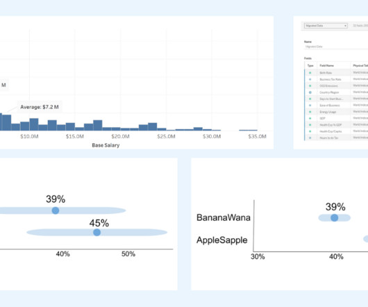
Ateken Abla November 14, 2023 - 6:59pm Sue Kraemer Senior Data Skills Curriculum Strategy Manager, Tableau Charts are all around us. In today’s world, the ability to swiftly make decisions and act on data is crucial. The Metadata grid in the TableauData Source page. October 3, 2024
Unfortunately, I started that role right as the Covid pandemic began in 2020. I began taking online courses on Python, SQL, and Tableau for datavisualization. Our sales organization experienced heavy layoffs, and I was included in this. After my stint in sales, I decided to pivot to my true passion, which was analytics.
We recently connected with three data experts at the U.S. Census Bureau who are using Tableau to visualize race and ethnicity data from the 2020 Decennial Census. Tableau: What were your primary goals in creating the new race and ethnicity dashboards? The answer: datavisualizations.
We recently connected with three data experts at the U.S. Census Bureau who are using Tableau to visualize race and ethnicity data from the 2020 Decennial Census. Tableau: What were your primary goals in creating the new race and ethnicity dashboards? The answer: datavisualizations.
Research Scientist, Tableau. Editor's note: This article originally appeared in the Tableau Engineering Blog. Data science has exploded over the past decade, changing the way that we conduct business and prepare the next generation of young people for the jobs of the future. What is data science? Ana Crisan.
We organize all of the trending information in your field so you don't have to. Join 17,000+ users and stay up to date on the latest articles your peers are reading.
You know about us, now we want to get to know you!
Let's personalize your content
Let's get even more personalized
We recognize your account from another site in our network, please click 'Send Email' below to continue with verifying your account and setting a password.


Let's personalize your content