This site uses cookies to improve your experience. To help us insure we adhere to various privacy regulations, please select your country/region of residence. If you do not select a country, we will assume you are from the United States. Select your Cookie Settings or view our Privacy Policy and Terms of Use.
Cookie Settings
Cookies and similar technologies are used on this website for proper function of the website, for tracking performance analytics and for marketing purposes. We and some of our third-party providers may use cookie data for various purposes. Please review the cookie settings below and choose your preference.
Used for the proper function of the website
Used for monitoring website traffic and interactions
Cookie Settings
Cookies and similar technologies are used on this website for proper function of the website, for tracking performance analytics and for marketing purposes. We and some of our third-party providers may use cookie data for various purposes. Please review the cookie settings below and choose your preference.
Strictly Necessary: Used for the proper function of the website
Performance/Analytics: Used for monitoring website traffic and interactions
Imagine representing data as vectors, where the distance between vectors reflects similarity, and using Vector Similarity Search algorithms to search billions of vectors in milliseconds. But what if we could use deep learning to revolutionize search?
AI-powered automation speeds things up, and machine learning improves foresight, but datavisualization is key to an analyst’s control over their supply chain. In this blog post, you’ll find out how to transform your supply chain processes by integrating graph and timeline visualization with the latest AI-led supply chain tools.
This post looks at some of the open source datavisualization tools our customers tell us theyve tried before upgrading to our fully-supported toolkits for their analysis apps. Teams working on datavisualization applications always aim to build the best product they can. js) GraphViz Viz.js
Explore the top 10 machine learning demos and discover cutting-edge techniques that will take your skills to the next level. Case studies highlighting its effectiveness Scikit-learn has been used in a variety of successful data analysis projects. It has a wide range of datavisualization tools.
In this blog post, Ill show how effective log datavisualization improves your enterprise observability workflows. Youll see how KronoGraph, our timeline visualization SDK , can work alongside your log table, or replace it entirely. With KronoGraph log datavisualization, observing log sources becomes instantaneous.
In this post, we explore geospatial data: what it is, what it’s for, and why map datavisualization is used by every business that’s serious about analyzing connected data. Digital mapping in the 1960s paved the way for geospatial datavisualization.
We’ve blogged before about the benefits of graph visualization SDKs over open source graph libraries. There are other datavisualization options available too, such as off-the-shelf apps and popular diagramming tools. 40,000 nodes and links visualized using KeyLines Does it tick the right boxes for your C-suite executives?
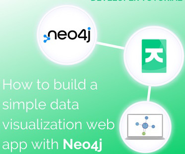
In this tutorial for JavaScript developers, I’ll demonstrate how to integrate our graph visualization SDKs with Neo4j to create a powerful datavisualization web app. Both come with powerful graph visualization functionality – from automatic layouts to complex graph algorithms.
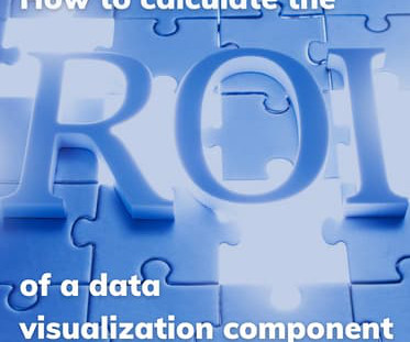
How do you measure the value of adding datavisualization to your web app? If you choose to build a visualization component using a datavisualization library, what is that investment worth? You’ll be able to justify whether or not datavisualization is a sound investment that’ll reap rewards.
Machine learning practitioners tend to do more than just create algorithms all day. First, there’s a need for preparing the data, aka data engineering basics. Second, there’s a strong trend of data storytelling involved, with communication skills, data analytics, and datavisualization being common amongst ML practitioners.
She has all the content ready, but she needs to draft a guided tutorial with a full list of prerequisites the workshop attendees will need to set up the environment and replicate her demo on their own. For the sake of simplicity, let’s suppose her workshop demo includes only one Python notebook like this.
In addition to its prowess in crafting captivating narratives and artistic creations, generative AI demonstrates its versatility by helping users empower their own data analytics. With its advanced algorithms and language comprehension, it can navigate complex datasets and distill valuable insights.
Using sophisticated datavisualization tools, many of which are powered by AI, app analytics services empower businesses to better understand IT operations , helping teams make smarter decisions, faster. SaaS offers businesses cloud-native app capabilities, but AI and ML turn the data generated by SaaS apps into actionable insights.
The challenge to understand hidden relationships and uncover actionable insights from data is universal, across countless datavisualization use cases. In this blog post, we focus on seven of the most popular: Why visualizedata as a graph? Datavisualization makes it easy for us to identify trends and outliers.
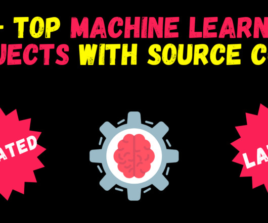
Source code projects provide valuable hands-on experience and allow you to understand the intricacies of machine learning algorithms, data preprocessing, model training, and evaluation. Flight Price Prediction with Flask app — with datavisualizations So guys this is yet another one of the most favorite projects of mine.
Its AI algorithms also personalize task suggestions and prioritize them, ensuring that critical tasks are never overlooked. This is especially valuable for startup data teams that may have some capital to spend on software, but not much on labor. with Tasks & Automation Any.do
HOGs are great feature detectors and can also be used for object detection with SVM but due to many other State of the Art object detection algorithms like YOLO, and SSD , present out there, we don’t use HOGs much for object detection. Check out the demo here… [link] 21. Check out the demo here… [link] 24.
Monday’s sessions will cover a wide range of topics, from Generative AI and LLMs to MLOps and DataVisualization. Tuesday is the first day of the AI Expo and Demo Hall , where you can connect with our conference partners and check out the latest developments and research from leading tech companies. What’s next?
it’s possible to build a robust image recognition algorithm with high accuracy. Who Can Benefit from the VisualData? Get Started for Free or reach out to our team to request a demo. See Visual AI in Action Today. The post Get Maximum Value from Your VisualData appeared first on DataRobot AI Cloud.
Graph visualization SDKs would have been a huge asset to those projects. To prove this, I built my own digital twin using the KeyLines graph visualization toolkit. Let’s see how advanced datavisualization can illuminate these models and uncover powerful insights. What is a digital twin?
Improving your data literacy not only involves hard skills, such as programming languages, but soft skills such as interpersonal communication, and stakeholder relations, as well as blended skills such as datavisualization. Programming/coding skills are to data scientists as plumbing tools are to professional plumbers.
Noah Giansiracusa, PhD, Associate Professor of Mathematics and Data Science at Bentley University Noah explores the societal impact of algorithms through his books and writings, including How Algorithms Create and Prevent Fake News. Edward Donner, Co-founder and CTO of Nebula.io Government agencies.
FREE: Managing fraud The ultimate guide to fraud detection, investigation and prevention using datavisualization GET YOUR FREE GUIDE The role of new & existing technology For many years, credit card companies have relied on analytics, algorithms and decision trees to power their fraud strategy.
Data science is used to protect people from dangers like harmful algal blooms and unsustainable fishing practices , and to monitor effects of a changing climate on natural disasters , financial inclusion , and wildlife conservation. Data science, machine learning and AI rely on data. Take the Zamba tool we discussed above.
For more information on how to use GluonTS SBP, see the following demo notebook. She is working on research and development of Machine Learning algorithms for high-impact customer applications in a variety of industrial verticals to accelerate their AI and cloud adoption.
You’ll find links to each survey below And because we’re the leading supplier of datavisualization toolkits that make the world safer, I’ll also share what we’re doing to help the CEOs of the most successful global organizations we work with. Visualization transforms the data into something that anyone can explore and understand.
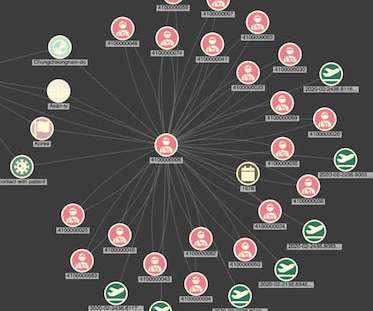
Graph algorithms can pick out degrees of separation between individuals, for example, or find the most influential people in a graph – as we’ll find out later on. Whether you need to investigate phone calls between two people or IT traffic across a whole enterprise network, KronoGraph provides a rich, interactive view of the data.
Visual language processing (VLP) is at the forefront of generative AI, driving advancements in multimodal learning that encompasses language intelligence, vision understanding, and processing. The demo implementation code is available in the following GitHub repo. He focuses on developing scalable machine learning algorithms.
FREE: Start your ReGraph trial today Visualize your data! Request full access to our ReGraph SDK, demos and live-coding playground. We can encourage users to explore the data more deeply with an “expand” interaction, which fetches additional data from Neo4j. FREE: Start your ReGraph trial today Visualize your data!
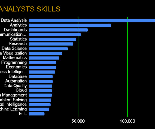
As you’ll see below, however, a growing number of data analytics platforms, skills, and frameworks have altered the traditional view of what a data analyst is. Data Presentation: Communication Skills, DataVisualization Any good data analyst can go beyond just number crunching.
Jon Krohn | Chief Data Scientist | Nebula.io You will discuss both the theory behind each approach and the various pros and cons. Register today Remember, that’s just the tip of the iceberg. Check out our preliminary schedule for more sessions and speakers and register soon to save 40% on any in-person or virtual ODSC East pass.
Open Source Data Exploration Tools You Need to Know, GitHub Codespaces and Copilot, and Meta’s New LLM 11 Open Source Data Exploration Tools You Need to Know in 2023 In this article, we’re going to cover 11 data exploration tools that are specifically designed for exploration and analysis. Check out the recap here!
Inference Speed Is the Key To Unleashing AI’s Potential Inference: Where AI Training Ends & Business Begins Industry, Opinion, Career Advice The Impact of DataVisualization Tools on Brand Strategy Development Charts, graphs, and maps are all useful tools that transform raw data into visually engaging formats.
Each image and animation demonstrates what you can achieve with our datavisualization toolkits. It exposes hierarchies : Visualizing transactions paints a clear picture of control structures and rankings between businesses, shareholder groups or account holders. FREE: Start your trial today Visualize your data!
This Data Science professional certificate program is industry-recognized and incorporates all the fundamentals of Data Science along with Machine Learning and its practical applications. The Udacity’s Data Science and Machine Learning course covers a wide range of topics in Data Science and Machine Learning.
A basic visualization created in TigerGraph GraphStudio Once I’ve loaded each CSV file, We have a working graph database, a REST interface and a basic visualization. For more advanced analysis of your TigerGraph data, applications built using our powerful datavisualization toolkits provide the ideal solution.
In particular, the following groups come to mind: Deep learning researchers: Many visualization techniques are first developed by academic researchers looking to improve existing deep learning algorithms or to understand why a particular model exhibits a certain characteristic. All of these visualizations do not only satisfy curiosity.
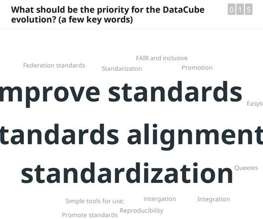
How can we all make environmental data more usable, accessible and more relevant? Presentations include demos of functionality and proposals for the future development work, primarily funded by the Horizon Europe programme. Video Presentation of the B3 Project’s Data Cube.
It is often the case that the problem you aim to solve with machine learning and data science techniques has already been approached in the past by experts in the specific field, who are not necessarily data scientists. Examples of such fields include financial modeling, cognitive psychology, algorithmic trading, and many others.
This comprehensive blog outlines vital aspects of Data Analyst interviews, offering insights into technical, behavioural, and industry-specific questions. It covers essential topics such as SQL queries, datavisualization, statistical analysis, machine learning concepts, and data manipulation techniques.
These steps include defining business and project objectives, acquiring and exploring data, modeling the data with various algorithms, interpreting and communicating the project outcome, and implementing and maintaining the project. catboost is the machine learning algorithm for model building. Flask==2.1.2 xgboost==1.6.1
Many rely on graph technology and healthcare datavisualization for this because it’s powerful, it’s accessible, and its advanced algorithms help analysts to identify, investigate and predict fraud. Timeline visualization of AI data The AI also gives us time-based data. Request a free trial today.
🌵 ♬ use this audio if im the best editor oat – alpine Wolfram Alpha : Wolfram Alpha is a computational knowledge engine that can answer any question or query using its vast database of facts and algorithms. In essence, the AI model acts as a bridge between users, allowing them to communicate via chat and generate visuals.
And that means visualizingdata to carry out link analysis for AML. FREE: Managing fraud The ultimate guide to fraud detection, investigation and prevention using datavisualization GET YOUR FREE GUIDE What is link analysis for AML? FREE: Start your trial today Visualize your data!
We organize all of the trending information in your field so you don't have to. Join 17,000+ users and stay up to date on the latest articles your peers are reading.
You know about us, now we want to get to know you!
Let's personalize your content
Let's get even more personalized
We recognize your account from another site in our network, please click 'Send Email' below to continue with verifying your account and setting a password.


Let's personalize your content