This site uses cookies to improve your experience. To help us insure we adhere to various privacy regulations, please select your country/region of residence. If you do not select a country, we will assume you are from the United States. Select your Cookie Settings or view our Privacy Policy and Terms of Use.
Cookie Settings
Cookies and similar technologies are used on this website for proper function of the website, for tracking performance analytics and for marketing purposes. We and some of our third-party providers may use cookie data for various purposes. Please review the cookie settings below and choose your preference.
Used for the proper function of the website
Used for monitoring website traffic and interactions
Cookie Settings
Cookies and similar technologies are used on this website for proper function of the website, for tracking performance analytics and for marketing purposes. We and some of our third-party providers may use cookie data for various purposes. Please review the cookie settings below and choose your preference.
Strictly Necessary: Used for the proper function of the website
Performance/Analytics: Used for monitoring website traffic and interactions
This article was published as a part of the Data Science Blogathon. What is PowerBI? Microsoft‘s business analytics product, PowerBI, delivers interactive data visualization BI capabilities that allow users to see and share data and insights throughout their organisation.
Among numerous available exciting career choices, PowerBI developer is one of the intriguing career options among professionals. With dataanalysis, visualization, interpretation, and business intelligence skills, setting your foot and heading over others requires consistency, practice, and an innovative mindset.
Introduction We have worked on plenty of drag-and-drop tools in our business intelligence (BI) journey. The post 10 Useful DataAnalysis Expressions (DAX) Functions for PowerBI Beginners appeared first on Analytics Vidhya. But none has come close to matching the Swiss.
Introduction If you’re new to PowerBI Desktop, this post is for you. You’ll learn the fundamentals of DataAnalysis Expressions (DAX) and how to apply them to common math and dataanalysis tasks in no time. The post Complete Introduction to DAX in PowerBI appeared first on Analytics Vidhya.
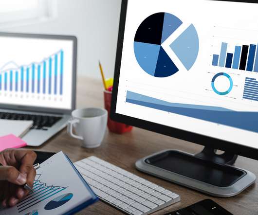
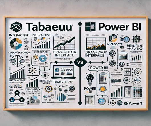
That’s why businesses of all types and sizes are embracing data visualization, albeit often with a simplified approach. PowerBI and Tableau, popular and user-friendly data visualization tools, help businesses organize large datasets.
Both MS Excel and PowerBI offer impressive capabilities regarding dataanalysis and decision-making. This […] The post Excel vs PowerBI – Which is a Better for Decision Making? appeared first on Analytics Vidhya. However, determining the best choice depends on specific requirements.
It is at this juncture that PowerBI Semantic Models are useful. They also work in the capacity of […] The post What are PowerBI Semantic Models? appeared first on Analytics Vidhya. It may not be easy to incorporate, sort and analyze such information for presentation purposes to be meaningful.
Introduction PowerBI uses a set of functions, operators, and constants called DAX to perform dynamic computations and analysis. One can enhance their PowerBI competency by using DAX features that help in data modeling and reporting.
Introduction The following is an in-depth article explaining DAX which stands for DataAnalysis Expression. DAX is the language developed by Microsoft to interact with data in a variety of their platforms, such as PowerBI, PowerPivot, and SSAS tabular models. It is designed to […].
Introduction PowerBI is a freely available tool from Microsoft for business analytics. It helps you visualize data and seamlessly share the insights from it with stakeholders. Whether you’re a data scientist, an analyst, or a business user, PowerBI is a must-know tool that can make your work a lot easier.
This article was published as a part of the Data Science Blogathon Introduction I have been associated with Analytics Vidya from the 3rd edition of Blogathon. The post Guide For DataAnalysis: From Data Extraction to Dashboard appeared first on Analytics Vidhya.
Data is an essential component of any business, and it is the role of a data analyst to make sense of it all. PowerBI is a powerfuldata visualization tool that helps them turn raw data into meaningful insights and actionable decisions. How does a data analyst use PowerBI?
Summary: This PowerBI DAX tutorial introduces beginners to the fundamentals of DataAnalysis Expressions, including syntax, functions, and context. It covers creating measures and calculated columns, using aggregate functions, and applying time intelligence for advanced DataAnalysis. What is DAX?
Augmented analytics is revolutionizing how organizations interact with their data. By harnessing the power of machine learning (ML) and natural language processing (NLP), businesses can streamline their dataanalysis processes and make more informed decisions. What is augmented analytics?
In this article, we’ll explore the art of data visualization and how it can be used to tell compelling stories with business analytics. We’ll cover the key principles of data visualization and provide tips and best practices for creating stunning visualizations.
Discover the full potential of Copilot in PowerBI with our step-by-step tutorial. From dataanalysis to reporting, we guide you through harnessing its capabilities effortlessly.
In today’s world, data is exploding at an unprecedented rate, and the challenge is making sense of it all. Generative AI (GenAI) is stepping in to change the game by making dataanalytics accessible to everyone. They generate new data points that are statistically similar to the original data.
For instance, Berkeley’s Division of Data Science and Information points out that entry level data science jobs remote in healthcare involves skills in NLP (Natural Language Processing) for patient and genomic dataanalysis, whereas remote data science jobs in finance leans more on skills in risk modeling and quantitative analysis.
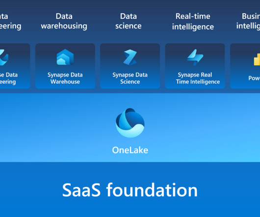
Microsoft Fabric aims to reduce unnecessary data replication, centralize storage, and create a unified environment with its unique data fabric method. Microsoft Fabric is a cutting-edge analytics platform that helps data experts and companies work together on data projects. What is Microsoft Fabric?
This blog lists down-trending data science, analytics, and engineering GitHub repositories that can help you with learning data science to build your own portfolio. What is GitHub? GitHub is a powerful platform for data scientists, data analysts, data engineers, Python and R developers, and more.
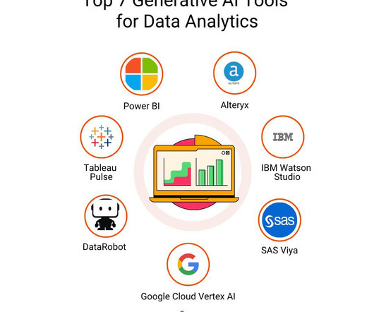
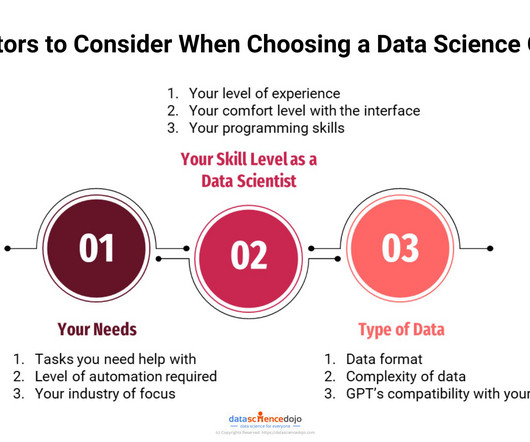
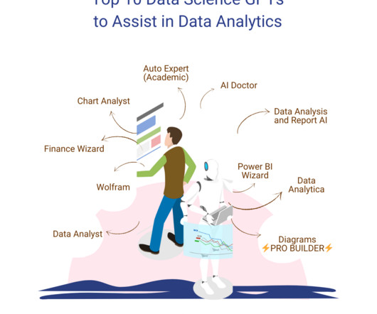
GPTs for Data science are the next step towards innovation in various data-related tasks. These are platforms that integrate the field of dataanalytics with artificial intelligence (AI) and machine learning (ML) solutions. However, our focus lies on exploring the GPTs for data science available on the platform.
Microsoft has made good on its promise to deliver a simplified and more efficient Microsoft Fabric price model for its end-to-end platform designed for analytics and data workloads. Microsoft’s unified pricing model for the Fabric suite marks a significant advancement in the analytics and data market.
Companies use Business Intelligence (BI), Data Science , and Process Mining to leverage data for better decision-making, improve operational efficiency, and gain a competitive edge. So while Process Mining can be seen as a subpart of BI while both are using Machine Learning for better analytical results.
Open source business intelligence software is a game-changer in the world of dataanalysis and decision-making. It has revolutionized the way businesses approach dataanalytics by providing cost-effective and customizable solutions that are tailored to specific business needs.
So, to provide our community with the knowledge they need to master these domains, Analytics Vidhya has launched its DataHour sessions. appeared first on Analytics Vidhya. These sessions provide not only theoretical knowledge but also cover practical demonstrations of the […].
Did you know that 53% of companies use dataanalytics technology ? Machine Learning Helps Companies Get More Value Out of Analytics. There are a lot of benefits of using analytics to help run a business. You will get even more value out of analytics if you leverage machine learning at the same time.
Summary : Microsoft Fabric is an end-to-end DataAnalytics platform designed for integration, processing, and advanced insights, while PowerBI excels in creating interactive visualisations and reports. Both tools complement each other, enabling seamless data management and visualisation. What is Microsoft Fabric?
Summary: This blog dives into the most promising PowerBI projects, exploring advanced data visualization, AI integration, IoT & blockchain analytics, and emerging technologies. Discover best practices for successful implementation and propel your organization towards data-driven success.
Summary: PowerBI alternatives like Tableau, Qlik Sense, and Zoho Analytics provide businesses with tailored DataAnalysis and Visualisation solutions. Selecting the right alternative ensures efficient data-driven decision-making and aligns with your organisation’s goals and budget. What is PowerBI?
Introduction Analytics Vidhya DataHour is designed to provide valuable insights and knowledge to individuals looking to build a career in the data-tech industry. These sessions cover a wide range of topics, from the fields of artificial intelligence, and machine learning, and various topics related to data science.
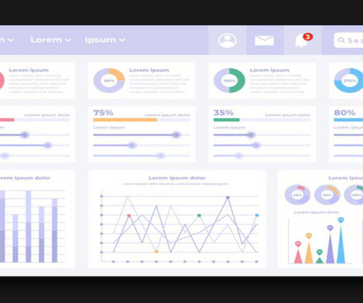
Summary: PowerBI is a business intelligence tool that transforms raw data into actionable insights. PowerBI enhances decision-making by providing interactive dashboards and reports that are accessible to both technical and non-technical users. What Is PowerBI?
Summary: PowerBI is a leading dataanalytics platform offering advanced features like real-time analytics and collaborative capabilities. Understanding its significance is vital for aspiring PowerBI developers. Optimising PowerBI reports for performance ensures efficient dataanalysis.
Summary: PowerBI is a business analytics tool transforming data into actionable insights. Key features include AI-poweredanalytics, extensive data connectivity, customisation options, and robust data modelling. Key Takeaways It transforms raw data into actionable, interactive visualisations.
Summary: Counting rows is a fundamental task in PowerBI that requires careful consideration. This blog explores how to get total number of rows in power query. Understanding PowerBI and Its Importance PowerBI is a suite of business analytics tools that allows users to analyze data and share insights.
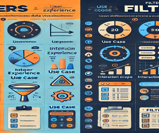
Summary: In PowerBI, slicers and filters serve distinct purposes. Slicers are visual elements that allow users to interactively filter data on the report canvas, enhancing user experience. Filters, on the other hand, are backend features that refine data at various levels—visual, page, or report—without direct user interaction.
Mito is the powerhouse of your dataanalytics workflow. We built Mito to be the first analytics tool that’s easy to use, super powerful, and designed to keep your workflow yours forever. When it comes to dataanalytics , not much is easier to use than a spreadsheet. Great Power. Or something.
The Datamarts capability opens endless possibilities for organizations to achieve their dataanalytics goals on the PowerBI platform. Before we look into the PowerBI Datamarts, let us take a step back and understand the meaning of a Datamart. in an enterprise data warehouse.
Summary: This section outlines key mistakes to avoid when creating dynamic visual displays in PowerBI. Introduction In a world where data is growing exponentially, effective visualisation is crucial. Introduction In a world where data is growing exponentially, effective visualisation is crucial.
Summary: Data Visualisation is crucial to ensure effective representation of insights tableau vs powerbi are two popular tools for this. This article compares Tableau and PowerBI, examining their features, pricing, and suitability for different organisations. What is PowerBI? billion in 2023.
Summary: This guide covers visualising KPI in PowerBI, from setting up the tool and preparing data to selecting the right visuals and enhancing dashboards. Introduction In todays data-driven world, Key Performance Indicators (KPIs) are crucial in guiding business decisions. Excel or SQL Server).
Google Releases a tool for Automated Exploratory DataAnalysis Exploring data is one of the first activities a data scientist performs after getting access to the data. This command-line tool helps to determine the properties and quality of the data as well the predictive power.
GPTs for Data science are the next step towards innovation in various data-related tasks. These are platforms that integrate the field of dataanalytics with artificial intelligence (AI) and machine learning (ML) solutions. However, our focus lies on exploring the GPTs for data science available on the platform.
Though you may encounter the terms “data science” and “dataanalytics” being used interchangeably in conversations or online, they refer to two distinctly different concepts. Meanwhile, dataanalytics is the act of examining datasets to extract value and find answers to specific questions.
We organize all of the trending information in your field so you don't have to. Join 17,000+ users and stay up to date on the latest articles your peers are reading.
You know about us, now we want to get to know you!
Let's personalize your content
Let's get even more personalized
We recognize your account from another site in our network, please click 'Send Email' below to continue with verifying your account and setting a password.


Let's personalize your content