KitikiPlot: Your New Go-To for Time-Series Data Visualization
Analytics Vidhya
DECEMBER 11, 2024
Introducing KitikiPlot, a Python library designed for visualizing sequential and time-series categorical “Sliding Window” patterns.
This site uses cookies to improve your experience. To help us insure we adhere to various privacy regulations, please select your country/region of residence. If you do not select a country, we will assume you are from the United States. Select your Cookie Settings or view our Privacy Policy and Terms of Use.
Cookies and similar technologies are used on this website for proper function of the website, for tracking performance analytics and for marketing purposes. We and some of our third-party providers may use cookie data for various purposes. Please review the cookie settings below and choose your preference.
Used for the proper function of the website
Used for monitoring website traffic and interactions
Cookies and similar technologies are used on this website for proper function of the website, for tracking performance analytics and for marketing purposes. We and some of our third-party providers may use cookie data for various purposes. Please review the cookie settings below and choose your preference.
Analytics Vidhya
DECEMBER 11, 2024
Introducing KitikiPlot, a Python library designed for visualizing sequential and time-series categorical “Sliding Window” patterns.
Analytics Vidhya
MAY 24, 2020
Overview matplotlib is a widely used Python library for performing data visualization and exploratory data analysis These 10 matplotlib tricks will enable you to. The post 10 matplotlib Tricks to Master Data Visualization in Python appeared first on Analytics Vidhya.
This site is protected by reCAPTCHA and the Google Privacy Policy and Terms of Service apply.
Analytics Vidhya
AUGUST 1, 2021
ArticleVideo Book This article was published as a part of the Data Science Blogathon Data Visualization Data Visualization techniques involve the generation of graphical or. The post Effective Data Visualization Techniques in Data Science Using Python appeared first on Analytics Vidhya.
Analytics Vidhya
JULY 26, 2021
ArticleVideo Book This article was published as a part of the Data Science Blogathon Introduction Visualization leverages the power of data in getting insights and. The post Cyberpunk Themed Charts: Advanced Data Visualization in Python appeared first on Analytics Vidhya.
Analytics Vidhya
JUNE 25, 2021
ArticleVideo Book This article was published as a part of the Data Science Blogathon Introduction Data Visualization helps to bridge the gap between numbers and. The post Plotly and cufflinks : Advanced Python Data Visualization Libraries appeared first on Analytics Vidhya.
Analytics Vidhya
MAY 20, 2024
Introduction Strong libraries like Matplotlib, Seaborn, Plotly, and Bokeh serve as the foundation of Python’s data visualization ecosystem. Together, they provide a wide range of tools for trend analysis, results presentation, and the creation of dynamic dashboards.
Analytics Vidhya
MARCH 4, 2020
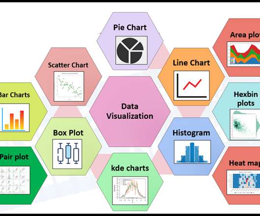
Introduction “Visualization gives you answers to questions you didn’t know you had.” ” – Ben Shneiderman My day-to-day work as a Data Scientist requires a. The post 6 Essential Data Visualization Python Libraries – Matplotlib, Seaborn, Bokeh, Altair, Plotly, GGplot appeared first on Analytics Vidhya.
Analytics Vidhya
FEBRUARY 23, 2021
ArticleVideos This article was published as a part of the Data Science Blogathon. Introduction Data visualization in python is perhaps one of the most. The post An Intuitive Guide to Data Visualization in Python appeared first on Analytics Vidhya.
Analytics Vidhya
FEBRUARY 27, 2020
matplotlib – The Most Popular Python Library for Data Visualization and Exploration I love working with matplotlib in Python. It was the first visualization. The post A Beginner’s Guide to matplotlib for Data Visualization and Exploration in Python appeared first on Analytics Vidhya.
Analytics Vidhya
JUNE 20, 2021
ArticleVideo Book This article was published as a part of the Data Science Blogathon Like the evolution of humans, data visualization techniques have also been. The post Lollipop Charts: Advanced Data Visualization in Python appeared first on Analytics Vidhya.
Analytics Vidhya
SEPTEMBER 22, 2021
This article was published as a part of the Data Science Blogathon Image 1 Introduction I am sure many of you have read several articles around the world stating the buzz around “Machine Learning, “Data Scientist”, “Data Visualization” and so on. A report […].
Analytics Vidhya
MARCH 31, 2024
Introduction Artificial Intelligence revolutionizes various fields such as networking, multi-dimensional data exploration, genomics, and sensor data analysis, increasing the demand for advanced data visualization tools.
Analytics Vidhya
JUNE 15, 2021
ArticleVideo Book This article was published as a part of the Data Science Blogathon Introduction The twenty-first century can be regarded as the era of. The post Donut Plots : Data Visualization With Python appeared first on Analytics Vidhya.
Analytics Vidhya
AUGUST 8, 2021
ArticleVideo Book This article was published as a part of the Data Science Blogathon Introduction We all love exploring data. Representing data and interpreting or. The post Understanding Bar Plots in Python : Beginner’s Guide to Data Visualization appeared first on Analytics Vidhya.
Analytics Vidhya
FEBRUARY 12, 2024
One tool that shines in Python is ggplot. This article will dive into ggplot’s features and why it’s such a valuable tool for visualizing data […] The post ggplot in Python: A Data Visualization Guide appeared first on Analytics Vidhya.
Analytics Vidhya
OCTOBER 8, 2021
This article was published as a part of the Data Science Blogathon Overview Data visualization is the process of finding, interpreting, and comparing data so that it can communicate more clearly complex ideas, thus making it easier to identify once analysis of logical patterns.
Data Science Dojo
MAY 22, 2023
Data visualization is the art of presenting complex information in a way that is easy to understand and analyze. With the explosion of data in today’s business world, the ability to create compelling data visualizations has become a critical skill for anyone working with data.
Analytics Vidhya
JULY 14, 2021
ArticleVideo Book This article was published as a part of the Data Science Blogathon Introduction: Seaborn is a Python data visualization library based on the. The post Data Visualization Using Seaborn For Beginners appeared first on Analytics Vidhya.
Analytics Vidhya
JUNE 6, 2021
ArticleVideo Book This article was published as a part of the Data Science Blogathon Introduction In applied Statistics and Machine Learning, Data Visualization is one. The post Must Known Data Visualization Techniques for Data Science appeared first on Analytics Vidhya.
Analytics Vidhya
NOVEMBER 18, 2021
Introduction to Sankey Diagram for Data Visualization Very often, we are in a situation where we would have to visualize how data flows between entities. The post Here’s How to use Sankey Diagrams for Data Visualization appeared first on Analytics Vidhya.
Analytics Vidhya
SEPTEMBER 11, 2022
This article was published as a part of the Data Science Blogathon. Introduction Data visualization is the skill that helps us to interpret the data in a creative and intrusive way. Suppose we break down more aspects of data visualization.
Analytics Vidhya
AUGUST 9, 2021
ArticleVideo Book This article was published as a part of the Data Science Blogathon Introduction Matplotlib is a widely used library for data visualizations. The post Exploring Matplotlib Stylesheets For Data Visualization appeared first on Analytics Vidhya. Matplotlib.
Analytics Vidhya
AUGUST 1, 2021
ArticleVideo Book This article was published as a part of the Data Science Blogathon DATA VISUALIZATION: Data Visualization is one of the parts of descriptive. The post DATA VISUALIZATION : What Is This And Why It Matters appeared first on Analytics Vidhya.
Analytics Vidhya
OCTOBER 12, 2020
This article was published as a part of the Data Science Blogathon. Introduction I have always been in love with Data Visualization since the. The post Create a Word Cloud or Tag Cloud in Python appeared first on Analytics Vidhya.
Analytics Vidhya
JULY 10, 2021
ArticleVideo Book This article was published as a part of the Data Science Blogathon Introduction Data visualization is the most important step in the life. The post How To Perform Data Visualization with Pandas appeared first on Analytics Vidhya.
Analytics Vidhya
NOVEMBER 2, 2021
Introduction to Matplotlib Matplotlib is a widely used data visualization library in python. The post Plotting Images Using Matplotlib Library in Python appeared first on Analytics Vidhya. This article illustrates how to display, modify and save an image using the ‘matplotlib’ library.
Analytics Vidhya
OCTOBER 17, 2021
This article was published as a part of the Data Science Blogathon Introduction to Matplotlib If you are interested in data analytics or data visualization you are at the right place to get started. The post Introduction to Matplotlib using Python for Beginners appeared first on Analytics Vidhya.
Analytics Vidhya
APRIL 4, 2022
We have worked on different data visualization libraries over the last decade. Data visualization is the way to tell stories by curating data into a more simple plot and helps us understand and highlight the key trends in our data. Introduction A sound data […].
Analytics Vidhya
APRIL 27, 2022
Introduction Data visualization is crucial in Data Analytics. With exploratory data analysis (EDA), we gain insights into the hidden trends and patterns in a dataset that are useful for decision-making. Several popular open-source Python libraries like Matplotlib, seaborn, Altair, Bokeh, Plotly, etc.
Analytics Vidhya
OCTOBER 21, 2021
With the amount of data at our disposal today, the need to extract insights from it is […]. The post 10 Ideas that every Professional should avoid for Data Visualization appeared first on Analytics Vidhya.
Analytics Vidhya
AUGUST 5, 2021
ArticleVideo Book This article was published as a part of the Data Science Blogathon Introduction Human beings are amongst the most creative species on this. The post 8 Charts You Must Know To Excel In The Art of Data Visualization! appeared first on Analytics Vidhya.
Analytics Vidhya
MAY 30, 2024
Introduction Python is the favorite language for most data engineers due to its adaptability and abundance of libraries for various tasks such as manipulation, machine learning, and data visualization. This post looks at the top 9 Python libraries necessary for data engineers to have successful careers.
Analytics Vidhya
AUGUST 27, 2021
This article was published as a part of the Data Science Blogathon Introduction Dash is an open-source web framework for creating analytical dashboards and data visualizations. It helps data analysts to deploy dashboards and serve these dashboards to the main web application. appeared first on Analytics Vidhya.
Analytics Vidhya
JULY 23, 2021
ArticleVideo Book This article was published as a part of the Data Science Blogathon Introduction Data is everywhere in today’s world of data, and we. The post Interactive Data Visualization Plots with Plotly and Cufflinks appeared first on Analytics Vidhya.
Analytics Vidhya
FEBRUARY 15, 2024
Introduction A bubble chart is a type of data visualization that displays data points as bubbles on a two-dimensional graph. Each bubble represents a data point, and its size and color can be used to convey additional information.
Analytics Vidhya
FEBRUARY 27, 2024
Introduction Matplotlib is a fundamental Python library, empowers you to create various visualizations to explore and communicate your data effectively. While basic plots like bar charts and scatter plots are essential, delving into advanced visualizations can unlock deeper insights and enhance your storytelling.
Analytics Vidhya
FEBRUARY 19, 2025
Python has become the lingua franca for scientific computing and data visualization, thanks in large part to its rich ecosystem of libraries. One such tool that has been a favourite among researchers and practitioners alike is PyLab.
Analytics Vidhya
JULY 20, 2021
ArticleVideo Book This article was published as a part of the Data Science Blogathon. Image Source Introduction We can say that data visualization is basically. The post Visualizing Netflix Data Using Python! appeared first on Analytics Vidhya.
Analytics Vidhya
FEBRUARY 8, 2024
Introduction Matplotlib.pyplot.subplots() is a powerful function in Python that allows users to create a grid of subplots within a single figure. This function is a part of the Matplotlib library, which is widely used for data visualization in Python.
Analytics Vidhya
JUNE 24, 2024
Introduction Pydeck is a Python library that is by far the most powerful tool for creating an interactive map using Python. It works seamlessly with the PyData stack and Pandas, making it an easy-to-use option for plotting geospatial data.
KDnuggets
MARCH 22, 2023
Our latest cheat sheet is a handy reference for Plotly Express, a high-level data visualization library in Python built on top of Plotly.
Analytics Vidhya
DECEMBER 15, 2020
This article was published as a part of the Data Science Blogathon. INTRODUCTION The purpose of data visualization is insight, not pictures ?Ben The post Exploring the Tale of Music Through Data Visualization appeared first on Analytics Vidhya. Ben Shneiderman.
Analytics Vidhya
MAY 7, 2022
Introduction on Data Visualization Data Visualization is an interdisciplinary discipline concerned with the visual depiction of data. When the data is large, such as in a time series, it is a very effective manner of communicating.
Analytics Vidhya
JULY 8, 2021
ArticleVideo Book This article was published as a part of the Data Science Blogathon Data visualization and its importance Let’s see what does technical definition. The post Data Visualization – A Useful tool to Explore Data appeared first on Analytics Vidhya.
Expert insights. Personalized for you.
We have resent the email to
Are you sure you want to cancel your subscriptions?
Let's personalize your content