This site uses cookies to improve your experience. To help us insure we adhere to various privacy regulations, please select your country/region of residence. If you do not select a country, we will assume you are from the United States. Select your Cookie Settings or view our Privacy Policy and Terms of Use.
Cookie Settings
Cookies and similar technologies are used on this website for proper function of the website, for tracking performance analytics and for marketing purposes. We and some of our third-party providers may use cookie data for various purposes. Please review the cookie settings below and choose your preference.
Used for the proper function of the website
Used for monitoring website traffic and interactions
Cookie Settings
Cookies and similar technologies are used on this website for proper function of the website, for tracking performance analytics and for marketing purposes. We and some of our third-party providers may use cookie data for various purposes. Please review the cookie settings below and choose your preference.
Strictly Necessary: Used for the proper function of the website
Performance/Analytics: Used for monitoring website traffic and interactions
Data is an essential component of any business, and it is the role of a data analyst to make sense of it all. PowerBI is a powerfuldatavisualization tool that helps them turn raw data into meaningful insights and actionable decisions.
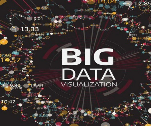
Summary: Big Datavisualization involves representing large datasets graphically to reveal patterns, trends, and insights that are not easily discernible from raw data. quintillion bytes of data daily, the need for effective visualization techniques has never been greater. As we generate approximately 2.5
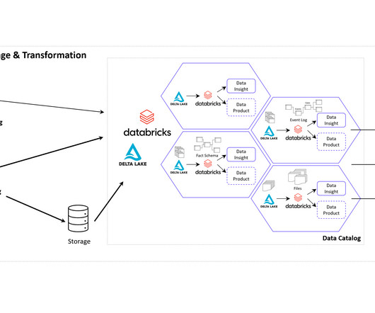
It could be a curated dataset, a machine learning model, an API that exposes data, a real-time data stream, a datavisualization dashboard, or any other data-related asset that provides value to the organization. One of this aspect is the cloud architecture for the realization of Data Mesh.
With this full-fledged solution, you don’t have to spend all your time and effort combining different services or duplicating data. OneLake, being built on AzureData Lake Storage (ADLS), supports various data formats, including Delta, Parquet, CSV, and JSON. Choose a visual of interest.
How to Optimize PowerBI and Snowflake for Advanced Analytics Spencer Baucke May 25, 2023 The world of business intelligence and data modernization has never been more competitive than it is today. Table of Contents Why Discuss Snowflake & PowerBI?
Their role is crucial in understanding the underlying data structures and how to leverage them for insights. Key Skills Proficiency in SQL is essential, along with experience in datavisualization tools such as Tableau or PowerBI.
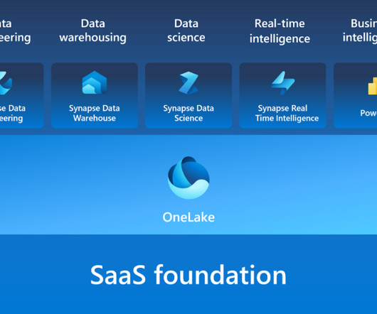
Microsoft Fabric combines multiple elements into a single platform – Image courtesy of Microsoft The contribution of PowerBI The integration of Microsoft PowerBI and Microsoft Fabric offers a powerful combination for organizations seeking comprehensive data analytics and insights.
Summary: This blog dives into the most promising PowerBI projects, exploring advanced datavisualization, AI integration, IoT & blockchain analytics, and emerging technologies. Discover best practices for successful implementation and propel your organization towards data-driven success.
Driving a data culture is now a lot more — well, driven — thanks to the latest of Alation’s 80+ connectors : PowerBI Scanner, which unifies self-service and enterprise analytics and allows users to find answers fast with industry-leading AI. What Is the Significance of the Alation & PowerBI Partnership?
PowerBI is a user-friendly and powerfuldatavisualization tool that enables individuals to easily create interactive reports and dashboards as well as centralized datasets. Table data is filtered by using Power Query date/time parameters with the reserved, case-sensitive names RangeStart and RangeEnd.
Data Storytelling in Action: This panel will discuss the importance of datavisualization in storytelling in different industries, different visualization tools, tips on improving one’s visualization skills, personal experiences, breakthroughs, pressures, and frustrations as well as successes and failures.
Data scientists try multiple models, evaluate their performance, and fine-tune some parameters to get better accuracy. DataVisualization and Interpretation To make the data understandable to stakeholders, visualizations are created in the form of charts, graphs, and dashboards.
Summary: This blog provides a comprehensive roadmap for aspiring AzureData Scientists, outlining the essential skills, certifications, and steps to build a successful career in Data Science using Microsoft Azure. What is Azure?
Introduction The world of software development is ever-evolving, and with the increasing demand for powerful and easy-to-use solutions, low-code development platforms have emerged as game-changers. Microsoft’s Power Platform Copilot is one such cutting-edge platform that aims to transform how we approach software development.
Data science bootcamps are intensive short-term educational programs designed to equip individuals with the skills needed to enter or advance in the field of data science. They cover a wide range of topics, ranging from Python, R, and statistics to machine learning and datavisualization.
Key Tools and Techniques Business Analytics employs various tools and techniques to process and interpret data effectively. Dashboards, such as those built using Tableau or PowerBI , provide real-time visualizations that help track key performance indicators (KPIs). Data Scientists require a robust technical foundation.
There is a plethora of BI tools available in the market today, with new ones being added yearly. Through a comparative analysis of some of the leading BI tools: Google Looker, Microsoft PowerBI, Tableau and Qlik Sense, discover which BI solution best fits your organization’s data analytics needs to empower informed decision-making.
Cloud-Based Orchestration Tools While open-source tools are powerful, cloud-based orchestration services like AWS Glue, AzureData Factory, and Google Cloud Dataflow offer managed solutions that reduce the burden of infrastructure management.
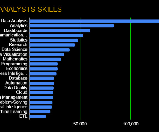
As you’ll see below, however, a growing number of data analytics platforms, skills, and frameworks have altered the traditional view of what a data analyst is. Data Presentation: Communication Skills, DataVisualization Any good data analyst can go beyond just number crunching.
Responsibilities of a Data Analyst Data analysts, on the other hand, help businesses and organizations make data-driven decisions through their analytical skills. Their job is mainly to collect, process, analyze, and create detailed reports on data to meet business needs. Basic programming knowledge in R or Python.
This allows for it to be integrated with many different tools and technologies to improve data management and analysis workflows. One set of tools that are becoming more important in our data-driven world is BI tools. Think of Tableau, PowerBI, and QlikView. Finally, cloud services.
Some of the key tools used for data visualisation include: Tableau Tableau is a data visualisation tool that allows researchers to create interactive dashboards and reports. It is useful for visualising complex data and identifying patterns and trends. It is useful for storing and processing large datasets.
Proficient in programming languages like Python or R, data manipulation libraries like Pandas, and machine learning frameworks like TensorFlow and Scikit-learn, data scientists uncover patterns and trends through statistical analysis and datavisualization. DataVisualization: Matplotlib, Seaborn, Tableau, etc.
Understanding real-time data processing frameworks, such as Apache Kafka, will also enhance your ability to handle dynamic analytics. Master DataVisualization Techniques Datavisualization is key to effectively communicating insights. Additionally, familiarity with cloud platforms (e.g.,
Tableau/PowerBI: Visualization tools for creating interactive and informative datavisualizations. Hadoop/Spark: Frameworks for distributed storage and processing of big data. Cloud Platforms (AWS, Azure, Google Cloud): Infrastructure for scalable and cost-effective data storage and analysis.
DataVisualizationData scientists may be expected to know some basic datavisualization to help tell a story with their data and algorithms. Luckily, nothing too complicated is needed, as Tableau is user-friendly while matplotlib is the popular Python library for datavisualization.
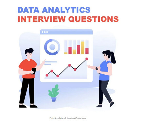
This comprehensive blog outlines vital aspects of Data Analyst interviews, offering insights into technical, behavioural, and industry-specific questions. It covers essential topics such as SQL queries, datavisualization, statistical analysis, machine learning concepts, and data manipulation techniques.
AI tools can help you with various aspects of presentation design, such as content generation, slide layout, datavisualization, speech synthesis, and more. Azure AI enables businesses to build, deploy, and manage AI applications at scale, using pre-built models or custom ones.
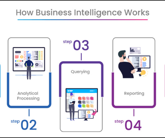
Apache Airflow Apache Airflow is a workflow automation tool that allows data engineers to schedule, monitor, and manage data pipelines efficiently. It helps streamline data processing tasks and ensures reliable execution. It helps organisations understand their data better and make informed decisions.
We organize all of the trending information in your field so you don't have to. Join 17,000+ users and stay up to date on the latest articles your peers are reading.
You know about us, now we want to get to know you!
Let's personalize your content
Let's get even more personalized
We recognize your account from another site in our network, please click 'Send Email' below to continue with verifying your account and setting a password.


Let's personalize your content