This site uses cookies to improve your experience. To help us insure we adhere to various privacy regulations, please select your country/region of residence. If you do not select a country, we will assume you are from the United States. Select your Cookie Settings or view our Privacy Policy and Terms of Use.
Cookie Settings
Cookies and similar technologies are used on this website for proper function of the website, for tracking performance analytics and for marketing purposes. We and some of our third-party providers may use cookie data for various purposes. Please review the cookie settings below and choose your preference.
Used for the proper function of the website
Used for monitoring website traffic and interactions
Cookie Settings
Cookies and similar technologies are used on this website for proper function of the website, for tracking performance analytics and for marketing purposes. We and some of our third-party providers may use cookie data for various purposes. Please review the cookie settings below and choose your preference.
Strictly Necessary: Used for the proper function of the website
Performance/Analytics: Used for monitoring website traffic and interactions
Dataanalysis is an essential process in today’s world of business and science. It involves extracting insights from large sets of data to make informed decisions. One of the most common ways to represent a dataanalysis is through code. However, is code the best way to represent a dataanalysis?
Unlock the potential of your data with Databricks' AI/BI Genie spaces! This blog post explores how to create a Genie space using a World of Warcraft dataset, enabling users to interactively query data and gain insights like a data analyst.
Data is an essential component of any business, and it is the role of a data analyst to make sense of it all. PowerBI is a powerfuldata visualization tool that helps them turn raw data into meaningful insights and actionable decisions. How does a data analyst use PowerBI?
This blog lists down-trending data science, analytics, and engineering GitHub repositories that can help you with learning data science to build your own portfolio. What is GitHub? GitHub is a powerful platform for data scientists, data analysts, data engineers, Python and R developers, and more.
Summary : Microsoft Fabric is an end-to-end Data Analytics platform designed for integration, processing, and advanced insights, while PowerBI excels in creating interactive visualisations and reports. Both tools complement each other, enabling seamless data management and visualisation. What is PowerBI?
Summary: Counting rows is a fundamental task in PowerBI that requires careful consideration. This blog explores how to get total number of rows in power query. Understanding PowerBI and Its Importance PowerBI is a suite of business analytics tools that allows users to analyze data and share insights.
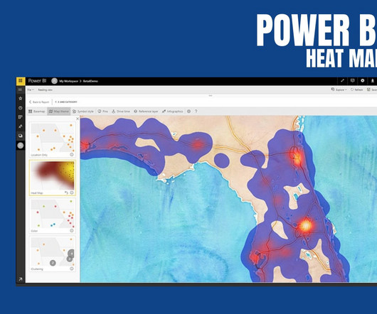
PowerBI Heatmap: Heatmap in PowerBI refers to the type of custom visualisation that businesses analysts utilise for showcasing the relationship between two variables on a map in different colour patches. It offers a wide range of features that make it a popular choice for data professionals, analysts, and organizations.
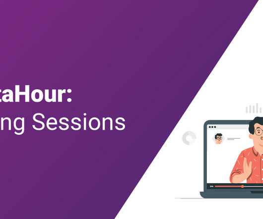
Introduction Analytics Vidhya DataHour is designed to provide valuable insights and knowledge to individuals looking to build a career in the data-tech industry. These sessions cover a wide range of topics, from the fields of artificial intelligence, and machine learning, and various topics related to data science.
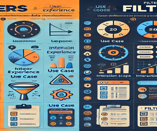
Summary: In PowerBI, slicers and filters serve distinct purposes. Slicers are visual elements that allow users to interactively filter data on the report canvas, enhancing user experience. Filters, on the other hand, are backend features that refine data at various levels—visual, page, or report—without direct user interaction.
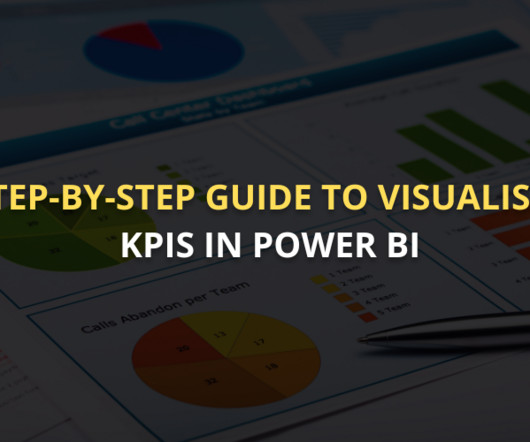
Summary: This guide covers visualising KPI in PowerBI, from setting up the tool and preparing data to selecting the right visuals and enhancing dashboards. Introduction In todays data-driven world, Key Performance Indicators (KPIs) are crucial in guiding business decisions. Excel or SQL Server).
Summary: This section outlines key mistakes to avoid when creating dynamic visual displays in PowerBI. Introduction In a world where data is growing exponentially, effective visualisation is crucial. Introduction In a world where data is growing exponentially, effective visualisation is crucial.
Being able to view or slice data based on date and time fields is undoubtedly one of the more frequent use cases that any PowerBI developer will come across. Usually, this request is to view data based on specific dates, months, and years. Let’s walk through the blog and explore the step-by-step process.
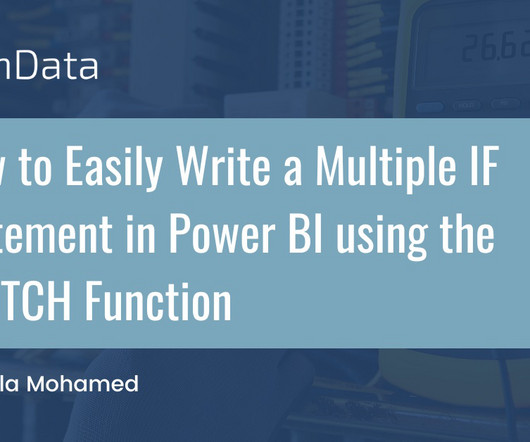
PowerBI is a versatile and scalable platform that combines self-service and enterprise business intelligence (BI) capabilities. It serves as a comprehensive solution for connecting to diverse data sources and creating compelling visualizations. What is the SWITCH Function?
For data scrapping a variety of sources, such as online databases, sensor data, or social media. Cleaning data: Once the data has been gathered, it needs to be cleaned. This involves removing any errors or inconsistencies in the data.
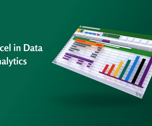
Accordingly, Data Analysts use various tools for DataAnalysis and Excel is one of the most common. Significantly, the use of Excel in DataAnalysis is beneficial in keeping records of data over time and enabling data visualization effectively. Let’s find out in the blog! What is DataAnalysis?
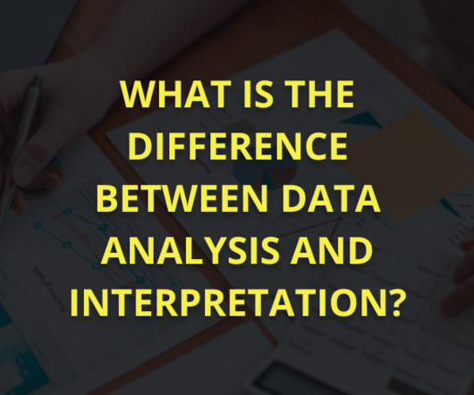
Summary: DataAnalysis and interpretation work together to extract insights from raw data. Analysis finds patterns, while interpretation explains their meaning in real life. Overcoming challenges like data quality and bias improves accuracy, helping businesses and researchers make data-driven choices with confidence.
To get participants started, we published a blog post outlining some commonly used open Earth observation datasets. QGIS, Microsoft's PowerBI, Tableau, and Jupyter notebooks also facilitated many interesting visualizations, particularly for solvers with less programming experience.
A Data Analyst certification builds credibility, validates expertise, and opens doors to advanced career opportunities. This blog explores top certifications, factors to consider when choosing one, and future trends, helping aspiring and experienced analysts navigate their professional growth effectively.
The lower part of the iceberg is barely visible to the normal analyst on the tool interface, but is essential for implementation and success: this is the Event Log as the data basis for graph and dataanalysis in Process Mining. The creation of this data model requires the data connection to the source system (e.g.
By analyzing the sentiment of users towards certain products, services, or topics, sentiment analysis provides valuable insights that empower businesses and organizations to make informed decisions, gauge public opinion, and improve customer experiences. It ensures that the data used in analysis or modeling is comprehensive and comprehensive.
Summary: Conditional formatting in PowerBI transforms data visualisation by dynamically adjusting visual elements based on data values. Introduction Microsoft PowerBI has a 15.62% market share in data visualisation, making it a leading tool for transforming data into actionable insights.
In modern organizations, the significance of the Business Analyst role lies in their ability to interpret data. This blog aims to equip you with the core questions often asked during interviews. Data visualization tools like Tableau and PowerBI can be applied to inform decisions. Who Is a Business Analyst?
DataAnalysis is the process of collecting, cleaning, transforming, and modeling data to extract useful information and insights. In today’s data-driven world, dataanalysis has become an essential skill for organizations across industries to make informed decisions and improve business outcomes.
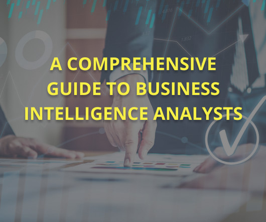
Business Intelligence Analysts are the skilled artisans who transform this raw data into valuable insights, empowering organizations to make strategic decisions and stay ahead of the curve. Key Takeaways BI Analysts convert data into actionable insights for strategic business decisions. Ensuring data integrity and security.
Advanced data visualization techniques are necessary to unlock deeper insights and reveal hidden patterns within the data. In this blog post, we’ll explore some of these advanced techniques and how they can be used to enhance analytical capabilities. Tools like Tableau, PowerBI, and D3.js
Advancements in data processing, storage, and analysis technologies power this transformation. In Data Science in a Cloud World, we explore how cloud computing has revolutionised Data Science. Each platform caters to specific requirements, ensuring flexibility and scalability.
According to a report by Gartner, organizations that utilize BI tools can improve their operational efficiency and gain competitive advantages over rivals. Furthermore, a study indicated that 71% of organisations consider Data Analytics a critical factor for enhancing their business performance.
In this blog, we will explore the arena of data science bootcamps and lay down a guide for you to choose the best data science bootcamp. What do Data Science Bootcamps Offer? R : Often used for statistical analysis and data visualization.
Overview: Data science vs data analytics Think of data science as the overarching umbrella that covers a wide range of tasks performed to find patterns in large datasets, structure data for use, train machine learning models and develop artificial intelligence (AI) applications.
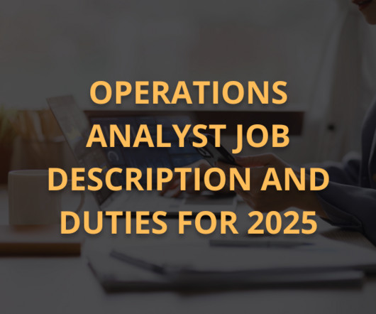
Summary: Operations Analyst job in 2025 are integral to improving efficiency, dataanalysis, and process optimisation. With career growth opportunities and a focus on data-driven decisions, this job remains central to organisational success. Expertise in tools like PowerBI, SQL, and Python is crucial.
It is expected that the Data Science market will have more than 11 million job roles in India by 2030, opening up opportunities for you. However, as a Data Analyst aspirant, you may be wondering how to shape or build your Data Analyst Portfolio so that you’re visible to the employers. How to build a Data Analyst Portfolio?
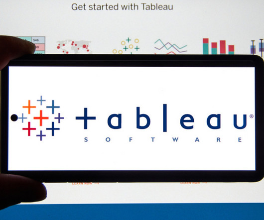
Tableau can help Data Scientists generate graphs, charts, maps and data-driven stories, etc for purpose of visualisation and analysing data. But What is Tableau for Data Science and what are its advantages and disadvantages? Let’s read the blog to find out! How Professionals Can Use Tableau for Data Science?
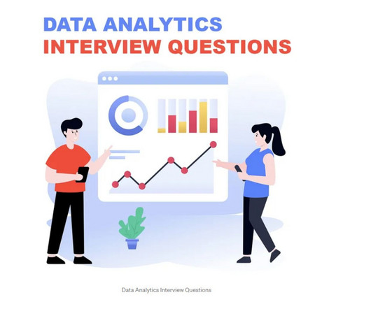
This comprehensive blog outlines vital aspects of Data Analyst interviews, offering insights into technical, behavioural, and industry-specific questions. It covers essential topics such as SQL queries, data visualization, statistical analysis, machine learning concepts, and data manipulation techniques.
I find that R markdown is most useful for making reports or documents with your analysis. The most common ways to create a written report with dataanalysis notebooks are: 1. Python, R, SQL) code analysis in jupyter notebook, using Markdown notation — File —Download as (pdf, html, docx, etc) document 2. R markdown (.rmd)
As industries rely more on data to inform strategies, these roles have become indispensable for analysing trends, improving operations, and fostering growth. While both roles contribute significantly to decision-making, they do so in distinct ways, catering to different aspects of business and data management. Tableau, PowerBI).
It involves using data to determine optimal pricing strategies that align with customer behaviour, market trends, and competitive dynamics. As businesses increasingly rely on data-driven decision-making, embracing Pricing Analytics can provide a significant edge. Skilled personnel are necessary for accurate DataAnalysis.
Summary: Operations Analysts play a crucial role in enhancing organisational efficiency by analysing processes, implementing improvements, and leveraging data-driven insights. This blog explores their responsibilities, challenges, and career advancement opportunities in detail.
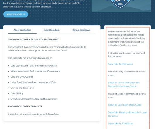
While learning Snowflake presents its challenges, the benefits for any data professional are immense. In this blog, I’ll guide you towards success in your Snowflake learning journey. Snowflake’s SnowPro Advanced Certifications assess advanced Snowflake knowledge and skills relating to five data science roles.
Introduction Bioinformatics is a rapidly evolving field that combines computer science, statistics, and biology to manage and analyse biological data. Familiarise yourself with dataanalysis tools such as RStudio, Jupyter Notebook, and Excel. It is useful for visualising complex data and identifying patterns and trends.
These courses introduce you to Python, Statistics, and Machine Learning , all essential to Data Science. Starting with these basics enables a smoother transition to more specialised topics, such as Data Visualisation, Big DataAnalysis , and Artificial Intelligence. Prestigious Background : Offered by Harvard University.
Thus, if you want to transition to a career in Data Science, you should enrol yourself in a Data Science Job Guarantee Course. Accordingly, the most common question that hence, arises is- What are the best sites for learning Data Science Job Guarantee Course? The blog will answer your question.
Here are steps you can follow to pursue a career as a BI Developer: Acquire a solid foundation in data and analytics: Start by building a strong understanding of data concepts, relational databases, SQL (Structured Query Language), and data modeling.
At the core of Data Science lies the art of transforming raw data into actionable information that can guide strategic decisions. Role of Data Scientists Data Scientists are the architects of dataanalysis. They clean and preprocess the data to remove inconsistencies and ensure its quality.
Summary: This blog provides a comprehensive roadmap for aspiring Azure Data Scientists, outlining the essential skills, certifications, and steps to build a successful career in Data Science using Microsoft Azure. Leveraging these tools, Data Scientists can efficiently build, deploy, and manage Machine Learning models at scale.
We organize all of the trending information in your field so you don't have to. Join 17,000+ users and stay up to date on the latest articles your peers are reading.
You know about us, now we want to get to know you!
Let's personalize your content
Let's get even more personalized
We recognize your account from another site in our network, please click 'Send Email' below to continue with verifying your account and setting a password.


Let's personalize your content