This site uses cookies to improve your experience. To help us insure we adhere to various privacy regulations, please select your country/region of residence. If you do not select a country, we will assume you are from the United States. Select your Cookie Settings or view our Privacy Policy and Terms of Use.
Cookie Settings
Cookies and similar technologies are used on this website for proper function of the website, for tracking performance analytics and for marketing purposes. We and some of our third-party providers may use cookie data for various purposes. Please review the cookie settings below and choose your preference.
Used for the proper function of the website
Used for monitoring website traffic and interactions
Cookie Settings
Cookies and similar technologies are used on this website for proper function of the website, for tracking performance analytics and for marketing purposes. We and some of our third-party providers may use cookie data for various purposes. Please review the cookie settings below and choose your preference.
Strictly Necessary: Used for the proper function of the website
Performance/Analytics: Used for monitoring website traffic and interactions
Unlock the full potential of your data with the power of datavisualization! Go through this blog and discover why visualizations are crucial in Data Science and explore the most effective and game-changing types of visualizations that will revolutionize the way you interpret and extract insights from your data.
In fact, 90% of the worlds data has been created in just the past two years, underscoring the rapid pace of data generation. However, the explosion of data has […] The post Mastering DataVisualizations for Better Understanding appeared first on DATAVERSITY.
This article was published as a part of the Data Science Blogathon Image 1In this blog, We are going to talk about some of the advanced and most used charts in Plotly while doing analysis. All you need to know is Plotly for visualization!
Datavisualization has become a major part of life for those looking to make use of the large swathes of data available in the modern world. As important as this data is, understanding and making use of that data is even more important. That’s where datavisualization comes in. Images add to your SEO.
It’s a versatile tool used in various applications, from scientific computing to data analysis and datavisualization. In this blog, we’ll explore the ins and outs of numpy.linspace() and how you […] The post What is numpy.linspace() in Python? appeared first on Analytics Vidhya.
In this blog, we will explore the top 7 blogs of 2023 that have been instrumental in disseminating detailed and updated information in these dynamic fields. These blogs stand out not just for their depth of content but also for their ability to make complex topics accessible to a broader audience.
There is no disputing the fact that the collection and analysis of massive amounts of unstructured data has been a huge breakthrough. This is something that you can learn more about in just about any technology blog. We would like to talk about datavisualization and its role in the big data movement.
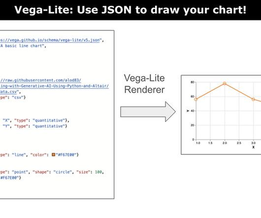
A tutorial on how to start using Vega-Lite to draw charts.Image by Author Vega-lite is a concise JSON representation of a Vega visualization. Vega is a visualization grammar used to represent the elements of a datavisualization chart. However,… Read the full blog for free on Medium. For those who know D3.js,
Source: Stephen Wolfram Writings Generate visualizations: You can ask ChatGPT to generate a plot of a function or to create a map of a specific region. Data manipulation: You can use the plugin to perform data cleaning, transformation, and feature engineering tasks. Source: Datacamp 4.
My methods of using GPT-4 to optimize my datavisual workflow For the past 6 months, I have been a heavy daily GPT-4 user. I know it makes me sound like an addict, but I have found many good reasons and many excellent use cases where this tool is an invaluable resource for improving my data workflow.
Can it do decent quantitative analysis from a datavisualization? For me, one of the most useful GPT-4 tools is the ability to analyze and interpret image data. But how good it this tool now with charting data and with map images? GPT-4o also provides overview of the range,… Read the full blog for free on Medium.
Can it do decent quantitative analysis from a datavisualization? For me, one of the most useful GPT-4 tools is the ability to analyze and interpret image data. But how good it this tool now with charting data and with map images? GPT-4o also provides overview of the range,… Read the full blog for free on Medium.
This maxim is often stated by datavisualization experts, but often ignored by practitioners. The post Datavisualization tip: Plot rates, not counts appeared first on SAS Blogs. The post Datavisualization tip: Plot rates, not counts appeared first on SAS Blogs.
Combine this with Python Plotly for your datavisualizations and youve got beautiful maps and charts that can be animated with Streamlit tools. The UNHCR refugee dataset contains recently updated data on global displacement. Join thousands of data leaders on the AI newsletter. From research to projects and ideas.
Learn about 33 tools to visualizedata with this blog In this blog post, we will delve into some of the most important plots and concepts that are indispensable for any data scientist. 9 Data Science Plots – Data Science Dojo 1.
A case study example with UN population projection data The GPT-4 Python Code Interpreter, is turning heads in the world of data science for its ability to instantly generate datavisualization code AND display the results. How does it… Read the full blog for free on Medium.
While it has always been a data-intensive process, enterprise fraud management today is more complex and more important than ever. This blog post explores the evolving role of enterprise fraud management, examines the impact of AI and showcases the importance of visualdata analysis. What is enterprise fraud management?
Introduction Data Science is everywhere in the 21st century and has emerged as an innovative field. But what exactly is Data Science? This blog post aims to answer these questions and more. And why should one consider specializing in it?
From the latest developments to guiding people through the thorns of career, Analytics Vidhya has it all in its blog archives. The post Top Data Science Guest Authors of 2021 appeared first on Analytics Vidhya. And this would not have been possible without leveraging the power of the […].
Here, I use a practical, real example to walk you through the process of using GPT-4 to scrape renewable energy data from a web page, and then to visualize it with charts and maps. Join thousands of data leaders on the AI newsletter. Let’s get to it! From research to projects and ideas.
ArticleVideo Book This article was published as a part of the Data Science Blogathon Let us see a short intro about this blog, Descriptive Statistics. The post Descriptive statistics | A Beginners Guide! appeared first on Analytics Vidhya.
Introduction Data Science and Artificial Intelligence (AI) are two of the most rapidly growing and exciting technological fields today. Both disciplines are revolutionizing how we process, analyze, and make sense of data to solve complex problems and make informed decisions.
With its advanced natural language processing capabilities, ChatGPT can uncover hidden patterns and trends in your data that you never thought possible. In this blog post, we’ll explore how ChatGPT can revolutionize your data with […] The post Analyzing Data Made Effortless Using ChatGPT appeared first on Analytics Vidhya.
Prompting GPT-4 for multi-visual interactive dashboard creation This member-only story is on us. As a comp sci professor, over the past year, I have heavily integrated GPT-4o into my datavisual creation workflow. Were using a very simple dataset for the sake of… Read the full blog for free on Medium.
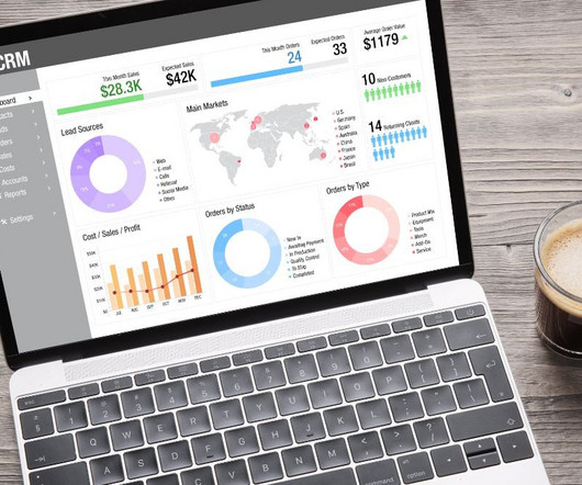
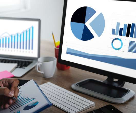
Data is an essential component of any business, and it is the role of a data analyst to make sense of it all. Power BI is a powerful datavisualization tool that helps them turn raw data into meaningful insights and actionable decisions. Learn Power BI with this crash course in no time!
According to Forbes, Almost eighty-thousand scientific studies attest that visual images promote retention. Research has shown that many people learn best when they see a story or information depicted in an image.
Introduction Scatter plots are a powerful tool in a data scientist’s arsenal, allowing us to visualize the relationship between two variables. This blog will explore the ins and outs of creating stunning scatter Plot Visualization in Python using matplotlib.
ArticleVideo Book This article was published as a part of the Data Science Blogathon This Blog deals with the problem of flight price prediction. The post Flight Price Prediction -A Regression Analysis using Lazy Prediction appeared first on Analytics Vidhya.
In 2024, I wrote about 80 articles for The DO Loop blog. My most popular articles were about SAS programming, datavisualization, and statistics. The post Top 10 posts from <em>The DO Loop</em> in 2024 appeared first on SAS Blogs. SAS Programming The following [.]
Introduction As a data scientist, you have the power to revolutionize the real estate industry by developing models that can accurately predict house prices. This blog post will teach you how to build a real estate price prediction model from start to finish.
Introduction Welcome to our comprehensive data analysis blog that delves deep into the world of Netflix. Netflix’s Global Reach Netflix […] The post Netflix Case Study (EDA): Unveiling Data-Driven Strategies for Streaming appeared first on Analytics Vidhya.
Introduction DreamFusion, the revolutionary AI-driven technology capable of converting text into 3D visuals using 2D diffusion techniques, has recently been honored with the prestigious Best Paper Award at ICLR-2023.
Big data is conventionally understood in terms of its scale. This one-dimensional approach, however, runs the risk of simplifying the complexity of big data. In this blog, we discuss the 10 Vs as metrics to gauge the complexity of big data.
Introduction Analytics Vidhya DataHour is designed to provide valuable insights and knowledge to individuals looking to build a career in the data-tech industry. These sessions cover a wide range of topics, from the fields of artificial intelligence, and machine learning, and various topics related to data science.
In this blog post, we are going to share the top 10 YouTube videos for learning about LLMs. In this video, you will learn how to use ChatGPT to perform common data analysis tasks, such as data cleaning, data exploration, and datavisualization.
In this blog post, we will discuss how the Power Platform Copilot […] The post Microsoft Power Platform Copilot: The Dawn of a New Era in Low-Code Development appeared first on Analytics Vidhya. Microsoft’s Power Platform Copilot is one such cutting-edge platform that aims to transform how we approach software development.
It involves extracting insights from large sets of data to make informed decisions. One of the most common ways to represent a data analysis is through code. However, is code the best way to represent a data analysis? With it, analysts have the flexibility to adjust the analysis as needed to fit specific requirements.
In this blog post, we will explore some of the essential research tools that every researcher should have in their toolkit. From data collection to data analysis and presentation, this blog will cover it all. Excel – Excel is spreadsheet software used for organizing, analyzing, and presenting data.
This blog lists down-trending data science, analytics, and engineering GitHub repositories that can help you with learning data science to build your own portfolio. What is GitHub? GitHub is a powerful platform for data scientists, data analysts, data engineers, Python and R developers, and more.
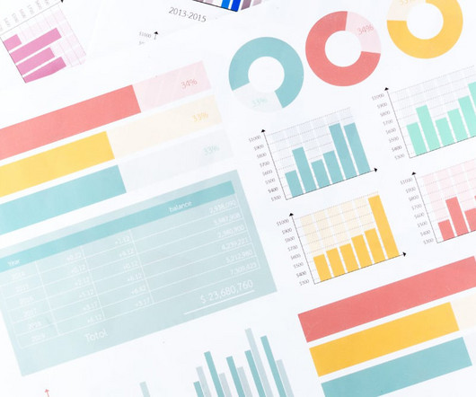
Summary: Datavisualization is essential for interpreting complex information. This article covers various types of datavisualization, such as bar charts, line graphs, and heat maps. This blog will explore various types of datavisualization, their unique features, and when to use them.
We can see by the observation that if we… Read the full blog for free on Medium. Join thousands of data leaders on the AI newsletter. Now if we want to do a choropleth map to show each country over time (by heat map), then we really only want the rows that actually have a value for the 3-letter ISO field.
AI-powered automation speeds things up, and machine learning improves foresight, but datavisualization is key to an analyst’s control over their supply chain. In this blog post, you’ll find out how to transform your supply chain processes by integrating graph and timeline visualization with the latest AI-led supply chain tools.
No-code prompts for rapid datavisualization reporting This member-only story is on us. As a computer science professor of 20+ years, I have heaps of experience in writing Python code for datavisualizations. Now GPT-4 cannot download data files for us, at least not as of today. Upgrade to access all of Medium.
We organize all of the trending information in your field so you don't have to. Join 17,000+ users and stay up to date on the latest articles your peers are reading.
You know about us, now we want to get to know you!
Let's personalize your content
Let's get even more personalized
We recognize your account from another site in our network, please click 'Send Email' below to continue with verifying your account and setting a password.


Let's personalize your content