This site uses cookies to improve your experience. To help us insure we adhere to various privacy regulations, please select your country/region of residence. If you do not select a country, we will assume you are from the United States. Select your Cookie Settings or view our Privacy Policy and Terms of Use.
Cookie Settings
Cookies and similar technologies are used on this website for proper function of the website, for tracking performance analytics and for marketing purposes. We and some of our third-party providers may use cookie data for various purposes. Please review the cookie settings below and choose your preference.
Used for the proper function of the website
Used for monitoring website traffic and interactions
Cookie Settings
Cookies and similar technologies are used on this website for proper function of the website, for tracking performance analytics and for marketing purposes. We and some of our third-party providers may use cookie data for various purposes. Please review the cookie settings below and choose your preference.
Strictly Necessary: Used for the proper function of the website
Performance/Analytics: Used for monitoring website traffic and interactions
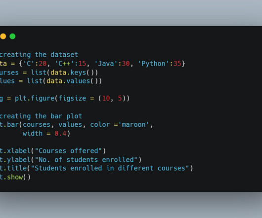
This article was published as a part of the Data Science Blogathon Image 1In this blog, We are going to talk about some of the advanced and most used charts in Plotly while doing analysis. All you need to know is Plotly for visualization!
In this blog, we will discuss exploratory data analysis, also known as EDA, and why it is important. EDA is an iterative process of conglomerative activities which include data cleaning, manipulation and visualization. So, without any further ado let’s dive right in. DSD got you covered!
Introduction Welcome to our comprehensive data analysis blog that delves deep into the world of Netflix. Netflix’s Global Reach Netflix […] The post Netflix Case Study (EDA): Unveiling Data-Driven Strategies for Streaming appeared first on Analytics Vidhya.
Source: Stephen Wolfram Writings Generate visualizations: You can ask ChatGPT to generate a plot of a function or to create a map of a specific region. Data manipulation: You can use the plugin to perform data cleaning, transformation, and feature engineering tasks. Source: Datacamp 4.
With its advanced natural language processing capabilities, ChatGPT can uncover hidden patterns and trends in your data that you never thought possible. In this blog post, we’ll explore how ChatGPT can revolutionize your data with […] The post Analyzing Data Made Effortless Using ChatGPT appeared first on Analytics Vidhya.
Introduction As a data scientist, you have the power to revolutionize the real estate industry by developing models that can accurately predict house prices. This blog post will teach you how to build a real estate price prediction model from start to finish.
Introduction Analytics Vidhya DataHour is designed to provide valuable insights and knowledge to individuals looking to build a career in the data-tech industry. These sessions cover a wide range of topics, from the fields of artificial intelligence, and machine learning, and various topics related to data science.
The importance of EDA in the machine learning world is well known to its users. Making visualizations is one of the finest ways for data scientists to explain data analysis to people outside the business. Exploratory data analysis can help you comprehend your data better, which can aid in future data preprocessing.
Today’s question is, “What does a data scientist do.” ” Step into the realm of data science, where numbers dance like fireflies and patterns emerge from the chaos of information. In this blog post, we’re embarking on a thrilling expedition to demystify the enigmatic role of data scientists.
According to a report from Statista, the global big data market is expected to grow to over $103 billion by 2027, highlighting the increasing importance of data handling practices. Key Takeaways Data preprocessing is crucial for effective Machine Learning model training. Matplotlib/Seaborn: For datavisualization.
If you can analyze data with statistical knowledge or unsupervised machine learning, just extracting data without labeling would be enough. And sometimes ad hoc analysis with simple datavisualization will help your decision makings. “Shut up and annotate!” ” could be often the best practice in practice.
Exploratory Data Analysis(EDA)on Biological Data: A Hands-On Guide Unraveling the Structural Data of Proteins, Part II — Exploratory Data Analysis Photo from Pexels In a previous post, I covered the background of this protein structure resolution data set, including an explanation of key data terminology and details on how to acquire the data.
Proficient in programming languages like Python or R, data manipulation libraries like Pandas, and machine learning frameworks like TensorFlow and Scikit-learn, data scientists uncover patterns and trends through statistical analysis and datavisualization. DataVisualization: Matplotlib, Seaborn, Tableau, etc.
In the digital age, the abundance of textual information available on the internet, particularly on platforms like Twitter, blogs, and e-commerce websites, has led to an exponential growth in unstructured data. Integration also helps avoid duplication and redundancy of data, providing a comprehensive view of the information.
Data Extraction, Preprocessing & EDA & Machine Learning Model development Data collection : Automatically download the stock historical prices data in CSV format and save it to the AWS S3 bucket. Data storage : Store the data in a Snowflake data warehouse by creating a data pipe between AWS and Snowflake.
Python data visualisation libraries offer powerful visualisation tools , ranging from simple charts to interactive dashboards. In this blog, we aim to explore the most popular Python data visualisation libraries, highlight their unique features, and guide you on how to use them effectively.
Photo by Juraj Gabriel on Unsplash Data analysis is a powerful tool that helps businesses make informed decisions. In today’s blog, we will explore the Netflix dataset using Python and uncover some interesting insights. The platform has gained a massive following in recent years, and its popularity shows no signs of slowing down.
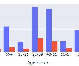
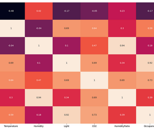
From the above EDA, it is clear that the room's temperature, light, and CO2 levels are good occupancy indicators. The CO2 levels of the room decrease when there is no person in the room. This proves the hypothesis regarding the peaks in the CO2 graph. Therefore, we will be using these three variables for our classification model.
We organize all of the trending information in your field so you don't have to. Join 17,000+ users and stay up to date on the latest articles your peers are reading.
You know about us, now we want to get to know you!
Let's personalize your content
Let's get even more personalized
We recognize your account from another site in our network, please click 'Send Email' below to continue with verifying your account and setting a password.


Let's personalize your content