This site uses cookies to improve your experience. To help us insure we adhere to various privacy regulations, please select your country/region of residence. If you do not select a country, we will assume you are from the United States. Select your Cookie Settings or view our Privacy Policy and Terms of Use.
Cookie Settings
Cookies and similar technologies are used on this website for proper function of the website, for tracking performance analytics and for marketing purposes. We and some of our third-party providers may use cookie data for various purposes. Please review the cookie settings below and choose your preference.
Used for the proper function of the website
Used for monitoring website traffic and interactions
Cookie Settings
Cookies and similar technologies are used on this website for proper function of the website, for tracking performance analytics and for marketing purposes. We and some of our third-party providers may use cookie data for various purposes. Please review the cookie settings below and choose your preference.
Strictly Necessary: Used for the proper function of the website
Performance/Analytics: Used for monitoring website traffic and interactions
Data is an essential component of any business, and it is the role of a data analyst to make sense of it all. PowerBI is a powerfuldatavisualization tool that helps them turn raw data into meaningful insights and actionable decisions.
Learn about 33 tools to visualizedata with this blog In this blog post, we will delve into some of the most important plots and concepts that are indispensable for any data scientist. 9 Data Science Plots – Data Science Dojo 1. Check out our Introduction to PowerBI cohort.
It involves extracting insights from large sets of data to make informed decisions. One of the most common ways to represent a data analysis is through code. However, is code the best way to represent a data analysis? Check out this course and learn PowerBI today!
How to Optimize PowerBI and Snowflake for Advanced Analytics Spencer Baucke May 25, 2023 The world of business intelligence and data modernization has never been more competitive than it is today. Table of Contents Why Discuss Snowflake & PowerBI?
This blog lists down-trending data science, analytics, and engineering GitHub repositories that can help you with learning data science to build your own portfolio. What is GitHub? GitHub is a powerful platform for data scientists, data analysts, data engineers, Python and R developers, and more.
In today’s environment, the need for developers to control, automate, and monitor the lifecycle of their data analytics products is crucial to the success and health of any business. PowerBI Deployment Pipelines give developers the ability to do all three in a single, easy-to-use interface from directly within the PowerBI Service.
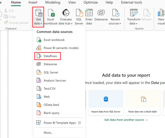
We at phData have written extensively about creating centralized data products in PowerBI. However, we have not yet touched on dataflows and the importance of this unique type of data product. Most PowerBI developers are familiar with Power Query , Which is the data transformation layer of PowerBI.
Introduction Analytics Vidhya DataHour is designed to provide valuable insights and knowledge to individuals looking to build a career in the data-tech industry. These sessions cover a wide range of topics, from the fields of artificial intelligence, and machine learning, and various topics related to data science.
Introduction The world of software development is ever-evolving, and with the increasing demand for powerful and easy-to-use solutions, low-code development platforms have emerged as game-changers. Microsoft’s Power Platform Copilot is one such cutting-edge platform that aims to transform how we approach software development.
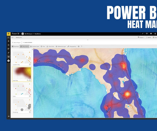
PowerBI Heatmap: Heatmap in PowerBI refers to the type of custom visualisation that businesses analysts utilise for showcasing the relationship between two variables on a map in different colour patches. It offers a wide range of features that make it a popular choice for data professionals, analysts, and organizations.
Consequently, the tools we employ to process and visualize this data play a critical role. Among these tools, KNIME and PowerBI have emerged as key players, catering to the demands of this evolving landscape. In this blog, we will focus on integrating PowerBI within KNIME for enhanced data analytics.
As organizations embrace the power of self-service analytics and interactive dashboards, transitioning from SSRS to PowerBI becomes an enticing and oftentimes necessary decision. The PowerBI Service further enhances collaboration by enabling easy sharing and embedding reports in web pages and applications.
At this point, PowerBI has extended itself beyond the definition of just a datavisualization tool and truly is a robust business intelligence platform. One of the more powerful elements of PowerBI is the ability to distribute reporting to end users for self-service analytics through a PowerBI Workspace App.
PowerBI is a user-friendly and powerfuldatavisualization tool that enables individuals to easily create interactive reports and dashboards as well as centralized datasets. Table data is filtered by using Power Query date/time parameters with the reserved, case-sensitive names RangeStart and RangeEnd.
Summary: IoT datavisualization converts raw sensor data into interactive visuals, enabling businesses to monitor trends, detect anomalies, and improve efficiency. IoT datavisualization transforms complex datasets into clear, actionable insights. Hence, leveraging data visualisation becomes crucial.
Summary: Datavisualization is the art of transforming complex data sets into easily understandable visuals like charts, graphs, and maps. By presenting information visually, datavisualization allows us to communicate insights clearly and effectively to a wider audience.
Whether you’re a seasoned tech professional looking to switch lanes, a fresh graduate planning your career trajectory, or simply someone with a keen interest in the field, this blog post will walk you through the exciting journey towards becoming a data scientist. This is where datavisualization comes in.
They cover a wide range of topics, ranging from Python, R, and statistics to machine learning and datavisualization. In this blog, we will explore the arena of data science bootcamps and lay down a guide for you to choose the best data science bootcamp.
Summary: Conditional formatting in PowerBI transforms data visualisation by dynamically adjusting visual elements based on data values. Introduction Microsoft PowerBI has a 15.62% market share in data visualisation, making it a leading tool for transforming data into actionable insights.
In the digital age, the abundance of textual information available on the internet, particularly on platforms like Twitter, blogs, and e-commerce websites, has led to an exponential growth in unstructured data. These tools offer a wide range of functionalities to handle complex data preparation tasks efficiently.
In modern organizations, the significance of the Business Analyst role lies in their ability to interpret data. This blog aims to equip you with the core questions often asked during interviews. Datavisualization tools like Tableau and PowerBI can be applied to inform decisions. Who Is a Business Analyst?
To pursue a data science career, you need a deep understanding and expansive knowledge of machine learning and AI. js and Tableau Data science, data analytics and IBM Practicing data science isn’t without its challenges.
According to a report by Gartner, organizations that utilize BI tools can improve their operational efficiency and gain competitive advantages over rivals. Furthermore, a study indicated that 71% of organisations consider Data Analytics a critical factor for enhancing their business performance.
Summary: Business Intelligence Analysts transform raw data into actionable insights. They use tools and techniques to analyse data, create reports, and support strategic decisions. Key skills include SQL, datavisualization, and business acumen. Introduction We are living in an era defined by data.
Canvas Apps – functionality within the Microsoft Power Apps suite – offers a versatile and user-friendly way to develop custom applications without extensive coding. PowerBI Integration: Embed PowerBI reports and dashboards within your Canvas App, enabling datavisualization and insights directly within your custom application.
On the same day as Qlik’s roadmap keynote and PowerBI’s Summit in Ireland, Tableau decides to rain on both of those parades. by Jen Underwood. Tableau stole the thunder yesterday with. Read More.
It is the process of converting raw data into relevant and practical knowledge to help evaluate the performance of businesses, discover trends, and make well-informed choices. Data gathering, data integration, data modelling, analysis of information, and datavisualization are all part of intelligence for businesses.
Tableau can help Data Scientists generate graphs, charts, maps and data-driven stories, etc for purpose of visualisation and analysing data. But What is Tableau for Data Science and what are its advantages and disadvantages? Let’s read the blog to find out! How Professionals Can Use Tableau for Data Science?
It is expected that the Data Science market will have more than 11 million job roles in India by 2030, opening up opportunities for you. However, as a Data Analyst aspirant, you may be wondering how to shape or build your Data Analyst Portfolio so that you’re visible to the employers. How to build a Data Analyst Portfolio?
Introduction Bioinformatics is a rapidly evolving field that combines computer science, statistics, and biology to manage and analyse biological data. Some of the key tools used for data visualisation include: Tableau Tableau is a data visualisation tool that allows researchers to create interactive dashboards and reports.
Proficient in programming languages like Python or R, data manipulation libraries like Pandas, and machine learning frameworks like TensorFlow and Scikit-learn, data scientists uncover patterns and trends through statistical analysis and datavisualization. DataVisualization: Matplotlib, Seaborn, Tableau, etc.
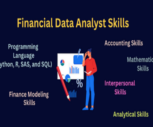
Summary: Leveraging data skills for Financial Analysts explores how Financial Analysts can harness data skills to enhance their roles. It delves into data analysis techniques to interpret financial trends effectively, including statistical analysis and datavisualization. So what does a Financial Analyst do?
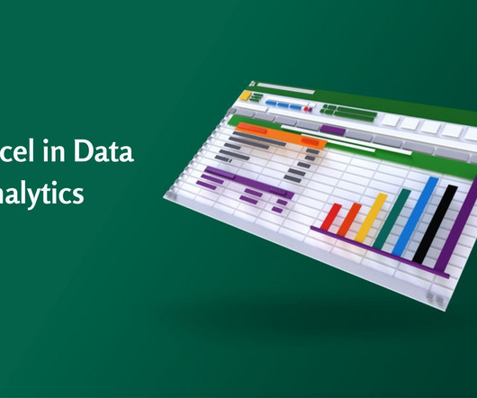
Accordingly, Data Analysts use various tools for Data Analysis and Excel is one of the most common. Significantly, the use of Excel in Data Analysis is beneficial in keeping records of data over time and enabling datavisualization effectively. How to use Excel in Data Analysis and why is it important?
In today’s data-driven world, data analysis has become an essential skill for organizations across industries to make informed decisions and improve business outcomes. For freshers, data analysis presents an exciting career opportunity with great growth potential.
Introduction Business Intelligence (BI) architecture is a crucial framework that organizations use to collect, integrate, analyze, and present business data. This architecture serves as a blueprint for BI initiatives, ensuring that data-driven decision-making is efficient and effective.
The hockey stick growth of Data Scientist salary in India is one of the contributing reasons to make it the most preferred career choice. If you, too, are looking to make a career as a data professional, this blog will take you through some of the best-paying cities for Data Scientists.
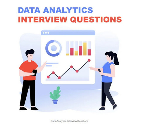
This comprehensive blog outlines vital aspects of Data Analyst interviews, offering insights into technical, behavioural, and industry-specific questions. It covers essential topics such as SQL queries, datavisualization, statistical analysis, machine learning concepts, and data manipulation techniques.
A well-structured syllabus for Big Data encompasses various aspects, including foundational concepts, technologies, data processing techniques, and real-world applications. This blog aims to provide a comprehensive overview of a typical Big Data syllabus, covering essential topics that aspiring data professionals should master.
Summary: This blog provides a comprehensive roadmap for aspiring Azure Data Scientists, outlining the essential skills, certifications, and steps to build a successful career in Data Science using Microsoft Azure. DataVisualization: Ability to create compelling visualisations to communicate insights effectively.
Business Intelligence Tools: Business intelligence (BI) tools are used to visualize your data. You should pick those that allow for easy integration and can create beautiful datavisualizations. Examples of BI tools include Looker, PowerBI , and Tableau. Subscribe to Alation's Blog.
Furthermore, with the ability to manipulate data efficiently, companies can unlock their true potential, which can eventually help in boosting their productivity and gain a competitive edge. Key Features of Data Manipulation Data Filtering Filtering of data is an integral aspect of data manipulation.
Click to learn more about author Piyush Goel. The health care system today is in the midst of a much-needed technological revolution. Considering how medical errors are now the number three killer in the United States every year, this overhaul is sorely needed. Furthermore, COVID-19 stretched the health care system thin over the past 16 months.
In this blog post, we will introduce you to some of the best AI tools that you can try right now, sorted by category. These tools use machine learning, natural language processing, computer vision, and other AI techniques to provide you with powerful features and functionalities.
Summary: This blog dives into the most promising PowerBI projects, exploring advanced datavisualization, AI integration, IoT & blockchain analytics, and emerging technologies. Discover best practices for successful implementation and propel your organization towards data-driven success.
We organize all of the trending information in your field so you don't have to. Join 17,000+ users and stay up to date on the latest articles your peers are reading.
You know about us, now we want to get to know you!
Let's personalize your content
Let's get even more personalized
We recognize your account from another site in our network, please click 'Send Email' below to continue with verifying your account and setting a password.


Let's personalize your content