This site uses cookies to improve your experience. To help us insure we adhere to various privacy regulations, please select your country/region of residence. If you do not select a country, we will assume you are from the United States. Select your Cookie Settings or view our Privacy Policy and Terms of Use.
Cookie Settings
Cookies and similar technologies are used on this website for proper function of the website, for tracking performance analytics and for marketing purposes. We and some of our third-party providers may use cookie data for various purposes. Please review the cookie settings below and choose your preference.
Used for the proper function of the website
Used for monitoring website traffic and interactions
Cookie Settings
Cookies and similar technologies are used on this website for proper function of the website, for tracking performance analytics and for marketing purposes. We and some of our third-party providers may use cookie data for various purposes. Please review the cookie settings below and choose your preference.
Strictly Necessary: Used for the proper function of the website
Performance/Analytics: Used for monitoring website traffic and interactions
Datavisualization tools have become very useful for many businesses. Companies use datavisualization for trend mapping, data contextualization and various forms of business optimization. billion on datavisualization technology within the next three years. Increasing Overall Productivity.
Elbow curve: In unsupervised learning, particularly clustering, the elbow curve aids in determining the optimal number of clusters for a dataset. It plots the variance explained as a function of the number of clusters. The “elbow point” is a good indicator of the ideal cluster count.
There is no disputing the fact that the collection and analysis of massive amounts of unstructured data has been a huge breakthrough. We would like to talk about datavisualization and its role in the big data movement. Data is useless without the opportunity to visualize what we are looking for.
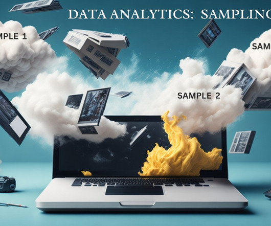
Cluster Sampling: The population is divided into clusters, and a random sample of clusters is selected, with all members in selected clusters included. Datavisualizations: Datavisualization is the art and science of representing complex data in a visual and comprehensible form.
Read a comprehensive SQL guide for data analysis; Learn how to choose the right clustering algorithm for your data; Find out how to create a viral DataViz using the data from Data Science Skills poll; Enroll in any of 10 Free Top Notch Natural Language Processing Courses; and more.
The primary aim is to make sense of the vast amounts of data generated daily by combining statistical analysis, programming, and datavisualization. It is divided into three primary areas: data preparation, data modeling, and datavisualization.
Data analysis and interpretation After mining, the results are utilized for analytical modeling. Datavisualization plays an important role in this stage, as it helps stakeholders interpret findings clearly and effectively communicate insights through compelling storytelling.
Summary: IoT datavisualization converts raw sensor data into interactive visuals, enabling businesses to monitor trends, detect anomalies, and improve efficiency. Introduction The Internet of Things (IoT) connects billions of devices, generating massive real-time data streams. What is IoT Visualization?
Skills for data analysts 2023 10 essential skills for data analysts to have in 2023 Here are 10 essential skills for data analysts to have in 2023: 1. DataVisualization: Topping the list of skills for data analysts datavisualization stands first.
Summary: Datavisualization transforms complex datasets into easily understandable visuals, facilitating better decision-making and communication. While it enhances Data Analysis and engagement, challenges such as misinterpretation, oversimplification, and accessibility issues can arise.
What’s amazing is that Marvel characters are developed through the influence of other Marvel heroes through datavisualization. For instance, when Spider-Man appears in a comic book with Captain America, these are all visualized through data graphics. Better Understanding of Marvel and Its Evolution with Big Data.
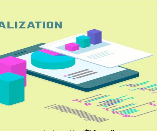
Summary: Datavisualization is the art of transforming complex data sets into easily understandable visuals like charts, graphs, and maps. By presenting information visually, datavisualization allows us to communicate insights clearly and effectively to a wider audience.
Data engineering tools offer a range of features and functionalities, including data integration, data transformation, data quality management, workflow orchestration, and datavisualization. Essential data engineering tools for 2023 Top 10 data engineering tools to watch out for in 2023 1.
It provides a range of algorithms for classification, regression, clustering, and more. TensorFlow is used for numerical computation using data flow graphs. Link to the repository: [link] Looking to begin exploring, analyzing, and visualizingdata with Power BI Desktop?
This post looks at some of the open source datavisualization tools our customers tell us theyve tried before upgrading to our fully-supported toolkits for their analysis apps. Teams working on datavisualization applications always aim to build the best product they can. js) GraphViz Viz.js
Clustering — Beyonds KMeans+PCA… Perhaps the most popular way of clustering is K-Means. It natively supports only numerical data, so typically an encoding is applied first for converting the categorical data into a numerical form. this link ).
Matplotlib is a great tool for datavisualization and is widely used in data analysis, scientific computing, and machine learning. It provides a wide range of tools for supervised and unsupervised learning, including linear regression, k-means clustering, and support vector machines.
Artificial intelligence is changing the way organizations think about data analysis. AI and datavisualization can do a lot of the heavy lifting for analysts and investigators working with connected data – helping them detect, understand and even predict risks and threats.
At this Fall’s Open Data Science Conference , I will talk about how to bring a systematic approach to the interpretation of clustering models. To get ready for that, let’s talk about datavisualization for clustering models. load diabetes data diabetesData = load_diabetes(as_frame = True).data
Scikit-learn can be used for a variety of data analysis tasks, including: Classification Regression Clustering Dimensionality reduction Feature selection Leveraging Scikit-learn in data analysis projects Scikit-learn can be used in a variety of data analysis projects. It has a wide range of datavisualization tools.
From local happenings to global events, understanding the torrent of information becomes manageable when we apply intelligent data strategies to our media consumption. Machine learning: curating your news experience Data isn’t just a cluster of numbers and facts; it’s becoming the sculptor of the media experience.
Steps to Perform DataVisualization: Datavisualization is the presentation of information and statistics using visual tools that include charts, graphs, and maps. Its goal is to create patterns in data, trends, and anomalies comprehensible to both data professionals and people without technical knowledge.
Matplotlib is a great tool for datavisualization and is widely used in data analysis, scientific computing, and machine learning. It provides a wide range of tools for supervised and unsupervised learning, including linear regression, k-means clustering, and support vector machines.
Data scientists are using NLP to make these assistants smarter and more helpful. Enhanced DataVisualization: AI-powered datavisualization tools are enabling data scientists to create interactive and dynamic visualizations that facilitate better communication of insights and findings.
Analyze the obtained sample data. Cluster Sampling Definition and applications Cluster sampling involves dividing a population into clusters or groups and selecting entire clusters at random for inclusion in the sample. Select clusters randomly from the population. Analyze the obtained sample data.
How Clustering Can Help You Understand Your Customers Better Customer segmentation is crucial for businesses to better understand their customers, target marketing efforts, and improve satisfaction. Clustering, a popular machine learning technique, identifies patterns in large datasets to group similar customers and gain insights.
The most common unsupervised learning method is cluster analysis, which uses clustering algorithms to categorize data points according to value similarity (as in customer segmentation or anomaly detection ).
It involves developing algorithms that can learn from and make predictions or decisions based on data. Familiarity with regression techniques, decision trees, clustering, neural networks, and other data-driven problem-solving methods is vital. This is where datavisualization comes in. Works with smaller data sets.
Senior DataVisualization Lead, Excella. Once we find issues of inequality in data, it’s also our responsibility to spend time to understand the causes of those inequalities.” - Amanda Makulec. I’ve never seen so many people so fixated on a cluster of charts,” notes Amanda Makulec. “At Amanda Makulec. Kristin Adderson.
Data science bootcamps are intensive short-term educational programs designed to equip individuals with the skills needed to enter or advance in the field of data science. They cover a wide range of topics, ranging from Python, R, and statistics to machine learning and datavisualization.
Autoscaling When traffic spikes, Kubernetes can automatically spin up new clusters to handle the additional workload. This means that organizations must rely on a tailored, cloud-native observability strategy and scrutinize every available data source within the system.
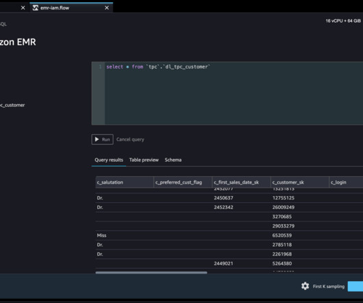
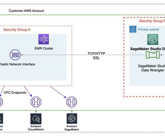
The outputs of this template are as follows: An S3 bucket for the data lake. An EMR cluster with EMR runtime roles enabled. Associating runtime roles with EMR clusters is supported in Amazon EMR 6.9. The EMR cluster should be created with encryption in transit. internal in the certificate subject definition.
Data scientists and data engineers use Apache Spark, Apache Hive, and Presto running on Amazon EMR for large-scale data processing. This blog post will go through how data professionals may use SageMaker Data Wrangler’s visual interface to locate and connect to existing Amazon EMR clusters with Hive endpoints.
They employ statistical and mathematical techniques to uncover patterns, trends, and relationships within the data. Data scientists possess a deep understanding of statistical modeling, datavisualization, and exploratory data analysis to derive actionable insights and drive business decisions.
These packages are built to handle various aspects of machine learning, including tasks such as classification, regression, clustering, dimensionality reduction, and more. These packages cover a wide array of areas including classification, regression, clustering, dimensionality reduction, and more.
Basic knowledge of statistics is essential for data science. Statistics is broadly categorized into two types – Descriptive statistics – Descriptive statistics is describing the data. Visual graphs are the core of descriptive statistics. Clustering (Unsupervised). Anomaly Detection (Semi-Supervised).
With Image Augmentation , you can create new training images from your dataset by randomly transforming existing images, thereby increasing the size of the training data via augmentation. Multimodal Clustering.
Multiply insights with easy integration with KeyLines, ReGraph or KronoGraph MapWeave is designed to work effortlessly alongside our other SDKs, making it easy to build rich, interconnected datavisualization experiences.
Introduction Analytics Vidhya DataHour is designed to provide valuable insights and knowledge to individuals looking to build a career in the data-tech industry. These sessions cover a wide range of topics, from the fields of artificial intelligence, and machine learning, and various topics related to data science.
This article was published as a part of the Data Science Blogathon. Introduction Phonepe, Google Pay (Tez) are ubiquitous names in the Indian payment ecosystem and the top two players in the area. According to Phonepe pulse report, it has133 million monthly active users as of July’21. For the Q3-21 quarter, the total transactions were 526.8
When you’re making bar charts or column charts in Power BI (a tool for showing datavisually), sometimes you want to add a special bar. Also, it can be helpful to put this special total bar in a certain kind of chart where bars are put next to each other for each month (this is called a “clustered” bar chart).
They’re looking to hire experienced data analysts, data scientists and data engineers. With big data careers in high demand, the required skillsets will include: Apache Hadoop. Software businesses are using Hadoop clusters on a more regular basis now. Other coursework.
If you can analyze data with statistical knowledge or unsupervised machine learning, just extracting data without labeling would be enough. And sometimes ad hoc analysis with simple datavisualization will help your decision makings. But only with limited labeled data, decision boundaries would be ambiguous.
We organize all of the trending information in your field so you don't have to. Join 17,000+ users and stay up to date on the latest articles your peers are reading.
You know about us, now we want to get to know you!
Let's personalize your content
Let's get even more personalized
We recognize your account from another site in our network, please click 'Send Email' below to continue with verifying your account and setting a password.


Let's personalize your content