This site uses cookies to improve your experience. To help us insure we adhere to various privacy regulations, please select your country/region of residence. If you do not select a country, we will assume you are from the United States. Select your Cookie Settings or view our Privacy Policy and Terms of Use.
Cookie Settings
Cookies and similar technologies are used on this website for proper function of the website, for tracking performance analytics and for marketing purposes. We and some of our third-party providers may use cookie data for various purposes. Please review the cookie settings below and choose your preference.
Used for the proper function of the website
Used for monitoring website traffic and interactions
Cookie Settings
Cookies and similar technologies are used on this website for proper function of the website, for tracking performance analytics and for marketing purposes. We and some of our third-party providers may use cookie data for various purposes. Please review the cookie settings below and choose your preference.
Strictly Necessary: Used for the proper function of the website
Performance/Analytics: Used for monitoring website traffic and interactions
Explore, analyze, and visualizedata using PowerBI Desktop to make data-driven business decisions. Check out our Introduction to PowerBI cohort. Elbow curve: In unsupervised learning, particularly clustering, the elbow curve aids in determining the optimal number of clusters for a dataset.
It provides a range of algorithms for classification, regression, clustering, and more. TensorFlow is used for numerical computation using data flow graphs. It can be used for creating interactive visualizations, animations, and more. Seaborn: A Python datavisualization library based on matplotlib.
When you’re making bar charts or column charts in PowerBI (a tool for showing datavisually), sometimes you want to add a special bar. Also, it can be helpful to put this special total bar in a certain kind of chart where bars are put next to each other for each month (this is called a “clustered” bar chart).
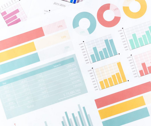
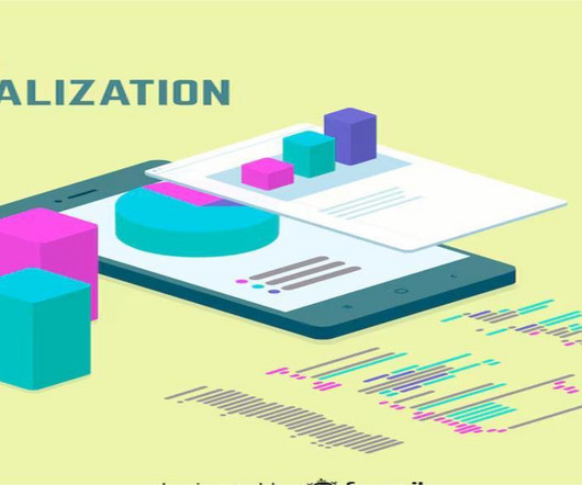
Summary: Datavisualization is the art of transforming complex data sets into easily understandable visuals like charts, graphs, and maps. By presenting information visually, datavisualization allows us to communicate insights clearly and effectively to a wider audience.
Summary: IoT datavisualization converts raw sensor data into interactive visuals, enabling businesses to monitor trends, detect anomalies, and improve efficiency. Introduction The Internet of Things (IoT) connects billions of devices, generating massive real-time data streams. What is IoT Visualization?
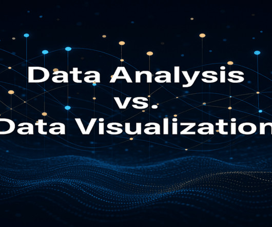
Summary: Data Analysis focuses on extracting meaningful insights from raw data using statistical and analytical methods, while datavisualization transforms these insights into visual formats like graphs and charts for better comprehension. Deep Dive: What is DataVisualization?
Introduction Analytics Vidhya DataHour is designed to provide valuable insights and knowledge to individuals looking to build a career in the data-tech industry. These sessions cover a wide range of topics, from the fields of artificial intelligence, and machine learning, and various topics related to data science.
It involves developing algorithms that can learn from and make predictions or decisions based on data. Familiarity with regression techniques, decision trees, clustering, neural networks, and other data-driven problem-solving methods is vital. This is where datavisualization comes in. Works with smaller data sets.
Data science bootcamps are intensive short-term educational programs designed to equip individuals with the skills needed to enter or advance in the field of data science. They cover a wide range of topics, ranging from Python, R, and statistics to machine learning and datavisualization.
How to become a data scientist Data transformation also plays a crucial role in dealing with varying scales of features, enabling algorithms to treat each feature equally during analysis Noise reduction As part of data preprocessing, reducing noise is vital for enhancing data quality.
Tableau further has its own drawbacks in case of its use in Data Science considering it is a Data Analysis tool rather than a tool for Data Science. How Professionals Can Use Tableau for Data Science? Collaboration and sharing: Tableau provides features for collaboration and sharing of datavisualizations and dashboards.
Proficient in programming languages like Python or R, data manipulation libraries like Pandas, and machine learning frameworks like TensorFlow and Scikit-learn, data scientists uncover patterns and trends through statistical analysis and datavisualization. DataVisualization: Matplotlib, Seaborn, Tableau, etc.
The project I did to land my business intelligence internship — CAR BRAND SEARCH ETL PROCESS WITH PYTHON, POSTGRESQL & POWERBI 1. Load Data After the transform process we will load that “final dataframe” into pgadmin4 , pgAdmin is an open-source administration and development platform for PostgreSQL.
Data Cleaning is a crucial step in any data analysis process, and it’s important to showcase your ability to handle messy data effectively. DataVisualization: Create compelling and informative DataVisualizations. Visual Appeal: Use clean and visually appealing DataVisualizations.
Big Data Technologies and Tools A comprehensive syllabus should introduce students to the key technologies and tools used in Big Data analytics. Some of the most notable technologies include: Hadoop An open-source framework that allows for distributed storage and processing of large datasets across clusters of computers.
This layer is critical as it transforms raw data into actionable insights that drive business decisions. DataVisualizationDatavisualization tools present analyzed data in an easily understandable format. These tools work together to facilitate efficient data management and analysis processes.
DataVisualizationData scientists may be expected to know some basic datavisualization to help tell a story with their data and algorithms. Luckily, nothing too complicated is needed, as Tableau is user-friendly while matplotlib is the popular Python library for datavisualization.
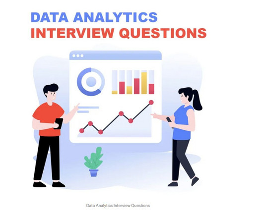
This comprehensive blog outlines vital aspects of Data Analyst interviews, offering insights into technical, behavioural, and industry-specific questions. It covers essential topics such as SQL queries, datavisualization, statistical analysis, machine learning concepts, and data manipulation techniques.
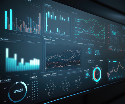
Summary: Datavisualization transforms complex datasets into easily understandable visuals, facilitating better decision-making and communication. While it enhances Data Analysis and engagement, challenges such as misinterpretation, oversimplification, and accessibility issues can arise.
Steps to Perform DataVisualization: Datavisualization is the presentation of information and statistics using visual tools that include charts, graphs, and maps. Its goal is to create patterns in data, trends, and anomalies comprehensible to both data professionals and people without technical knowledge.
We organize all of the trending information in your field so you don't have to. Join 17,000+ users and stay up to date on the latest articles your peers are reading.
You know about us, now we want to get to know you!
Let's personalize your content
Let's get even more personalized
We recognize your account from another site in our network, please click 'Send Email' below to continue with verifying your account and setting a password.


Let's personalize your content