This site uses cookies to improve your experience. To help us insure we adhere to various privacy regulations, please select your country/region of residence. If you do not select a country, we will assume you are from the United States. Select your Cookie Settings or view our Privacy Policy and Terms of Use.
Cookie Settings
Cookies and similar technologies are used on this website for proper function of the website, for tracking performance analytics and for marketing purposes. We and some of our third-party providers may use cookie data for various purposes. Please review the cookie settings below and choose your preference.
Used for the proper function of the website
Used for monitoring website traffic and interactions
Cookie Settings
Cookies and similar technologies are used on this website for proper function of the website, for tracking performance analytics and for marketing purposes. We and some of our third-party providers may use cookie data for various purposes. Please review the cookie settings below and choose your preference.
Strictly Necessary: Used for the proper function of the website
Performance/Analytics: Used for monitoring website traffic and interactions
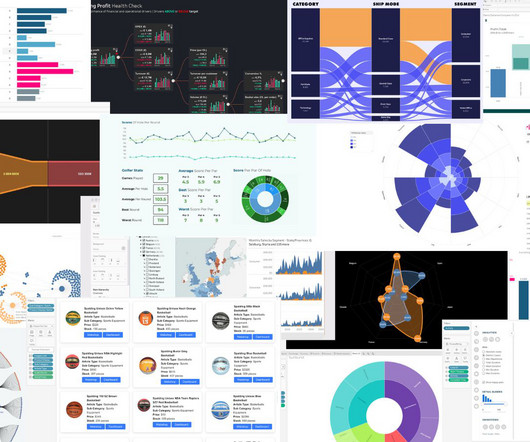
The post Customer Segmentation using RFM Analysis in Tableau appeared first on Analytics Vidhya. Introduction Customer segmentation is the process by which we divide customers into groups based on common characteristics like demographics (age, gender, income, etc.), geography, psychology, and behavior.
Technical Fellow, Tableau. Tableau has been helping people and organizations to see and understand data for almost two decades, bringing exciting innovations to the landscape of business intelligence with every product release. I am proud to announce that my History of Tableau Innovation viz is now published to Tableau Public.
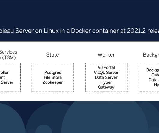
We are excited to announce that with the release of Tableau 2021.2, you can now deploy and run Tableau Server for Linux using Docker containers and Kubernetes! Although this release of Tableau Server in a Container does not support auto-scaling (see below), it can be deployed and managed by Kubernetes. . In the Tableau 2021.2
Community Manager, Tableau. I’m Caroline Yam, Tableau Community Manager based down under in Sydney, Australia, and I’m thrilled to join the ranks of the Best of Tableau Web authors. . To finish the program, participants are asked to share their Tableau knowledge to benefit the broader community and themselves. Hi DataFam!
Community Manager, Tableau. I’m Caroline Yam, Tableau Community Manager based down under in Sydney, Australia, and I’m thrilled to join the ranks of the Best of Tableau Web authors. . To finish the program, participants are asked to share their Tableau knowledge to benefit the broader community and themselves. Hi DataFam!
Technical Fellow, Tableau. Tableau has been helping people and organizations to see and understand data for almost two decades, bringing exciting innovations to the landscape of business intelligence with every product release. I am proud to announce that my History of Tableau Innovation viz is now published to Tableau Public.
Scikit-learn can be used for a variety of data analysis tasks, including: Classification Regression Clustering Dimensionality reduction Feature selection Leveraging Scikit-learn in data analysis projects Scikit-learn can be used in a variety of data analysis projects. It has a wide range of data visualization tools.
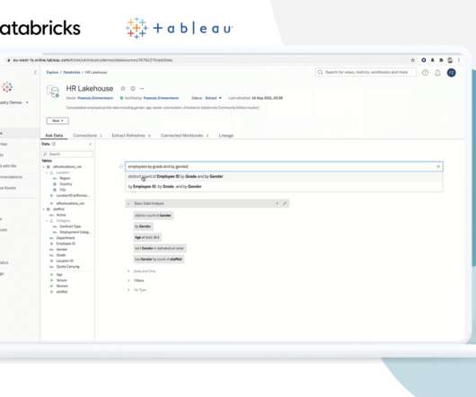
EMEA Field CTO, Tableau. We’ll also explore the technical synergy between Tableau and Databricks and how our customers typically use the two platforms together to maximize the value of their data. The lakehouse model provides distinct advantages for Tableau customers. Francois Zimmermann. Brian Dirking. Kristin Adderson.
At Tableau, we believe that data is the lifeblood of an organization. That’s what fuels our innovation at Tableau—we want to accelerate your success by transforming how you work with data. Let’s talk about that data future … and the technologies we’re building in Tableau to help you get there. But it’s out of reach for so many.
Data Connect is a new add-on offering designed to empower IT teams to scale on-premises and virtual private cloud data access in Tableau Cloud while reducing the burden on IT. With Bridge, Tableau Cloud can securely access on-premises and virtual private cloud data through an established outbound connection.
It supports various data types and offers advanced features like data sharing and multi-cluster warehouses. 10 Tableau: Tableau is a widely used business intelligence and data visualization tool. Tableau connects to various data sources, including data warehouses, spreadsheets, and cloud services.
Ateken Abla October 10, 2024 - 10:48pm Tristan Guillevin Tableau Visionary and Co-Founder LaDataViz Jessica Bautista DataDev Ambassador and Consultant LaDataViz Tableau Visionary Tristan Guillevin and DataDev Ambassador Jessica Bautista co-run LaDataViz, a data visualization studio and Tableau Developer Partner.
All of these techniques center around product clustering, where product lines or SKUs that are “closer” or more similar to each other are clustered and modeled together. Clustering by product group. The most intuitive way of clustering SKUs is by their product group. Clustering by sales profile.
Similarly, the Tableau Server must also be maintained to perform optimally. Tableau Server is one of the products in the Tableau suite, which is hosted and maintained within your company’s firewall and can be deployed on Cloud as well as On-Premises. What is Tableau Server Maintenance and Why Does It Matter?
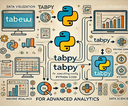
Summary: Incorporating TabPy into Tableau allows users to execute Python scripts directly within their dashboards, significantly enhancing analytical capabilities. One powerful combination is the integration of TabPy (Tableau Python Server) with Tableau , a leading data visualisation tool. Why Use TabPy with Tableau?
Tableau is a data visualisation software helping you to generate graphics-rich reporting and analysing enormous volumes of data. With the help of Tableau, organisations have been able to mine and gather actionable insights from granular sources of data. But What is Tableau for Data Science and what are its advantages and disadvantages?
Up to 40% of administrators don’t prioritize updating their Tableau Server. All risks aside, there are some great benefits to upgrading the Tableau Server when new versions are released. In this blog, we will understand the need for regular Tableau Server upgrades. What are Tableau Server Updates, and Why Does it Matter?
We are excited to announce that with the release of Tableau 2021.2, you can now deploy and run Tableau Server for Linux using Docker containers and Kubernetes! Although this release of Tableau Server in a Container does not support auto-scaling (see below), it can be deployed and managed by Kubernetes. In the Tableau 2021.2
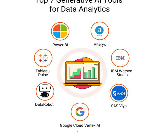
They classify, regress, or cluster data based on learned patterns but do not create new data. Tableau Pulse Tableau Pulse is a new feature in Tableau’s data analytics platform that integrates generative AI to make data analysis more intuitive and personalized. How is Generative AI Different from Traditional AI Models?
Summary: Tableau is fantastic for data visualization, but understanding your data is key. Data types in Tableau act like labels, telling Tableau if it’s a number for calculations, text for labels, or a date for trends. Tableau recognizes numbers, dates, text, locations, and more.
Principal Research Scientist, Tableau. In an earlier post, how to answer your data questions with a map in Tableau , I explored the three fundamental types of questions that maps help us answer: How to find the value for a specific location of interest. Or are there clusters of points? Sarah Battersby. Kristin Adderson.
At Tableau, we believe that data is the lifeblood of an organization. That’s what fuels our innovation at Tableau—we want to accelerate your success by transforming how you work with data. Let’s talk about that data future … and the technologies we’re building in Tableau to help you get there. But it’s out of reach for so many.
EMEA Field CTO, Tableau. We’ll also explore the technical synergy between Tableau and Databricks and how our customers typically use the two platforms together to maximize the value of their data. The lakehouse model provides distinct advantages for Tableau customers. Francois Zimmermann. Brian Dirking. Kristin Adderson.
Apache Hadoop Apache Hadoop is an open-source framework that allows for distributed storage and processing of large datasets across clusters of computers using simple programming models. Key Features : Scalability : Hadoop can handle petabytes of data by adding more nodes to the cluster. Statistics Kafka handles over 1.1
They should be proficient in using tools like Tableau, PowerBI, or Python libraries like Matplotlib and Seaborn to create visually appealing and informative dashboards. Data visualization is the process of presenting data in a visual format such as charts, graphs, or maps.
Principal Research Scientist, Tableau. In an earlier post, how to answer your data questions with a map in Tableau , I explored the three fundamental types of questions that maps help us answer: How to find the value for a specific location of interest. Or are there clusters of points? Sarah Battersby. Kristin Adderson.
Cluster analysis This method groups similar data points, helping organizations tailor their marketing strategies for specific customer segments. Data mining This technique focuses on discovering patterns and relationships within large datasets, providing valuable insights across various industries.
Familiarity with regression techniques, decision trees, clustering, neural networks, and other data-driven problem-solving methods is vital. Tools like Tableau, Matplotlib, Seaborn, or Power BI can be incredibly helpful. Machine learning Machine learning is a key part of data science. This is where data visualization comes in.
Techniques like binning, regression, and clustering are employed to smooth and filter the data, reducing noise and improving the overall quality of the dataset. Noise refers to random errors or irrelevant data points that can adversely affect the modeling process.
Tools like Tableau, Power BI, and Python libraries such as Matplotlib and Seaborn are commonly taught. Machine Learning : Supervised and unsupervised learning algorithms, including regression, classification, clustering, and deep learning. Tools and frameworks like Scikit-Learn, TensorFlow, and Keras are often covered.
Using tools like Power BI, Tableau, and Grafana, organisations can analyse real-time IoT data, optimise operations, and enhance decision-making while addressing security, scalability, and visualisation challenges. Popular IoT visualisation tools include Power BI, Tableau, Grafana, Google Data Studio, and Kibana.
Tools like Tableau, Power BI, and D3.js By visualizing the network structure, analysts can identify key influencers, clusters, and pathways within the data. These heatmaps can show geographical clusters of suspicious transactions or unusual spikes in spending.
Processing frameworks like Hadoop enable efficient data analysis across clusters. Key tools include: Business Intelligence (BI) Tools : Software like Tableau or Power BI allows users to visualise and analyse complex datasets easily. Key Takeaways Big Data originates from diverse sources, including IoT and social media.
Processing frameworks like Hadoop enable efficient data analysis across clusters. Key tools include: Business Intelligence (BI) Tools : Software like Tableau or Power BI allows users to visualise and analyse complex datasets easily. Key Takeaways Big Data originates from diverse sources, including IoT and social media.
Thirty seconds is a good default for human users; if you find that queries are regularly queueing, consider making your warehouse a multi-cluster that scales on-demand. Cluster Count If your warehouse has to serve many concurrent requests, you may need to increase the cluster count to meet demand. authorization server.
This beginner-friendly course emphasises Data Visualisation , Machine Learning applications, and clustering techniques. Pickl.AI’s Data Science Course is structured into 11 modules, covering everything from SQL and Tableau to Machine Learning techniques. Focus on Data Science Tools : Access high-demand tools like Tableau and Power BI.
OpenSearch Service currently has tens of thousands of active customers with hundreds of thousands of clusters under management, processing hundreds of trillions of requests per month. OpenSearch is an open source, distributed search and analytics suite derived from Elasticsearch.
Some of these specialism are: Python TensorFlow SQL Tableau PowerBI Keras Matlab Spark R HTML/CSS/JS Finding You Another aspect that you should look into is who can reach you. Skilled in programming languages such as Python, R, and SQL, and have worked on various projects involving predictive modeling, clustering, and classification.
Hence, you can use R for classification, clustering, statistical tests and linear and non-linear modelling. Packages like caret, random Forest, glmnet, and xgboost offer implementations of various machine learning algorithms, including classification, regression, clustering, and dimensionality reduction. How is R Used in Data Science?
Modeling & Algorithms: Applying statistical models (like regression, classification, clustering) or Machine Learning algorithms to identify deeper patterns, make predictions, or classify data points. Pattern & Trend Spotting: Makes it easier to identify relationships, trends over time, clusters, and anomalies.
These models may include regression, classification, clustering, and more. Data Visualization: Matplotlib, Seaborn, Tableau, etc. Excel, Tableau, Power BI, SQL Server, MySQL, Google Analytics, etc. Statistical Analysis: Hypothesis testing, probability, regression analysis, etc. Big Data Technologies: Hadoop, Spark, etc.
Some of the most notable technologies include: Hadoop An open-source framework that allows for distributed storage and processing of large datasets across clusters of computers. Visualisation Tools Familiarity with tools such as Tableau, Power BI, and D3.js Students should learn how to train and evaluate models using large datasets.
From linear regression and decision trees to neural networks and clustering algorithms, proficiency in a diverse array of machine learning techniques equips professionals to tackle a wide spectrum of Data Science tasks.
AutoML tools are doing most of that work now, in the same way that the basic dashboards or visualizations are now the domain of self-service tools like AWS QuickSight, Google Data Studio, or Tableau. I currently see an opening for clustering-as-a-service, in case you’re looking for ideas.)
We organize all of the trending information in your field so you don't have to. Join 17,000+ users and stay up to date on the latest articles your peers are reading.
You know about us, now we want to get to know you!
Let's personalize your content
Let's get even more personalized
We recognize your account from another site in our network, please click 'Send Email' below to continue with verifying your account and setting a password.


Let's personalize your content