This site uses cookies to improve your experience. To help us insure we adhere to various privacy regulations, please select your country/region of residence. If you do not select a country, we will assume you are from the United States. Select your Cookie Settings or view our Privacy Policy and Terms of Use.
Cookie Settings
Cookies and similar technologies are used on this website for proper function of the website, for tracking performance analytics and for marketing purposes. We and some of our third-party providers may use cookie data for various purposes. Please review the cookie settings below and choose your preference.
Used for the proper function of the website
Used for monitoring website traffic and interactions
Cookie Settings
Cookies and similar technologies are used on this website for proper function of the website, for tracking performance analytics and for marketing purposes. We and some of our third-party providers may use cookie data for various purposes. Please review the cookie settings below and choose your preference.
Strictly Necessary: Used for the proper function of the website
Performance/Analytics: Used for monitoring website traffic and interactions
This article was published as a part of the DataScience Blogathon. What is PowerBI? Microsoft‘s business analytics product, PowerBI, delivers interactive data visualization BI capabilities that allow users to see and share data and insights throughout their organisation.
This article was published as a part of the DataScience Blogathon. Introduction If you’re new to PowerBI Desktop, this post is for you. You’ll learn the fundamentals of DataAnalysis Expressions (DAX) and how to apply them to common math and dataanalysis tasks in no time.
Remote work quickly transitioned from a perk to a necessity, and datascience—already digital at heart—was poised for this change. For data scientists, this shift has opened up a global market of remote datascience jobs, with top employers now prioritizing skills that allow remote professionals to thrive.
It is at this juncture that PowerBI Semantic Models are useful. They also work in the capacity of […] The post What are PowerBI Semantic Models? It may not be easy to incorporate, sort and analyze such information for presentation purposes to be meaningful. appeared first on Analytics Vidhya.
This article was published as a part of the DataScience Blogathon. Introduction The following is an in-depth article explaining DAX which stands for DataAnalysis Expression. The post Introduction to DataAnalysis Expression (DAX) appeared first on Analytics Vidhya. It is designed to […].
This article was published as a part of the DataScience Blogathon Introduction I have been associated with Analytics Vidya from the 3rd edition of Blogathon. The post Guide For DataAnalysis: From Data Extraction to Dashboard appeared first on Analytics Vidhya.
Dataanalysis is an essential process in today’s world of business and science. It involves extracting insights from large sets of data to make informed decisions. One of the most common ways to represent a dataanalysis is through code. However, is code the best way to represent a dataanalysis?
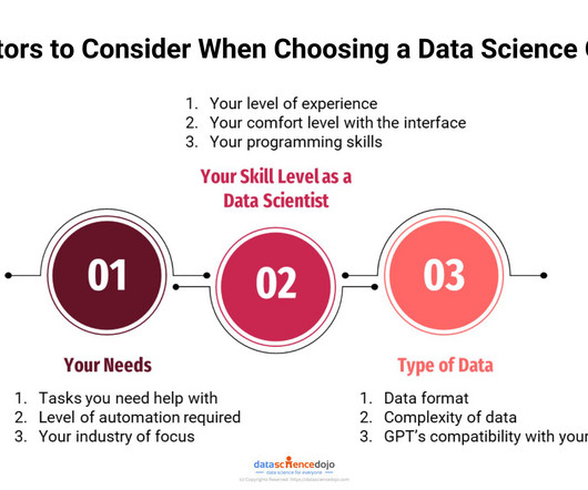
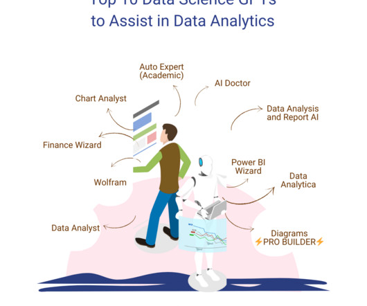
GPTs for Datascience are the next step towards innovation in various data-related tasks. These are platforms that integrate the field of data analytics with artificial intelligence (AI) and machine learning (ML) solutions. However, our focus lies on exploring the GPTs for datascience available on the platform.
Data is an essential component of any business, and it is the role of a data analyst to make sense of it all. PowerBI is a powerfuldata visualization tool that helps them turn raw data into meaningful insights and actionable decisions. How does a data analyst use PowerBI?
DataAnalysis Expressions (DAX) is a language used in Analysis Services, PowerBI, and Power Pivot in Excel. The Basics of DAX for DataAnalysis DAX is a powerful language that can be used to create dynamic and informative reports that can help you make better decisions.
DataAnalysis Expressions (DAX) is a language used in Analysis Services, PowerBI, and Power Pivot in Excel. The Basics of DAX for DataAnalysis DAX is a powerful language that can be used to create dynamic and informative reports that can help you make better decisions.
Discover the full potential of Copilot in PowerBI with our step-by-step tutorial. From dataanalysis to reporting, we guide you through harnessing its capabilities effortlessly.
Datascience GPTs are the next step towards innovation in various data-related tasks. OpenAI’s GPT store is designed to make AI-powered solutions more accessible to different community members. However, our focus lies on exploring the datascience GPTs available on the platform.
GPTs for Datascience are the next step towards innovation in various data-related tasks. These are platforms that integrate the field of data analytics with artificial intelligence (AI) and machine learning (ML) solutions. However, our focus lies on exploring the GPTs for datascience available on the platform.
This blog lists down-trending datascience, analytics, and engineering GitHub repositories that can help you with learning datascience to build your own portfolio. What is GitHub? GitHub is a powerful platform for data scientists, data analysts, data engineers, Python and R developers, and more.
These experiences facilitate professionals from ingesting data from different sources into a unified environment and pipelining the ingestion, transformation, and processing of data to developing predictive models and analyzing the data by visualization in interactive BI reports. Choose a visual of interest.
Datascience bootcamps are intensive short-term educational programs designed to equip individuals with the skills needed to enter or advance in the field of datascience. They cover a wide range of topics, ranging from Python, R, and statistics to machine learning and data visualization.
Summary: “DataScience in a Cloud World” highlights how cloud computing transforms DataScience by providing scalable, cost-effective solutions for big data, Machine Learning, and real-time analytics. Advancements in data processing, storage, and analysis technologies power this transformation.
When it comes to data analytics , not much is easier to use than a spreadsheet. For this reason, spreadsheets have been the predominant tool when it comes to basic dataanalysis for the past 20 years. If you work with data, you’ve done work in Excel or Google Sheets. Easy, Powerful, and Flexible. Easy Smeasy.
Google Releases a tool for Automated Exploratory DataAnalysis Exploring data is one of the first activities a data scientist performs after getting access to the data. This command-line tool helps to determine the properties and quality of the data as well the predictive power.
Introduction The world is transforming by AI, ML, Blockchain, and DataScience drastically, and hence its community is growing rapidly. So, to provide our community with the knowledge they need to master these domains, Analytics Vidhya has launched its DataHour sessions.
Benefits of data visualization Data visualization has several advantages for business analytics, including 1. Improved communication and understanding of data Visualizations make it easier to communicate complex data to stakeholders who may not have a background in dataanalysis.
Introduction Analytics Vidhya DataHour is designed to provide valuable insights and knowledge to individuals looking to build a career in the data-tech industry. These sessions cover a wide range of topics, from the fields of artificial intelligence, and machine learning, and various topics related to datascience.
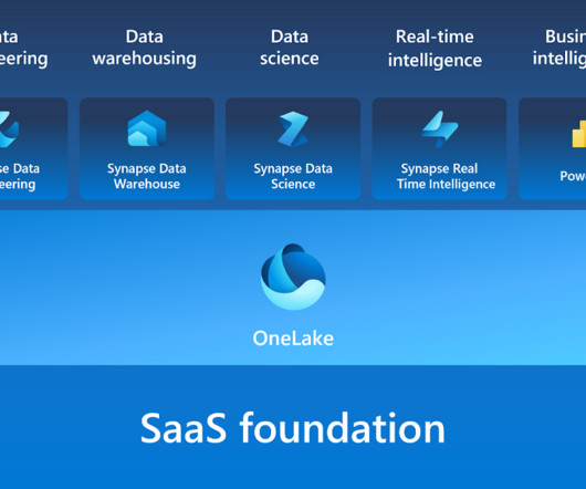
Microsoft Fabric combines multiple elements into a single platform – Image courtesy of Microsoft The contribution of PowerBI The integration of Microsoft PowerBI and Microsoft Fabric offers a powerful combination for organizations seeking comprehensive data analytics and insights.
In March 2023, we had the pleasure of hosting the first edition of the Future of Data and AI conference – an incredible tech extravaganza that drew over 10,000 attendees, featured 30+ industry experts as speakers, and offered 20 engaging panels and tutorials led by the talented team at DataScience Dojo.
Summary : Microsoft Fabric is an end-to-end Data Analytics platform designed for integration, processing, and advanced insights, while PowerBI excels in creating interactive visualisations and reports. Both tools complement each other, enabling seamless data management and visualisation. What is PowerBI?
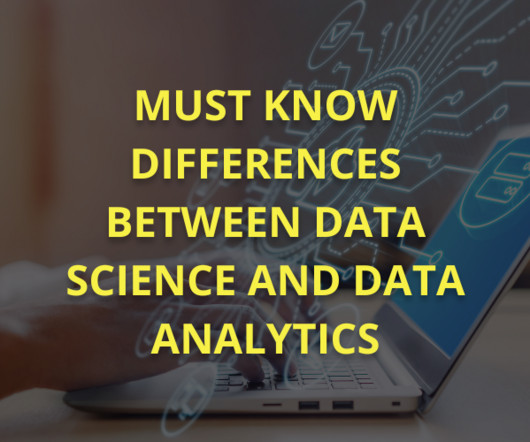
Though you may encounter the terms “datascience” and “data analytics” being used interchangeably in conversations or online, they refer to two distinctly different concepts. Meanwhile, data analytics is the act of examining datasets to extract value and find answers to specific questions.
The Datamarts capability opens endless possibilities for organizations to achieve their data analytics goals on the PowerBI platform. Before we look into the PowerBI Datamarts, let us take a step back and understand the meaning of a Datamart. in an enterprise data warehouse. What is PowerBI Datamarts?
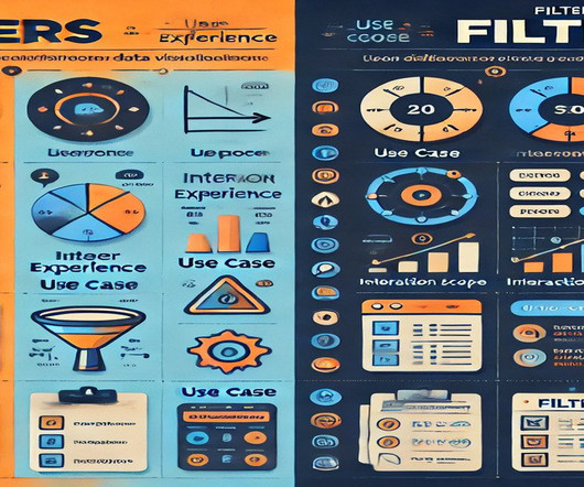
Summary: In PowerBI, slicers and filters serve distinct purposes. Slicers are visual elements that allow users to interactively filter data on the report canvas, enhancing user experience. Filters, on the other hand, are backend features that refine data at various levels—visual, page, or report—without direct user interaction.
Summary: This section outlines key mistakes to avoid when creating dynamic visual displays in PowerBI. Introduction In a world where data is growing exponentially, effective visualisation is crucial. Introduction In a world where data is growing exponentially, effective visualisation is crucial.
Open source business intelligence software is a game-changer in the world of dataanalysis and decision-making. It has revolutionized the way businesses approach data analytics by providing cost-effective and customizable solutions that are tailored to specific business needs.
In addition to Business Intelligence (BI), Process Mining is no longer a new phenomenon, but almost all larger companies are conducting this data-driven process analysis in their organization. The creation of this data model requires the data connection to the source system (e.g.
The problem may occur when you want to import an Excel file in SharePoint to PowerBI. When you try to get data via the Excel workbook, you have to go to the file location. Get data via the Excel workbook There is another way that I usually use. After that, paste the copied path in the URL in PowerBI.
print(llm("Suggest 3 bday gifts for a data scientist"))>>> 1. A subscription to a datascience magazine or journal2. A set of datascience books3. A datascience-themed mug or t-shirt As you can see, we initialize an LLM and call it with a query. content)>>>1.
When you’re making bar charts or column charts in PowerBI (a tool for showing data visually), sometimes you want to add a special bar. So, in simpler terms, this message talks about adding a total bar to your charts in PowerBI. Please clap and follow me for more datascience articles.
Tableau can help Data Scientists generate graphs, charts, maps and data-driven stories, etc for purpose of visualisation and analysing data. But What is Tableau for DataScience and what are its advantages and disadvantages? How Professionals Can Use Tableau for DataScience? Additionally.
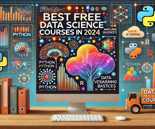
Summary: This guide highlights the best free DataScience courses in 2024, offering a practical starting point for learners eager to build foundational DataScience skills without financial barriers. Introduction DataScience skills are in high demand. billion in 2021 and projected to reach $322.9
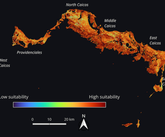
Combining large-scale Earth observation data with other data types enabled many participants to better understand specific issues or locales. For example, honorable mention winner DataScience Nigeria combined satellite imagery with reports of violent incidents from ACLED to better identify areas at high risk of hunger.
For data scrapping a variety of sources, such as online databases, sensor data, or social media. Cleaning data: Once the data has been gathered, it needs to be cleaned. This involves removing any errors or inconsistencies in the data.
Summary: The difference between DataScience and Data Analytics lies in their approachData Science uses AI and Machine Learning for predictions, while Data Analytics focuses on analysing past trends. DataScience requires advanced coding, whereas Data Analytics relies on statistical methods.
In this era of information overload, utilizing the power of data and technology has become paramount to drive effective decision-making. Decision intelligence is an innovative approach that blends the realms of dataanalysis, artificial intelligence, and human judgment to empower businesses with actionable insights.
For budding data scientists and data analysts, there are mountains of information about why you should learn R over Python and the other way around. Though both are great to learn, what gets left out of the conversation is a simple yet powerful programming language that everyone in the datascience world can agree on, SQL.
Summary: The healthcare industry is undergoing a data-driven revolution. DataScience is analyzing vast amounts of patient information to predict diseases before they strike, personalize treatment plans based on individual needs, and streamline healthcare operations. quintillion bytes of data each year [source: IBM].
Tools and Techniques Commonly Used Data Analysts rely on various tools to streamline their work. Software like Microsoft Excel and SQL helps them manipulate and query data efficiently. They use data visualisation tools like Tableau and PowerBI to create compelling reports.
We organize all of the trending information in your field so you don't have to. Join 17,000+ users and stay up to date on the latest articles your peers are reading.
You know about us, now we want to get to know you!
Let's personalize your content
Let's get even more personalized
We recognize your account from another site in our network, please click 'Send Email' below to continue with verifying your account and setting a password.


Let's personalize your content