This site uses cookies to improve your experience. To help us insure we adhere to various privacy regulations, please select your country/region of residence. If you do not select a country, we will assume you are from the United States. Select your Cookie Settings or view our Privacy Policy and Terms of Use.
Cookie Settings
Cookies and similar technologies are used on this website for proper function of the website, for tracking performance analytics and for marketing purposes. We and some of our third-party providers may use cookie data for various purposes. Please review the cookie settings below and choose your preference.
Used for the proper function of the website
Used for monitoring website traffic and interactions
Cookie Settings
Cookies and similar technologies are used on this website for proper function of the website, for tracking performance analytics and for marketing purposes. We and some of our third-party providers may use cookie data for various purposes. Please review the cookie settings below and choose your preference.
Strictly Necessary: Used for the proper function of the website
Performance/Analytics: Used for monitoring website traffic and interactions
This article was published as a part of the Data Science Blogathon. What is PowerBI? Microsoft‘s business analytics product, PowerBI, delivers interactive datavisualizationBI capabilities that allow users to see and share data and insights throughout their organisation.
That’s why businesses of all types and sizes are embracing datavisualization, albeit often with a simplified approach. PowerBI and Tableau, popular and user-friendly datavisualization tools, help businesses organize large datasets.
It is at this juncture that PowerBI Semantic Models are useful. They also work in the capacity of […] The post What are PowerBI Semantic Models? It may not be easy to incorporate, sort and analyze such information for presentation purposes to be meaningful. appeared first on Analytics Vidhya.
Introduction The following is an in-depth article explaining DAX which stands for DataAnalysis Expression. DAX is the language developed by Microsoft to interact with data in a variety of their platforms, such as PowerBI, PowerPivot, and SSAS tabular models. It is designed to […].
Dataanalysis is an essential process in today’s world of business and science. It involves extracting insights from large sets of data to make informed decisions. One of the most common ways to represent a dataanalysis is through code. However, is code the best way to represent a dataanalysis?
Introduction PowerBI is a freely available tool from Microsoft for business analytics. It helps you visualizedata and seamlessly share the insights from it with stakeholders. Whether you’re a data scientist, an analyst, or a business user, PowerBI is a must-know tool that can make your work a lot easier.
Datavisualization is the art of presenting complex information in a way that is easy to understand and analyze. With the explosion of data in today’s business world, the ability to create compelling datavisualizations has become a critical skill for anyone working with data.
Data is an essential component of any business, and it is the role of a data analyst to make sense of it all. PowerBI is a powerfuldatavisualization tool that helps them turn raw data into meaningful insights and actionable decisions.
The post Guide For DataAnalysis: From Data Extraction to Dashboard appeared first on Analytics Vidhya. Unlike hackathons, where we are supposed to come up with a theme-oriented project within the stipulated time, blogathons are different. Blogathons are competitions that are conducted for over a month […].
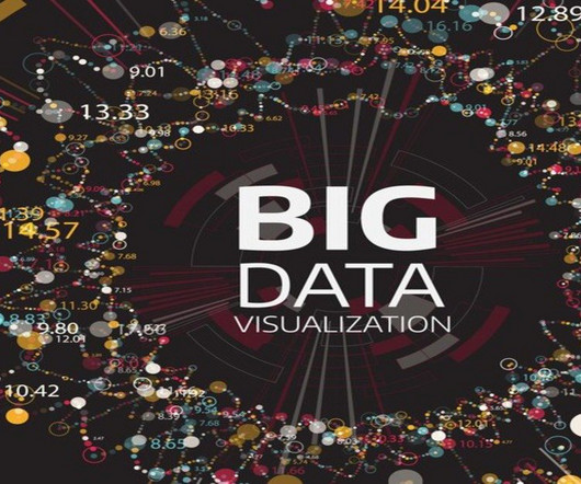
Summary: Big Datavisualization involves representing large datasets graphically to reveal patterns, trends, and insights that are not easily discernible from raw data. quintillion bytes of data daily, the need for effective visualization techniques has never been greater. As we generate approximately 2.5
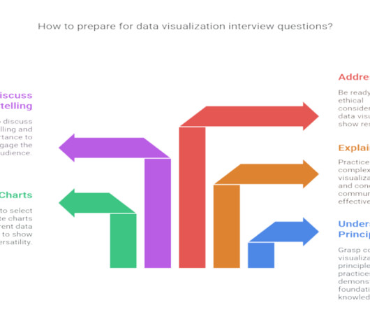
Summary : Prepare for your datavisualization interview with our guide to the top questions and answers. Introduction Datavisualization is no longer just a niche skill; it’s a fundamental component of DataAnalysis , business intelligence, and data science.
For instance, Berkeley’s Division of Data Science and Information points out that entry level data science jobs remote in healthcare involves skills in NLP (Natural Language Processing) for patient and genomic dataanalysis, whereas remote data science jobs in finance leans more on skills in risk modeling and quantitative analysis.
In the sales context, this helps monitor sales data in PowerBI reports and trigger alerts or actions based on real-time changes, ensuring that sales teams can respond quickly to critical events. This enables a deep analysis of sales data, helping to identify what drives demand and what affects sales performance.
This is where a data workflow is essential, allowing you to turn your raw data into actionable insights. In this article, well explore how that workflow covering aspects from data collection to datavisualizations can tackle the real-world challenges.
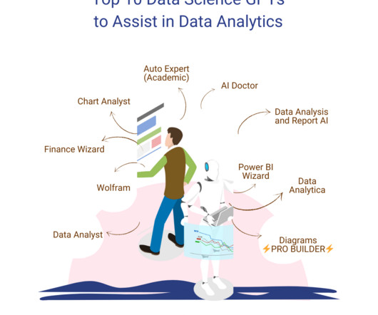
A wide range of applications deals with a variety of tasks, ranging from writing, E-learning, and SEO to medical advice, marketing, dataanalysis, and so much more. However, our focus lies on exploring the GPTs for data science available on the platform. You can upload your data files to this GPT that it can then analyze.
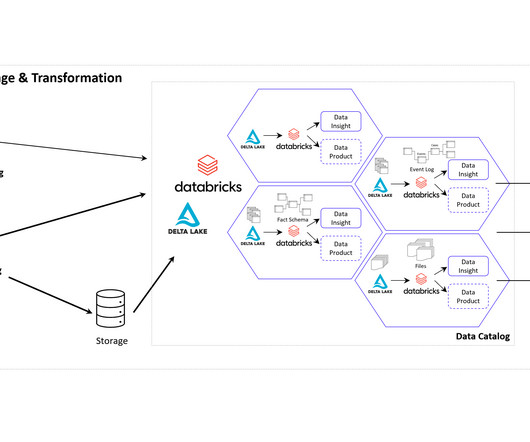
Companies use Business Intelligence (BI), Data Science , and Process Mining to leverage data for better decision-making, improve operational efficiency, and gain a competitive edge. A Data Product can take various forms, depending on the domain’s requirements and the data it manages.
Photo by Nathan Dumlao on Unsplash Let’s dive into the world of dataanalysis. Assuming that you are a data analyst, If not I will help you to become a data analyst by taking you through my experience in the field of dataanalysis. There is just efficient or inefficient dataanalysis only.
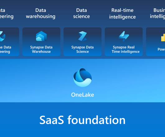
Microsoft Fabric combines multiple elements into a single platform – Image courtesy of Microsoft The contribution of PowerBI The integration of Microsoft PowerBI and Microsoft Fabric offers a powerful combination for organizations seeking comprehensive data analytics and insights.
It can be used for creating interactive visualizations, animations, and more. Link to the repository: [link] Looking to begin exploring, analyzing, and visualizingdata with PowerBI Desktop? Our Introduction to PowerBI training course is designed to assist you in getting started!
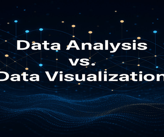
Summary: DataAnalysis focuses on extracting meaningful insights from raw data using statistical and analytical methods, while datavisualization transforms these insights into visual formats like graphs and charts for better comprehension. Is DataAnalysis just about crunching numbers?
Summary: This blog dives into the most promising PowerBI projects, exploring advanced datavisualization, AI integration, IoT & blockchain analytics, and emerging technologies. Discover best practices for successful implementation and propel your organization towards data-driven success.
Open source business intelligence software is a game-changer in the world of dataanalysis and decision-making. It has revolutionized the way businesses approach data analytics by providing cost-effective and customizable solutions that are tailored to specific business needs.
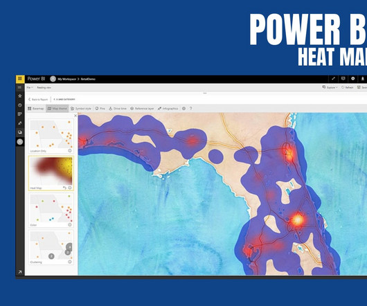
PowerBI Heatmap: Heatmap in PowerBI refers to the type of custom visualisation that businesses analysts utilise for showcasing the relationship between two variables on a map in different colour patches. It offers a wide range of features that make it a popular choice for data professionals, analysts, and organizations.
Augmented analytics is revolutionizing how organizations interact with their data. By harnessing the power of machine learning (ML) and natural language processing (NLP), businesses can streamline their dataanalysis processes and make more informed decisions.
Summary: Datavisualization is the art of transforming complex data sets into easily understandable visuals like charts, graphs, and maps. By presenting information visually, datavisualization allows us to communicate insights clearly and effectively to a wider audience.
When you’re making bar charts or column charts in PowerBI (a tool for showing datavisually), sometimes you want to add a special bar. So, in simpler terms, this message talks about adding a total bar to your charts in PowerBI. Please clap and follow me for more data science articles.
A wide range of applications deals with a variety of tasks, ranging from writing, E-learning, and SEO to medical advice, marketing, dataanalysis, and so much more. However, our focus lies on exploring the GPTs for data science available on the platform. You can upload your data files to this GPT that it can then analyze.
Data Analyst Data Analyst is a featured GPT in the store that specializes in dataanalysis and visualization. You can upload your data files to this GPT that it can then analyze. Other than the advanced dataanalysis, it can also deal with image conversions.
A data science book: Consider gifting a popular and highly recommended book on data science, such as "Python for DataAnalysis" by Wes McKinney or "The Elements of Statistical Learning" by Trevor Hastie, Robert Tibshirani, and Jerome Friedman.
This includes duplicate removal, missing value treatment, variable transformation, and normalization of data. Tools like Python (with pandas and NumPy), R, and ETL platforms like Apache NiFi or Talend are used for data preparation before analysis.
In the world of datavisualization , the ability to produce material that can speak to your audience, regardless of their technical expertise, is an ever-important factor to consider. Tableau Public Tableau Public , a powerfuldatavisualization software, empowers users to create interactive and shareable dashboards with ease.
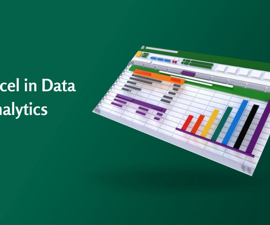
Accordingly, Data Analysts use various tools for DataAnalysis and Excel is one of the most common. Significantly, the use of Excel in DataAnalysis is beneficial in keeping records of data over time and enabling datavisualization effectively. What is DataAnalysis?
Data Storytelling in Action: This panel will discuss the importance of datavisualization in storytelling in different industries, different visualization tools, tips on improving one’s visualization skills, personal experiences, breakthroughs, pressures, and frustrations as well as successes and failures.
Introduction The world is transforming by AI, ML, Blockchain, and Data Science drastically, and hence its community is growing rapidly. So, to provide our community with the knowledge they need to master these domains, Analytics Vidhya has launched its DataHour sessions.
Data science bootcamps are intensive short-term educational programs designed to equip individuals with the skills needed to enter or advance in the field of data science. They cover a wide range of topics, ranging from Python, R, and statistics to machine learning and datavisualization.
Introduction Analytics Vidhya DataHour is designed to provide valuable insights and knowledge to individuals looking to build a career in the data-tech industry. These sessions cover a wide range of topics, from the fields of artificial intelligence, and machine learning, and various topics related to data science.
Proper data preprocessing is essential as it greatly impacts the model performance and the overall success of dataanalysis tasks ( Image Credit ) Data integration Data integration involves combining data from various sources and formats into a unified and consistent dataset.
There is a plethora of BI tools available in the market today, with new ones being added yearly. Through a comparative analysis of some of the leading BI tools: Google Looker, Microsoft PowerBI, Tableau and Qlik Sense, discover which BI solution best fits your organization’s data analytics needs to empower informed decision-making.
Summary: Conditional formatting in PowerBI transforms data visualisation by dynamically adjusting visual elements based on data values. Introduction Microsoft PowerBI has a 15.62% market share in data visualisation, making it a leading tool for transforming data into actionable insights.
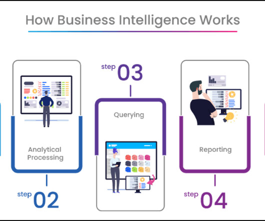
Summary: Business Intelligence Analysts transform raw data into actionable insights. They use tools and techniques to analyse data, create reports, and support strategic decisions. Key skills include SQL, datavisualization, and business acumen. Introduction We are living in an era defined by data.
Datavisualization tools like Tableau and PowerBI can be applied to inform decisions. A6: A Business Analyst commonly relies on platforms like Tableau , PowerBI , and Excel for data visualisation , reporting, and analysis to manage and interpret data across projects effectively.
You can perform dataanalysis within SQL Though mentioned in the first example, let’s expand on this a bit more. SQL allows for some pretty hefty and easy ad-hoc dataanalysis for the data professional on the go. One set of tools that are becoming more important in our data-driven world is BI tools.
These tools enable organizations to convert raw data into actionable insights through various means such as reporting, analytics, datavisualization, and performance management. Data Processing: Cleaning and organizing data for analysis.
Overview: Data science vs data analytics Think of data science as the overarching umbrella that covers a wide range of tasks performed to find patterns in large datasets, structure data for use, train machine learning models and develop artificial intelligence (AI) applications.
We organize all of the trending information in your field so you don't have to. Join 17,000+ users and stay up to date on the latest articles your peers are reading.
You know about us, now we want to get to know you!
Let's personalize your content
Let's get even more personalized
We recognize your account from another site in our network, please click 'Send Email' below to continue with verifying your account and setting a password.


Let's personalize your content