This site uses cookies to improve your experience. To help us insure we adhere to various privacy regulations, please select your country/region of residence. If you do not select a country, we will assume you are from the United States. Select your Cookie Settings or view our Privacy Policy and Terms of Use.
Cookie Settings
Cookies and similar technologies are used on this website for proper function of the website, for tracking performance analytics and for marketing purposes. We and some of our third-party providers may use cookie data for various purposes. Please review the cookie settings below and choose your preference.
Used for the proper function of the website
Used for monitoring website traffic and interactions
Cookie Settings
Cookies and similar technologies are used on this website for proper function of the website, for tracking performance analytics and for marketing purposes. We and some of our third-party providers may use cookie data for various purposes. Please review the cookie settings below and choose your preference.
Strictly Necessary: Used for the proper function of the website
Performance/Analytics: Used for monitoring website traffic and interactions
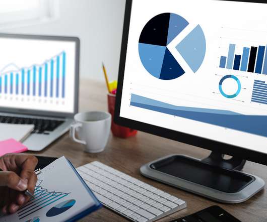
Efficient decision-making is the result of combining information, analysis, and effectiveness. That’s why businesses of all types and sizes are embracing data visualization, albeit often with a simplified approach.
In today’s fast-paced business landscape, making informed decisions is essential for the success of organizations. Both MS Excel and PowerBI offer impressive capabilities regarding dataanalysis and decision-making. This […] The post Excel vs PowerBI – Which is a Better for Decision Making?
Introduction Imagine you and your team are sitting with a huge set of data coming from different sources. It may not be easy to incorporate, sort and analyze such information for presentation purposes to be meaningful. It is at this juncture that PowerBI Semantic Models are useful. appeared first on Analytics Vidhya.
Dataanalysis is an essential process in today’s world of business and science. It involves extracting insights from large sets of data to make informed decisions. One of the most common ways to represent a dataanalysis is through code. However, is code the best way to represent a dataanalysis?
Data is an essential component of any business, and it is the role of a data analyst to make sense of it all. PowerBI is a powerfuldata visualization tool that helps them turn raw data into meaningful insights and actionable decisions. Check out this course and learn PowerBI today!
DataAnalysis Expressions (DAX) is a language used in Analysis Services, PowerBI, and Power Pivot in Excel. The Basics of DAX for DataAnalysis DAX is a powerful language that can be used to create dynamic and informative reports that can help you make better decisions.
DataAnalysis Expressions (DAX) is a language used in Analysis Services, PowerBI, and Power Pivot in Excel. The Basics of DAX for DataAnalysis DAX is a powerful language that can be used to create dynamic and informative reports that can help you make better decisions.
Synapse Data Science: Synapse Data Science empowers data scientists to work directly with secured and governed sales data prepared by engineering teams, allowing for the efficient development of predictive models.
Whether it’s finance, healthcare, or tech, each sector has unique data requirements. They work closely with database administrators to ensure data integrity, develop reporting tools, and conduct thorough analyses to inform business strategies. You could apply your skills in industries like finance, healthcare, and even fashion.
Data visualization is the art of presenting complex information in a way that is easy to understand and analyze. With the explosion of data in today’s business world, the ability to create compelling data visualizations has become a critical skill for anyone working with data.
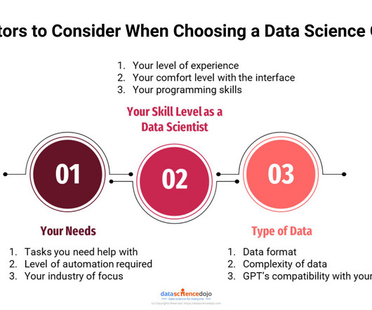
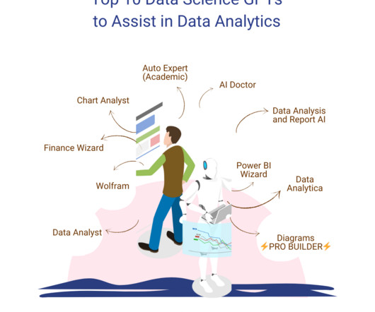
A wide range of applications deals with a variety of tasks, ranging from writing, E-learning, and SEO to medical advice, marketing, dataanalysis, and so much more. However, our focus lies on exploring the GPTs for data science available on the platform. You can upload your data files to this GPT that it can then analyze.
Providers like Opta, Statsbomb, and Wyscout provide users with data from different leagues all over the world. FBRef provides users with football statistics for free, while Statsbomb offers a few free resources for event data for practice. You may combine event data (e.g., shot types and results) with tracking data (e.g.,
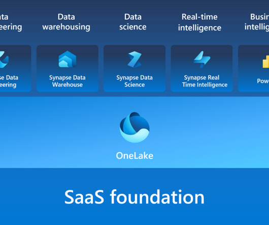
Microsoft Fabric combines multiple elements into a single platform – Image courtesy of Microsoft The contribution of PowerBI The integration of Microsoft PowerBI and Microsoft Fabric offers a powerful combination for organizations seeking comprehensive data analytics and insights.
Open source business intelligence software is a game-changer in the world of dataanalysis and decision-making. It has revolutionized the way businesses approach data analytics by providing cost-effective and customizable solutions that are tailored to specific business needs. What is open source business intelligence?
Summary: This blog dives into the most promising PowerBI projects, exploring advanced data visualization, AI integration, IoT & blockchain analytics, and emerging technologies. Discover best practices for successful implementation and propel your organization towards data-driven success.
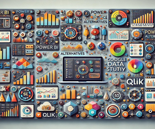
Summary: PowerBI alternatives like Tableau, Qlik Sense, and Zoho Analytics provide businesses with tailored DataAnalysis and Visualisation solutions. Selecting the right alternative ensures efficient data-driven decision-making and aligns with your organisation’s goals and budget. What is PowerBI?
Summary: PowerBI is a business analytics tool transforming data into actionable insights. Key features include AI-powered analytics, extensive data connectivity, customisation options, and robust data modelling. Customisable dashboards and reports enhance data presentation. Why PowerBI?
Summary : Microsoft Fabric is an end-to-end Data Analytics platform designed for integration, processing, and advanced insights, while PowerBI excels in creating interactive visualisations and reports. Both tools complement each other, enabling seamless data management and visualisation. What is PowerBI?
Summary: PowerBI is a business intelligence tool that transforms raw data into actionable insights. PowerBI enhances decision-making by providing interactive dashboards and reports that are accessible to both technical and non-technical users. What Is PowerBI?
Summary: Counting rows is a fundamental task in PowerBI that requires careful consideration. This blog explores how to get total number of rows in power query. Understanding PowerBI and Its Importance PowerBI is a suite of business analytics tools that allows users to analyze data and share insights.
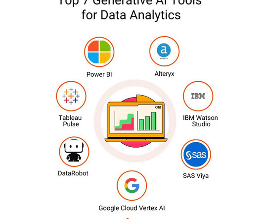
Natural Language Processing (NLP) for Data Interaction Generative AI models like GPT-4 utilize transformer architectures to understand and generate human-like text based on a given context. Impact on Data Analytics: Risk Management : By simulating various outcomes, GenAI helps organizations prepare for potential risks and uncertainties.
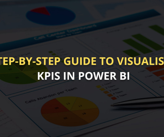
Summary: This guide covers visualising KPI in PowerBI, from setting up the tool and preparing data to selecting the right visuals and enhancing dashboards. Introduction In todays data-driven world, Key Performance Indicators (KPIs) are crucial in guiding business decisions. Clean and structure data for better insights.
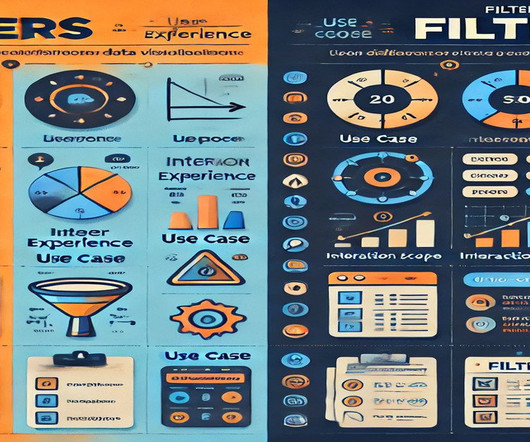
Summary: In PowerBI, slicers and filters serve distinct purposes. Slicers are visual elements that allow users to interactively filter data on the report canvas, enhancing user experience. Filters, on the other hand, are backend features that refine data at various levels—visual, page, or report—without direct user interaction.
Summary: This section outlines key mistakes to avoid when creating dynamic visual displays in PowerBI. Introduction In a world where data is growing exponentially, effective visualisation is crucial. Introduction In a world where data is growing exponentially, effective visualisation is crucial.
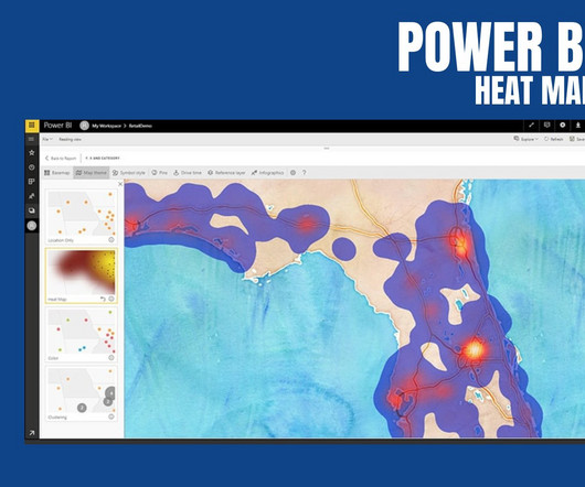
PowerBI Heatmap: Heatmap in PowerBI refers to the type of custom visualisation that businesses analysts utilise for showcasing the relationship between two variables on a map in different colour patches. It offers a wide range of features that make it a popular choice for data professionals, analysts, and organizations.
The Datamarts capability opens endless possibilities for organizations to achieve their data analytics goals on the PowerBI platform. Before we look into the PowerBI Datamarts, let us take a step back and understand the meaning of a Datamart. in an enterprise data warehouse. What is PowerBI Datamarts?
Augmented analytics is revolutionizing how organizations interact with their data. By harnessing the power of machine learning (ML) and natural language processing (NLP), businesses can streamline their dataanalysis processes and make more informed decisions.
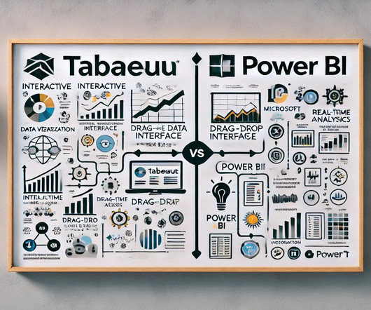
Summary: Data Visualisation is crucial to ensure effective representation of insights tableau vs powerbi are two popular tools for this. This article compares Tableau and PowerBI, examining their features, pricing, and suitability for different organisations. What is PowerBI? billion in 2023.
A wide range of applications deals with a variety of tasks, ranging from writing, E-learning, and SEO to medical advice, marketing, dataanalysis, and so much more. However, our focus lies on exploring the GPTs for data science available on the platform. You can upload your data files to this GPT that it can then analyze.
When it comes to data analytics , not much is easier to use than a spreadsheet. For this reason, spreadsheets have been the predominant tool when it comes to basic dataanalysis for the past 20 years. If you work with data, you’ve done work in Excel or Google Sheets. Great Power. Easy, Powerful, and Flexible.
It makes them more versatile as they are not limited to handling textual information, but can process multimodal forms of data. Other data science tasks include data preprocessing, visualization, and statistical analysis. You can upload your data files to this GPT that it can then analyze.
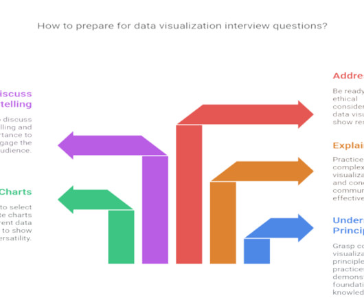
Introduction Data visualization is no longer just a niche skill; it’s a fundamental component of DataAnalysis , business intelligence, and data science. This blog post breaks down top data visualization interview questions into two categories: Beginner and Advanced. Now, let’s get to the questions!
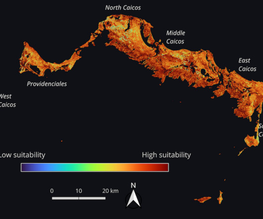
One critical tool for understanding and improving the urgent challenges facing our world is Earth observation (EO) data, meaning data that is gathered in outer space about life here on Earth! Earth observation data provides accurate and free information on our atmosphere, oceans, ecosystems, land cover, and built environment.
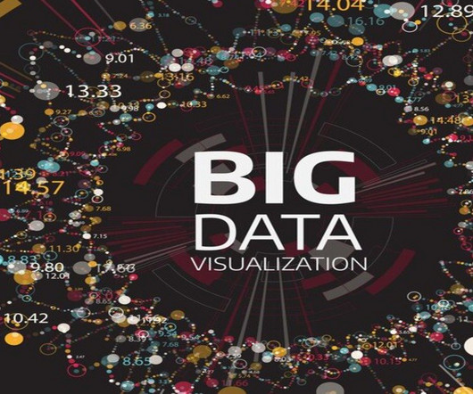
Summary: Big Data visualization involves representing large datasets graphically to reveal patterns, trends, and insights that are not easily discernible from raw data. Importance of Big Data Visualization The significance of Big Data Visualization lies in its ability to simplify complex datasets and facilitate decision-making.
Cleaning data: Once the data has been gathered, it needs to be cleaned. This involves removing any errors or inconsistencies in the data. Exploratory dataanalysis (EDA): EDA is a process of exploring data to gain insights into its distribution, relationships, and patterns.
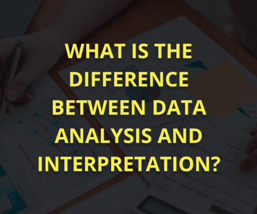
Summary: DataAnalysis and interpretation work together to extract insights from raw data. Analysis finds patterns, while interpretation explains their meaning in real life. Overcoming challenges like data quality and bias improves accuracy, helping businesses and researchers make data-driven choices with confidence.
In this era of information overload, utilizing the power of data and technology has become paramount to drive effective decision-making. Decision intelligence is an innovative approach that blends the realms of dataanalysis, artificial intelligence, and human judgment to empower businesses with actionable insights.
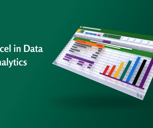
Accordingly, Data Analysts use various tools for DataAnalysis and Excel is one of the most common. Significantly, the use of Excel in DataAnalysis is beneficial in keeping records of data over time and enabling data visualization effectively. What is DataAnalysis?
PowerBI is a versatile and scalable platform that combines self-service and enterprise business intelligence (BI) capabilities. It serves as a comprehensive solution for connecting to diverse data sources and creating compelling visualizations. What is the SWITCH Function?
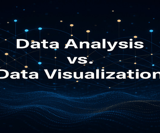
Summary: DataAnalysis focuses on extracting meaningful insights from raw data using statistical and analytical methods, while data visualization transforms these insights into visual formats like graphs and charts for better comprehension. But raw data, in its unprocessed state, is often just noise.
Business intelligence projects merge data from various sources for a comprehensive view ( Image credit ) Good business intelligence projects have a lot in common One of the cornerstones of a successful business intelligence (BI) implementation lies in the availability and utilization of cutting-edge BI tools such as Microsoft’s Fabric.
In addition to Business Intelligence (BI), Process Mining is no longer a new phenomenon, but almost all larger companies are conducting this data-driven process analysis in their organization. The creation of this data model requires the data connection to the source system (e.g.
By analyzing the sentiment of users towards certain products, services, or topics, sentiment analysis provides valuable insights that empower businesses and organizations to make informed decisions, gauge public opinion, and improve customer experiences.
We organize all of the trending information in your field so you don't have to. Join 17,000+ users and stay up to date on the latest articles your peers are reading.
You know about us, now we want to get to know you!
Let's personalize your content
Let's get even more personalized
We recognize your account from another site in our network, please click 'Send Email' below to continue with verifying your account and setting a password.


Let's personalize your content