This site uses cookies to improve your experience. To help us insure we adhere to various privacy regulations, please select your country/region of residence. If you do not select a country, we will assume you are from the United States. Select your Cookie Settings or view our Privacy Policy and Terms of Use.
Cookie Settings
Cookies and similar technologies are used on this website for proper function of the website, for tracking performance analytics and for marketing purposes. We and some of our third-party providers may use cookie data for various purposes. Please review the cookie settings below and choose your preference.
Used for the proper function of the website
Used for monitoring website traffic and interactions
Cookie Settings
Cookies and similar technologies are used on this website for proper function of the website, for tracking performance analytics and for marketing purposes. We and some of our third-party providers may use cookie data for various purposes. Please review the cookie settings below and choose your preference.
Strictly Necessary: Used for the proper function of the website
Performance/Analytics: Used for monitoring website traffic and interactions
In this tutorial for JavaScript developers, I’ll demonstrate how to integrate our graph visualization SDKs with Neo4j to create a powerful datavisualization web app. FREE: Start your KeyLines trial today Visualize your data! Request full access to our KeyLines SDK, demos and live-coding playground.
Cut costs by consolidating data warehouse investments. Think of Tableau as your datavisualization and business intelligence layer on top of Genie—allowing you to see, understand, and act on your live customer data. Harmonize your customer data into a unified view by mapping data sources into shared datamodels in Genie.
Cut costs by consolidating data warehouse investments. Think of Tableau as your datavisualization and business intelligence layer on top of Genie—allowing you to see, understand, and act on your live customer data. Harmonize your customer data into a unified view by mapping data sources into shared datamodels in Genie.
Most successful investigators bring datavisualization into their due diligence workflow. Graph visualization (link analysis) and ‘pattern-of-life’ timelines are essential for compliance because they put users in control of the investigation, giving them an intuitive way to navigate and organize the information they’re exploring.
When you design your datamodel, you’ll probably begin by sketching out your data in a graph format – representing entities as nodes and relationships as links. Working in a graph database means you can take that whiteboard model and apply it directly to your schema with relatively few adaptations.
Development - High quality model training, fine-tuning or prompt tuning, validation and deployment with CI/CD for ML. Application - Bringing business value to live applications through a real-time application pipeline that handles requests, data, model and validations. Check out this demo of fine-tuning a gen AI chatbot.
FREE: Managing fraud The ultimate guide to fraud detection, investigation and prevention using datavisualization GET YOUR FREE GUIDE The role of new & existing technology For many years, credit card companies have relied on analytics, algorithms and decision trees to power their fraud strategy.
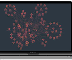
FREE: Start your ReGraph trial today Visualize your data! Request full access to our ReGraph SDK, demos and live-coding playground. We now have a Neo4j instance connected to a working ReGraph application, ready to visualize graphs. The datamodel Our Sandbox contains a subset of Neo4j-related Stack Overflow questions.
But its status as the go-between for programming and data professionals isn’t its only power. Within SQL you can also filter data, aggregate it and create valuations, manipulate data, update it, and even do datamodeling.
Analysts rely on our datavisualization toolkits to spot hidden patterns in their visualizeddata. What role can interactive datavisualization play? If you’re ready to start visualizing your data on a map, sign up for a free trial. FREE: Start your KeyLines trial today Visualize your data!
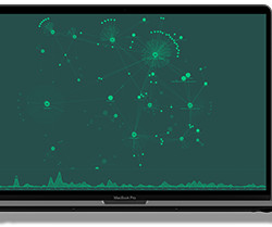
Graph visualization SDKs would have been a huge asset to those projects. To prove this, I built my own digital twin using the KeyLines graph visualization toolkit. Let’s see how advanced datavisualization can illuminate these models and uncover powerful insights. FREE: Start your trial today Visualize your data!
Think of Tableau as your datavisualization and business intelligence layer on top of Data Cloud—allowing you to see, understand, and act on your live customer data. These features cover functionality for enterprise customer data in five key categories: Connect, Harmonize, Unify, Analyze and Predict, and Act.
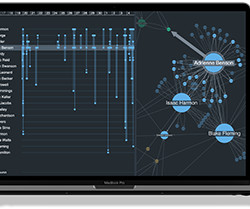
Bring world champion chess matches to life with KronoGraph & KeyLines Many of our customers integrate their visual analysis tools with Azure Cosmos DB because it lets them store both graph and tabular data, and choose which API they want to use for queries. Which data elements should be nodes and what should connect them?
These steps include defining business and project objectives, acquiring and exploring data, modeling the data with various algorithms, interpreting and communicating the project outcome, and implementing and maintaining the project. catboost is the machine learning algorithm for model building. Flask==2.1.2 xgboost==1.6.1
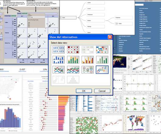
I did not realize as Chris demoed his prototype PhD system that it would become Tableau Desktop , a product used today by millions of people around the world to see and understand data, including in Fortune 500 companies, classrooms, and nonprofit organizations. Relationships in Tableau 2020.2 (May Beginning in Tableau 2020.2,
I did not realize as Chris demoed his prototype PhD system that it would become Tableau Desktop , a product used today by millions of people around the world to see and understand data, including in Fortune 500 companies, classrooms, and nonprofit organizations. Relationships in Tableau 2020.2 (May Beginning in Tableau 2020.2,
Link styles arent just meant to look beautiful: they convey important information in a concise, efficient way Link visualization styles: best practice Our datavisualization toolkit approach gives near-limitless styling options. Effective link styling should be an important consideration for your graph visualizationdatamodel.
Our toolkits work with any data source, which means we can carry out visual network analysis of these donations – a much more effective way to spot unusual connections and patterns. See my article on visualizing graph data without a graph database You can evaluate our tools for free.
We organize all of the trending information in your field so you don't have to. Join 17,000+ users and stay up to date on the latest articles your peers are reading.
You know about us, now we want to get to know you!
Let's personalize your content
Let's get even more personalized
We recognize your account from another site in our network, please click 'Send Email' below to continue with verifying your account and setting a password.


Let's personalize your content