This site uses cookies to improve your experience. To help us insure we adhere to various privacy regulations, please select your country/region of residence. If you do not select a country, we will assume you are from the United States. Select your Cookie Settings or view our Privacy Policy and Terms of Use.
Cookie Settings
Cookies and similar technologies are used on this website for proper function of the website, for tracking performance analytics and for marketing purposes. We and some of our third-party providers may use cookie data for various purposes. Please review the cookie settings below and choose your preference.
Used for the proper function of the website
Used for monitoring website traffic and interactions
Cookie Settings
Cookies and similar technologies are used on this website for proper function of the website, for tracking performance analytics and for marketing purposes. We and some of our third-party providers may use cookie data for various purposes. Please review the cookie settings below and choose your preference.
Strictly Necessary: Used for the proper function of the website
Performance/Analytics: Used for monitoring website traffic and interactions
ArticleVideo Book This article was published as a part of the DataScience Blogathon Introduction In applied Statistics and Machine Learning, DataVisualization is one. The post Must Known DataVisualization Techniques for DataScience appeared first on Analytics Vidhya.
ArticleVideo Book This article was published as a part of the DataScience Blogathon DataVisualizationDataVisualization techniques involve the generation of graphical or. The post Effective DataVisualization Techniques in DataScience Using Python appeared first on Analytics Vidhya.
Remote work quickly transitioned from a perk to a necessity, and datascience—already digital at heart—was poised for this change. For data scientists, this shift has opened up a global market of remote datascience jobs, with top employers now prioritizing skills that allow remote professionals to thrive.
ArticleVideo Book This article was published as a part of the DataScience Blogathon. What is datavisualization? ” The post A Complete Beginner’s Guide to DataVisualization appeared first on Analytics Vidhya. “A picture speaks a thousand words.”
This article was published as a part of the DataScience Blogathon. Introduction DataVisualization is used to present the insights in a given dataset. With meaningful and eye-catching charts, it becomes easier to communicate data analysis findings.
This article was published as a part of the DataScience Blogathon. Overview In this article, we will be dealing with Walmart’s sales dataset and will follow all the data analysis steps on the same and as a result, will try to get some business-related insights from the operations we will be performing on this dataset. […].
This article was published as a part of the DataScience Blogathon. Introduction to Sankey Diagram for DataVisualization Very often, we are in a situation where we would have to visualize how data flows between entities.
ArticleVideo Book This article was published as a part of the DataScience Blogathon Introduction Matplotlib is a widely used library for datavisualizations. The post Exploring Matplotlib Stylesheets For DataVisualization appeared first on Analytics Vidhya. Matplotlib.
This article was published as a part of the DataScience Blogathon. Introduction Datavisualization is the skill that helps us to interpret the data in a creative and intrusive way. Suppose we break down more aspects of datavisualization.
ArticleVideo Book This article was published as a part of the DataScience Blogathon DATAVISUALIZATION: DataVisualization is one of the parts of descriptive. The post DATAVISUALIZATION : What Is This And Why It Matters appeared first on Analytics Vidhya.
ArticleVideo Book This article was published as a part of the DataScience Blogathon Introduction Datavisualization is the most important step in the life. The post How To Perform DataVisualization with Pandas appeared first on Analytics Vidhya.
ArticleVideo Book This article was published as a part of the DataScience Blogathon Introduction Visualization leverages the power of data in getting insights and. The post Cyberpunk Themed Charts: Advanced DataVisualization in Python appeared first on Analytics Vidhya.
ArticleVideo Book This article was published as a part of the DataScience Blogathon Introduction DataVisualization helps to bridge the gap between numbers and. The post Plotly and cufflinks : Advanced Python DataVisualization Libraries appeared first on Analytics Vidhya.
This article was published as a part of the DataScience Blogathon. The post Using DataVisualization to Explore the Human Space Race! Humankind has always looked up to the stars. Since the dawn of civilization, we have mapped constellations, named planets after Gods and so on.
Are you interested in learning Python for DataScience? Look no further than DataScience Dojo’s Introduction to Python for DataScience course. Python is a powerful programming language used in datascience, machine learning, and artificial intelligence.
This article was published as a part of the DataScience Blogathon Image 1 Introduction I am sure many of you have read several articles around the world stating the buzz around “Machine Learning, “Data Scientist”, “DataVisualization” and so on. A report […].
ArticleVideo Book This article was published as a part of the DataScience Blogathon Like the evolution of humans, datavisualization techniques have also been. The post Lollipop Charts: Advanced DataVisualization in Python appeared first on Analytics Vidhya.
ChatGPT plugins can be used to extend the capabilities of ChatGPT in a variety of ways, such as: Accessing and processing external data Performing complex computations Using third-party services In this article, we’ll dive into the top 6 ChatGPT plugins tailored for datascience. Source: Datacamp 4.
This article was published as a part of the DataScience Blogathon Overview Tableau is a well-known datavisualization tool widely used in the industry and adopted by major firms like Nike, Coca-Cola, Skype, TCS, Accenture, and various other plethoras of companies both large and small.
This article was published as a part of the DataScience Blogathon Introduction This article will introduce you to the Spotfire Business Intelligence tool for creating interactive visualization, performing data analysis, and datascience. Spotfire a major player in the BI space is a product from TIBCO.
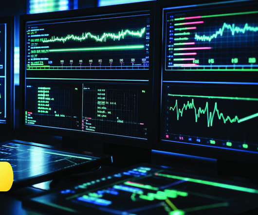
This article was published as a part of the DataScience Blogathon Image credits: Taras Bakusevych Data is the new oil we have heard it so many times. But can we visualize that data in a proper format? With the amount of data at our disposal today, the need to extract insights from it is […].
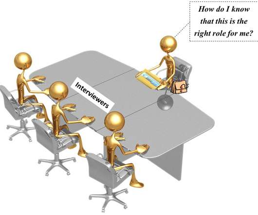
This article was published as a part of the DataScience Blogathon. Introduction You may be asked questions on various topics in a datascience interview. These include statistics, machine learning, probability, datavisualization, data analysis, and behavioral questions.
ArticleVideo Book This article was published as a part of the DataScience Blogathon Introduction Human beings are amongst the most creative species on this. The post 8 Charts You Must Know To Excel In The Art of DataVisualization! appeared first on Analytics Vidhya.
ArticleVideo Book This article was published as a part of the DataScience Blogathon Introduction Data is everywhere in today’s world of data, and we. The post Interactive DataVisualization Plots with Plotly and Cufflinks appeared first on Analytics Vidhya.
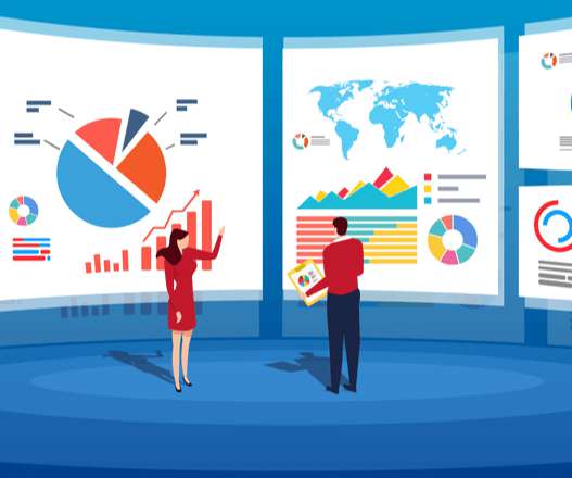
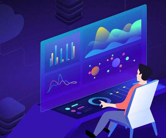
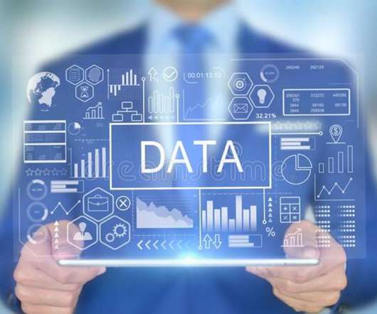
Unlock the full potential of your data with the power of datavisualization! Go through this blog and discover why visualizations are crucial in DataScience and explore the most effective and game-changing types of visualizations that will revolutionize the way you interpret and extract insights from your data.
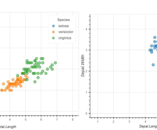
ArticleVideo Book This article was published as a part of the DataScience Blogathon Introduction We all love exploring data. Representing data and interpreting or. The post Understanding Bar Plots in Python : Beginner’s Guide to DataVisualization appeared first on Analytics Vidhya.
Introduction Tableau is a powerful datavisualization tool that is crucial in DataScience. Its significance lies in its ability to transform complex data into easily understandable visualizations, aiding in better decision-making processes.
This is great news for anyone who is interested in a career in datascience. Bureau of Labor Statistics, the job outlook for datascience is estimated to be 36% between 2021–31, significantly higher than the average for all occupations, which is 5%. This makes it an opportune time to pursue a career in datascience.
Navigating the realm of datascience careers is no longer a tedious task. In the current landscape, datascience has emerged as the lifeblood of organizations seeking to gain a competitive edge. They require strong analytical skills, knowledge of statistical analysis, and expertise in datavisualization.
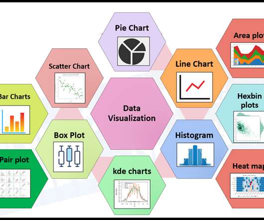
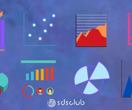
Plots in datascience play a pivotal role in unraveling complex insights from data. Learn about 33 tools to visualizedata with this blog In this blog post, we will delve into some of the most important plots and concepts that are indispensable for any data scientist.
This article was published as a part of the DataScience Blogathon. Introduction This article will discuss some datascience interview questions and their answers to help you fare well in job interviews. These are datascience interview questions and are based on datascience topics.
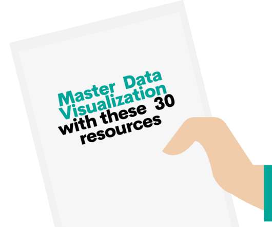
7 Tips To Produce Readable DataScience Code • 30 Resources for Mastering DataVisualization • 15 More Free Machine Learning and Deep Learning Books • Simple and Fast Data Streaming for Machine Learning Projects • The AI Education Gap and How to Close It.
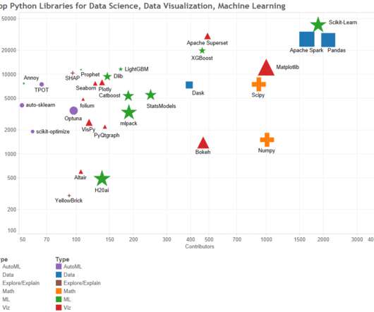
Introduction Strong libraries like Matplotlib, Seaborn, Plotly, and Bokeh serve as the foundation of Python’s datavisualization ecosystem. Together, they provide a wide range of tools for trend analysis, results presentation, and the creation of dynamic dashboards.
Introduction DataScience is everywhere in the 21st century and has emerged as an innovative field. But what exactly is DataScience? And why should one consider specializing in it? This blog post aims to answer these questions and more.
ArticleVideo Book This article was published as a part of the DataScience Blogathon Introduction Our world is becoming more and more digital, especially after. The post Emojize Your DataScience Projects appeared first on Analytics Vidhya.
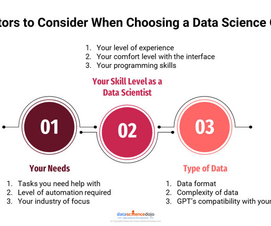
GPTs for Datascience are the next step towards innovation in various data-related tasks. These are platforms that integrate the field of data analytics with artificial intelligence (AI) and machine learning (ML) solutions. However, our focus lies on exploring the GPTs for datascience available on the platform.
DataVisualization is an important aspect of DataScience that enables the data to speak for itself by uncovering the hidden details. Follow this guide to get started with Matplotlib which is one of the most widely used plotting libraries in Python.
This article discusses the key components that contribute to the successful scaling of datascience projects. It covers how to collect data using APIs, how to store data in the cloud, how to clean and process data, how to visualizedata, and how to harness the power of datavisualization through interactive dashboards.
We organize all of the trending information in your field so you don't have to. Join 17,000+ users and stay up to date on the latest articles your peers are reading.
You know about us, now we want to get to know you!
Let's personalize your content
Let's get even more personalized
We recognize your account from another site in our network, please click 'Send Email' below to continue with verifying your account and setting a password.


Let's personalize your content