This site uses cookies to improve your experience. To help us insure we adhere to various privacy regulations, please select your country/region of residence. If you do not select a country, we will assume you are from the United States. Select your Cookie Settings or view our Privacy Policy and Terms of Use.
Cookie Settings
Cookies and similar technologies are used on this website for proper function of the website, for tracking performance analytics and for marketing purposes. We and some of our third-party providers may use cookie data for various purposes. Please review the cookie settings below and choose your preference.
Used for the proper function of the website
Used for monitoring website traffic and interactions
Cookie Settings
Cookies and similar technologies are used on this website for proper function of the website, for tracking performance analytics and for marketing purposes. We and some of our third-party providers may use cookie data for various purposes. Please review the cookie settings below and choose your preference.
Strictly Necessary: Used for the proper function of the website
Performance/Analytics: Used for monitoring website traffic and interactions
This article was published as a part of the DataScience Blogathon. What is PowerBI? Microsoft‘s business analytics product, PowerBI, delivers interactive datavisualizationBI capabilities that allow users to see and share data and insights throughout their organisation.
This article was published as a part of the DataScience Blogathon. Introduction BI tools, including software services, apps, and data connectors, make up the Microsoft PowerBI portfolio. Data from many sources are combined into a single dataset in this cloud-based platform.
This article was published as a part of the DataScience Blogathon. Introduction Microsoft’s PowerBI is one of its rapidly growing corporate analytics services. This self-service business intelligence tool is the latest and greatest in the data-driven industry.
This article was published as a part of the DataScience Blogathon. Table of contents Introduction What is Microsoft PowerBI? The post Getting started with Microsoft PowerBI appeared first on Analytics Vidhya.
This article was published as a part of the DataScience Blogathon. What is equally important here is the ability to communicate the data and insights from your predictive models through reports and dashboards. The post Building your First PowerBI Report from Scratch appeared first on Analytics Vidhya.
Introduction PowerBI has emerged as a formidable tool within datascience, enabling businesses to formulate informed decisions rooted in data-driven insights.
This article was published as a part of the DataScience Blogathon. Introduction PowerBI is one of the most popular datavisualization and analytics software product developed by Microsoft. The post Top 10 PowerBI Interview Questions in 2022 appeared first on Analytics Vidhya.
This article was published as a part of the DataScience Blogathon. Image 1 Introduction In this guide, we explore new BI Technology known as Microsoft PowerBI and let us learn some basics of it before we deep dive. The post A Comprehensive Guide on PowerBI appeared first on Analytics Vidhya.
Remote work quickly transitioned from a perk to a necessity, and datascience—already digital at heart—was poised for this change. For data scientists, this shift has opened up a global market of remote datascience jobs, with top employers now prioritizing skills that allow remote professionals to thrive.
It is at this juncture that PowerBI Semantic Models are useful. They also work in the capacity of […] The post What are PowerBI Semantic Models? It may not be easy to incorporate, sort and analyze such information for presentation purposes to be meaningful. appeared first on Analytics Vidhya.
This article was published as a part of the DataScience Blogathon. Introduction to PowerBI By interpreting raw data into visual representations such as images, diagrams, videos, graphs, and more, PowerBi Custom Visualization allows you to gain insights from your data.
This article was published as a part of the DataScience Blogathon. Introduction to PowerBI In today’s data-driven age, a large amount of data gets generated daily from various sources such as supply chain and logistics, emails and multi-media, e-commerce websites, healthcare, transaction processing systems, etc.
ArticleVideo Book This article was published as a part of the DataScience Blogathon. Microsoft PowerBI is a collection of apps, software services, The post Rise of Microsoft PowerBI as a Data Analytics powerhouse appeared first on Analytics Vidhya.
This article was published as a part of the DataScience Blogathon. Introduction on PowerBI As part of our discussion, we will discuss the features of PowerBI, its benefits, and a detailed description of how to use it for presenting data using an example and creating reports.
Plots in datascience play a pivotal role in unraveling complex insights from data. Learn about 33 tools to visualizedata with this blog In this blog post, we will delve into some of the most important plots and concepts that are indispensable for any data scientist.
Data is an essential component of any business, and it is the role of a data analyst to make sense of it all. PowerBI is a powerfuldatavisualization tool that helps them turn raw data into meaningful insights and actionable decisions.
ArticleVideo Book This article was published as a part of the DataScience Blogathon. This article helps in understanding the importance of data. The post Guide to DataVisualization and Insights appeared first on Analytics Vidhya.
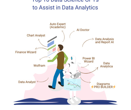
GPTs for Datascience are the next step towards innovation in various data-related tasks. These are platforms that integrate the field of data analytics with artificial intelligence (AI) and machine learning (ML) solutions. However, our focus lies on exploring the GPTs for datascience available on the platform.
Datavisualization is the art of presenting complex information in a way that is easy to understand and analyze. With the explosion of data in today’s business world, the ability to create compelling datavisualizations has become a critical skill for anyone working with data.
This article was published as a part of the DataScience Blogathon. Introduction The following is an in-depth article explaining DAX which stands for Data Analysis Expression. DAX is the language developed by Microsoft to interact with data in a variety of their platforms, such as PowerBI, PowerPivot, and SSAS tabular models.
This blog lists down-trending datascience, analytics, and engineering GitHub repositories that can help you with learning datascience to build your own portfolio. What is GitHub? GitHub is a powerful platform for data scientists, data analysts, data engineers, Python and R developers, and more.
Datascience GPTs are the next step towards innovation in various data-related tasks. OpenAI’s GPT store is designed to make AI-powered solutions more accessible to different community members. However, our focus lies on exploring the datascience GPTs available on the platform.
GPTs for Datascience are the next step towards innovation in various data-related tasks. These are platforms that integrate the field of data analytics with artificial intelligence (AI) and machine learning (ML) solutions. However, our focus lies on exploring the GPTs for datascience available on the platform.
These experiences facilitate professionals from ingesting data from different sources into a unified environment and pipelining the ingestion, transformation, and processing of data to developing predictive models and analyzing the data by visualization in interactive BI reports. Choose a visual of interest.
Datavisualization is the perfect solution to get over the headache. Datavisualization is the art and science of representing data in a visual format, such as charts, graphs, maps, and infographics. We all have faced problems when we interacted with large databases and numbers in tabular format.
Datascience bootcamps are intensive short-term educational programs designed to equip individuals with the skills needed to enter or advance in the field of datascience. They cover a wide range of topics, ranging from Python, R, and statistics to machine learning and datavisualization.
This article was published as a part of the DataScience Blogathon Introduction I have been associated with Analytics Vidya from the 3rd edition of Blogathon. Unlike hackathons, where we are supposed to come up with a theme-oriented project within the stipulated time, blogathons are different.
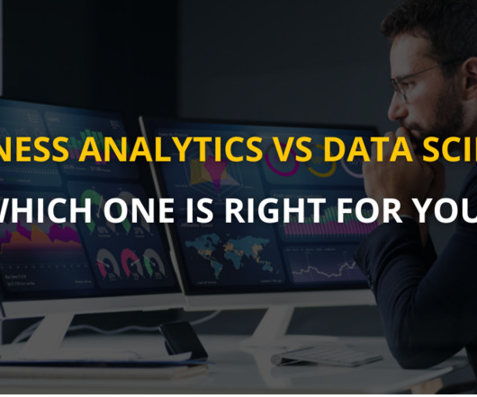
Summary: Business Analytics focuses on interpreting historical data for strategic decisions, while DataScience emphasizes predictive modeling and AI. Introduction In today’s data-driven world, businesses increasingly rely on analytics and insights to drive decisions and gain a competitive edge.
ArticleVideo Book This article was published as a part of the DataScience Blogathon 1. INTRODUCTION Datavisualization is one of the important aspects of. The post Embed PowerBI report in Jupyter Notebook using “powerbiclient” appeared first on Analytics Vidhya.
Introduction The world is transforming by AI, ML, Blockchain, and DataScience drastically, and hence its community is growing rapidly. So, to provide our community with the knowledge they need to master these domains, Analytics Vidhya has launched its DataHour sessions.
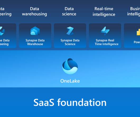
Microsoft Fabric combines multiple elements into a single platform – Image courtesy of Microsoft The contribution of PowerBI The integration of Microsoft PowerBI and Microsoft Fabric offers a powerful combination for organizations seeking comprehensive data analytics and insights.
Furthermore, code is a powerful tool for datavisualization, enabling analysts to create interactive and dynamic visualizations that can be easily shared and understood. Ultimately, the best way to represent data analysis will depend on the audience, the data, and the goals of the analysis.
Introduction Analytics Vidhya DataHour is designed to provide valuable insights and knowledge to individuals looking to build a career in the data-tech industry. These sessions cover a wide range of topics, from the fields of artificial intelligence, and machine learning, and various topics related to datascience.
In March 2023, we had the pleasure of hosting the first edition of the Future of Data and AI conference – an incredible tech extravaganza that drew over 10,000 attendees, featured 30+ industry experts as speakers, and offered 20 engaging panels and tutorials led by the talented team at DataScience Dojo.
Hey there, congratulations on completing that datascience bootcamp ! During that time, you likely learned a lot of valuable skills, discovered your strengths and weaknesses, and learned quite a bit about datascience overall. It’s time to land that sweet datascience job. So, what’s next? Here’s a scenario.
Though you may encounter the terms “datascience” and “data analytics” being used interchangeably in conversations or online, they refer to two distinctly different concepts. Meanwhile, data analytics is the act of examining datasets to extract value and find answers to specific questions.
If you’ve found yourself asking, “How to become a data scientist?” In this detailed guide, we’re going to navigate the exciting realm of datascience, a field that blends statistics, technology, and strategic thinking into a powerhouse of innovation and insights. This is where datavisualization comes in.
ArticleVideo Book This article was published as a part of the DataScience Blogathon. Visualization is the human being’s vehicle to the future – good, The post Power of Visualization and Getting Started with PowerBI appeared first on Analytics Vidhya.
print(llm("Suggest 3 bday gifts for a data scientist"))>>> 1. A subscription to a datascience magazine or journal2. A set of datascience books3. A datascience-themed mug or t-shirt As you can see, we initialize an LLM and call it with a query. turbo", temperature=0.01)conversation_history
When you’re making bar charts or column charts in PowerBI (a tool for showing datavisually), sometimes you want to add a special bar. So, in simpler terms, this message talks about adding a total bar to your charts in PowerBI. Please clap and follow me for more datascience articles.
In the digital era, datavisualization stands as an indispensable tool in the realm of business intelligence. It represents the graphical display of data and information, transforming complex datasets into intuitive and understandable visuals.
Here are some of the key features of open source BI software: Data integration: Open source BI software can pull data from various sources, such as databases, spreadsheets, and cloud services, and integrate it into a single location for analysis. BIDW: What makes business intelligence and data warehouses inseparable?
In the world of datavisualization , the ability to produce material that can speak to your audience, regardless of their technical expertise, is an ever-important factor to consider. Tableau Public Tableau Public , a powerfuldatavisualization software, empowers users to create interactive and shareable dashboards with ease.
Summary: Datavisualization is the art of transforming complex data sets into easily understandable visuals like charts, graphs, and maps. By presenting information visually, datavisualization allows us to communicate insights clearly and effectively to a wider audience.
We organize all of the trending information in your field so you don't have to. Join 17,000+ users and stay up to date on the latest articles your peers are reading.
You know about us, now we want to get to know you!
Let's personalize your content
Let's get even more personalized
We recognize your account from another site in our network, please click 'Send Email' below to continue with verifying your account and setting a password.


Let's personalize your content