This site uses cookies to improve your experience. To help us insure we adhere to various privacy regulations, please select your country/region of residence. If you do not select a country, we will assume you are from the United States. Select your Cookie Settings or view our Privacy Policy and Terms of Use.
Cookie Settings
Cookies and similar technologies are used on this website for proper function of the website, for tracking performance analytics and for marketing purposes. We and some of our third-party providers may use cookie data for various purposes. Please review the cookie settings below and choose your preference.
Used for the proper function of the website
Used for monitoring website traffic and interactions
Cookie Settings
Cookies and similar technologies are used on this website for proper function of the website, for tracking performance analytics and for marketing purposes. We and some of our third-party providers may use cookie data for various purposes. Please review the cookie settings below and choose your preference.
Strictly Necessary: Used for the proper function of the website
Performance/Analytics: Used for monitoring website traffic and interactions
This article explores 20 diverse PowerBI dashboard examples, showcasing how data can be transformed into actionable insights. From sales and marketing to HR and social media, these dashboards offer inspiration for your datavisualization projects.
This article was published as a part of the Data Science Blogathon. What is PowerBI? Microsoft‘s business analytics product, PowerBI, delivers interactive datavisualizationBI capabilities that allow users to see and share data and insights throughout their organisation.
Introduction BI tools, including software services, apps, and data connectors, make up the Microsoft PowerBI portfolio. Data from many sources are combined into a single dataset in this cloud-based platform. The post Understand the Workings of PowerBI appeared first on Analytics Vidhya.
That’s why businesses of all types and sizes are embracing datavisualization, albeit often with a simplified approach. PowerBI and Tableau, popular and user-friendly datavisualization tools, help businesses organize large datasets.
Introduction Microsoft’s PowerBI is one of its rapidly growing corporate analytics services. This self-service business intelligence tool is the latest and greatest in the data-driven industry. It eased the workaround for attaining data from several sources and consolidating it into one management […].
Dealing with and interpreting raw data is never easy, but knowing how to look for essential patterns can be tough, too. However, with better datavisualization, all […] The post How to Create a PowerBI Heatmap? You’re not alone! appeared first on Analytics Vidhya.
Table of contents Introduction What is Microsoft PowerBI? Microsoft PowerBI Concepts Data sources in Microsoft PowerBI Import Excel Data to Microsoft PowerBI Query Editor Inbuilt visuals Conclusion Introduction There is so much data collected in businesses and industries today. […].
Overview A demonstration of statistical analytics by Integrating Python within PowerBI Share the findings using dashboards and reports Introduction PowerBI is. The post Integrating Python in PowerBI: Get the best of both worlds appeared first on Analytics Vidhya.
The post Time Series Forecasting using Microsoft PowerBI appeared first on Analytics Vidhya. Introduction Time series forecasting is a really important area of Machine Learning as it gives you the ability to “see” ahead of time and.
This article was published as a part of the Data Science Blogathon. Introduction PowerBI is one of the most popular datavisualization and analytics software product developed by Microsoft. The post Top 10 PowerBI Interview Questions in 2022 appeared first on Analytics Vidhya.
Visualizations close the gap between big data and a more understandable realization of the data provided. Microsoft’s PowerBI tool is an […] The post Most Used 10 PowerBI Charts appeared first on Analytics Vidhya.
Introduction PowerBI has emerged as a formidable tool within data science, enabling businesses to formulate informed decisions rooted in data-driven insights. Developed by Microsoft, PowerBIVisualizations empower users to visually represent their data and disseminate insights seamlessly across organizational echelons.
What is equally important here is the ability to communicate the data and insights from your predictive models through reports and dashboards. The post Building your First PowerBI Report from Scratch appeared first on Analytics Vidhya. And […].
Overview Understand the importance of Time Intelligence functions in PowerBI Implement Time Intelligence functions in PowerBI with a simple example Introduction. The post Time Intelligence in PowerBI: Capitalize on time appeared first on Analytics Vidhya.
It is at this juncture that PowerBI Semantic Models are useful. They also work in the capacity of […] The post What are PowerBI Semantic Models? It may not be easy to incorporate, sort and analyze such information for presentation purposes to be meaningful. appeared first on Analytics Vidhya.
Image 1 Introduction In this guide, we explore new BI Technology known as Microsoft PowerBI and let us learn some basics of it before we deep dive. The post A Comprehensive Guide on PowerBI appeared first on Analytics Vidhya.
ArticleVideo Book Overview Understand how to create map-based visualizations in PowerBI Explore and compare Bing and ArcGIS maps in PowerBI Introduction In. The post Map-based visualizations in PowerBI – Bing or ArcGIS? Take your call! appeared first on Analytics Vidhya.
Introduction to PowerBI By interpreting raw data into visual representations such as images, diagrams, videos, graphs, and more, PowerBi Custom Visualization allows you to gain insights from your data. The post Top 5 Custom Visuals in PowerBI appeared first on Analytics Vidhya.
This article was published as a part of the Data Science Blogathon. Introduction to PowerBI In today’s data-driven age, a large amount of data gets generated daily from various sources such as supply chain and logistics, emails and multi-media, e-commerce websites, healthcare, transaction processing systems, etc.
ArticleVideo Book This article was published as a part of the Data Science Blogathon. Microsoft PowerBI is a collection of apps, software services, The post Rise of Microsoft PowerBI as a Data Analytics powerhouse appeared first on Analytics Vidhya.
This article was published as a part of the Data Science Blogathon. Introduction on PowerBI As part of our discussion, we will discuss the features of PowerBI, its benefits, and a detailed description of how to use it for presenting data using an example and creating reports.
Introduction PowerBI is a freely available tool from Microsoft for business analytics. It helps you visualizedata and seamlessly share the insights from it with stakeholders. Whether you’re a data scientist, an analyst, or a business user, PowerBI is a must-know tool that can make your work a lot easier.
Introduction to DataVisualization The amount of data has changed in the digital age, becoming both a challenge and an opportunity. Datavisualization has become an efficient method for communicating insights and making sense of complex information.
Datavisualization is the art of presenting complex information in a way that is easy to understand and analyze. With the explosion of data in today’s business world, the ability to create compelling datavisualizations has become a critical skill for anyone working with data.
Data is an essential component of any business, and it is the role of a data analyst to make sense of it all. PowerBI is a powerfuldatavisualization tool that helps them turn raw data into meaningful insights and actionable decisions.
ArticleVideo Book This article was published as a part of the Data Science Blogathon. This article helps in understanding the importance of data. The post Guide to DataVisualization and Insights appeared first on Analytics Vidhya.
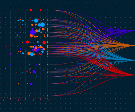
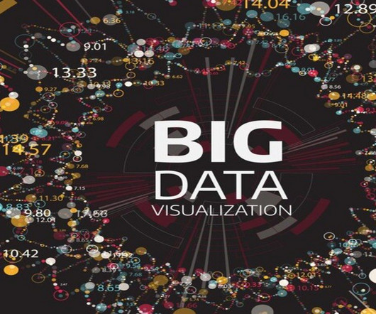
Summary: Big Datavisualization involves representing large datasets graphically to reveal patterns, trends, and insights that are not easily discernible from raw data. quintillion bytes of data daily, the need for effective visualization techniques has never been greater. As we generate approximately 2.5
Datavisualization is the perfect solution to get over the headache. Datavisualization is the art and science of representing data in a visual format, such as charts, graphs, maps, and infographics. As a designer and developer, you know the power of datavisualization to increase user conversion rates.
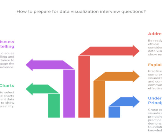
Summary : Prepare for your datavisualization interview with our guide to the top questions and answers. Introduction Datavisualization is no longer just a niche skill; it’s a fundamental component of Data Analysis , business intelligence, and data science. Preparing for these questions is crucial.
Introduction The following is an in-depth article explaining DAX which stands for Data Analysis Expression. DAX is the language developed by Microsoft to interact with data in a variety of their platforms, such as PowerBI, PowerPivot, and SSAS tabular models. It is designed to […].
Employing an analytical system in a data-driven business can help it to discover useful trends, information, conclusions and elevated decision making. PowerBI proves to be the best tool for analysis and visualization of data. Cloud-based PowerBI technology is a forerunner for corporate executives.
In the sales context, this helps monitor sales data in PowerBI reports and trigger alerts or actions based on real-time changes, ensuring that sales teams can respond quickly to critical events. This opens another tab of PowerBI , where you can visualize the sales data and create interactive dashboards.
Explore, analyze, and visualizedata using PowerBI Desktop to make data-driven business decisions. Check out our Introduction to PowerBI cohort. Gini Impurity vs. Entropy: These plots are critical in the field of decision trees and ensemble learning.
This is where a data workflow is essential, allowing you to turn your raw data into actionable insights. In this article, well explore how that workflow covering aspects from data collection to datavisualizations can tackle the real-world challenges.
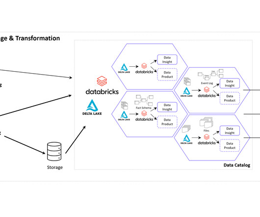
How to Optimize PowerBI and Snowflake for Advanced Analytics Spencer Baucke May 25, 2023 The world of business intelligence and data modernization has never been more competitive than it is today. Table of Contents Why Discuss Snowflake & PowerBI?
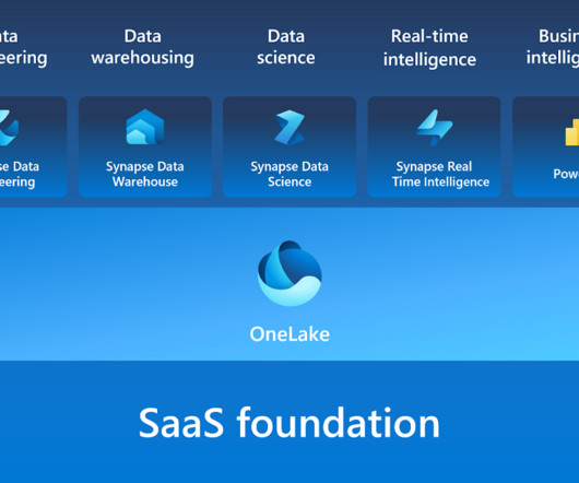
Microsoft Fabric combines multiple elements into a single platform – Image courtesy of Microsoft The contribution of PowerBI The integration of Microsoft PowerBI and Microsoft Fabric offers a powerful combination for organizations seeking comprehensive data analytics and insights.
Furthermore, code is a powerful tool for datavisualization, enabling analysts to create interactive and dynamic visualizations that can be easily shared and understood. Ultimately, the best way to represent data analysis will depend on the audience, the data, and the goals of the analysis.
A Data Product can take various forms, depending on the domain’s requirements and the data it manages. It could be a curated dataset, a machine learning model, an API that exposes data, a real-time data stream, a datavisualization dashboard, or any other data-related asset that provides value to the organization.
Summary: This blog dives into the most promising PowerBI projects, exploring advanced datavisualization, AI integration, IoT & blockchain analytics, and emerging technologies. Discover best practices for successful implementation and propel your organization towards data-driven success.
It can be used for creating interactive visualizations, animations, and more. Link to the repository: [link] Looking to begin exploring, analyzing, and visualizingdata with PowerBI Desktop? Our Introduction to PowerBI training course is designed to assist you in getting started!
Their role is crucial in understanding the underlying data structures and how to leverage them for insights. Key Skills Proficiency in SQL is essential, along with experience in datavisualization tools such as Tableau or PowerBI.
Summary: PowerBI dashboards transform complex data into actionable insights, enabling organizations to make informed decisions quickly. By using powerbi dashboard examples, businesses can can apply effective design principles to enhance collaboration and operational efficiency.
In today’s environment, the need for developers to control, automate, and monitor the lifecycle of their data analytics products is crucial to the success and health of any business. PowerBI Deployment Pipelines give developers the ability to do all three in a single, easy-to-use interface from directly within the PowerBI Service.
ArticleVideo Book This article was published as a part of the Data Science Blogathon 1. INTRODUCTION Datavisualization is one of the important aspects of. The post Embed PowerBI report in Jupyter Notebook using “powerbiclient” appeared first on Analytics Vidhya.
We organize all of the trending information in your field so you don't have to. Join 17,000+ users and stay up to date on the latest articles your peers are reading.
You know about us, now we want to get to know you!
Let's personalize your content
Let's get even more personalized
We recognize your account from another site in our network, please click 'Send Email' below to continue with verifying your account and setting a password.


Let's personalize your content