This site uses cookies to improve your experience. To help us insure we adhere to various privacy regulations, please select your country/region of residence. If you do not select a country, we will assume you are from the United States. Select your Cookie Settings or view our Privacy Policy and Terms of Use.
Cookie Settings
Cookies and similar technologies are used on this website for proper function of the website, for tracking performance analytics and for marketing purposes. We and some of our third-party providers may use cookie data for various purposes. Please review the cookie settings below and choose your preference.
Used for the proper function of the website
Used for monitoring website traffic and interactions
Cookie Settings
Cookies and similar technologies are used on this website for proper function of the website, for tracking performance analytics and for marketing purposes. We and some of our third-party providers may use cookie data for various purposes. Please review the cookie settings below and choose your preference.
Strictly Necessary: Used for the proper function of the website
Performance/Analytics: Used for monitoring website traffic and interactions
Introduction Azure Synapse Analytics is a cloud-based service that combines the capabilities of enterprise data warehousing, big data, data integration, datavisualization and dashboarding. The post Getting Started with Azure Synapse Analytics appeared first on Analytics Vidhya.
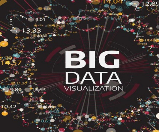
Summary: Big Datavisualization involves representing large datasets graphically to reveal patterns, trends, and insights that are not easily discernible from raw data. quintillion bytes of data daily, the need for effective visualization techniques has never been greater. As we generate approximately 2.5
There is no disputing the fact that the collection and analysis of massive amounts of unstructured data has been a huge breakthrough. We would like to talk about datavisualization and its role in the big data movement. Data is useless without the opportunity to visualize what we are looking for.
ArticleVideos This article was published as a part of the Data Science Blogathon. Introduction Many times we wonder if predictiveanalytics has the. The post AlgoTrading using Technical Indicator and ML models appeared first on Analytics Vidhya.
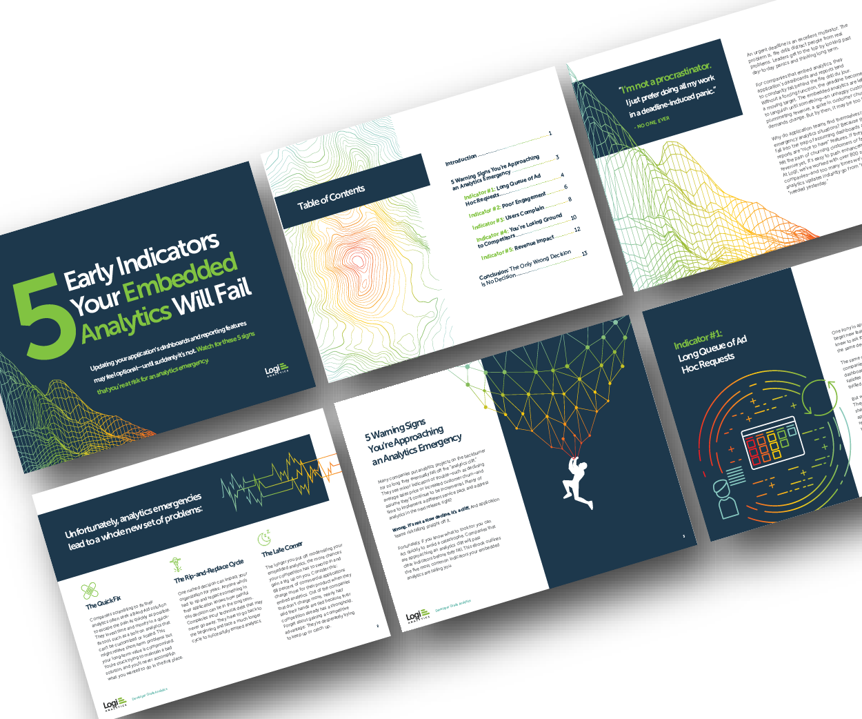
Many application teams leave embedded analytics to languish until something—an unhappy customer, plummeting revenue, a spike in customer churn—demands change. In this White Paper, Logi Analytics has identified 5 tell-tale signs your project is moving from “nice to have” to “needed yesterday.". Brought to you by Logi Analytics.
Summary: IoT datavisualization converts raw sensor data into interactive visuals, enabling businesses to monitor trends, detect anomalies, and improve efficiency. Introduction The Internet of Things (IoT) connects billions of devices, generating massive real-time data streams. What is IoT Visualization?
Here are some of the key types of cloud analytics: Descriptive analytics: This type focuses on summarizing historical data to provide insights into what has happened in the past. It helps organizations understand trends, patterns, and anomalies in their data.
Boot Camp worth $4000 by Data Science Dojo Data Science Dojo is offering an amazing boot camp worth $4000 to attendees of the Future of Data and AI conference. This Data Science boot camp is an intensive five-day program that provides hands-on training in data science, machine learning, and predictiveanalytics.
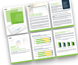
Why do some embedded analytics projects succeed while others fail? We surveyed 500+ application teams embedding analytics to find out which analytics features actually move the needle. Read the 6th annual State of Embedded Analytics Report to discover new best practices. Brought to you by Logi Analytics.
Are you an aspiring data scientist , or just want to understand the benefits of integrating data catalogs with visualization tools? In today’s ever-growing world of data, having an easy way to gain insights quickly is essential. It helps them effectively capture, store, manage, and share data assets.
The integration of AI project management tools has reshaped the landscape, allowing for greater efficiency, predictiveanalytics, and automated task handling. Data-Driven Decision Making With AI’s capability to analyze large sets of data, project managers can now make more informed decisions.
Given your extensive background in administration and management, how do you envision specific data science tools, such as predictiveanalytics, machine learning, and datavisualization, and methodologies like data mining and big data analysis, could enhance public administration and investment management?
Are you an aspiring data scientist , or just want to understand the benefits of integrating data catalogs with visualization tools? In today’s ever-growing world of data, having an easy way to gain insights quickly is essential. It helps them effectively capture, store, manage, and share data assets.
With e-Discovery legal analytics tools, you can filter documents by data range instead of delving through mountains of documents or focus on only those containing the exact keywords. Predictiveanalytics. Predictiveanalytics enable leaders to make more informed decisions.
Data-Driven Approaches to Cybersecurity and Sustainability Data scientists play a critical role in harnessing the power of data to improve both cybersecurity and sustainability efforts. Identifying potential attacks in advance allows organizations to take proactive measures and prevent security breaches.
Here are some of the key features of open source BI software: Data integration: Open source BI software can pull data from various sources, such as databases, spreadsheets, and cloud services, and integrate it into a single location for analysis.
This article was published as a part of the Data Science Blogathon. Introduction Exploratory Data Analysis is an approach to discover the insights in. The post How to Improve Your Business With Exploratory Data Analysis! appeared first on Analytics Vidhya.
We capitalized on the powerful tools provided by AWS to tackle this challenge and effectively navigate the complex field of machine learning (ML) and predictiveanalytics. Our efforts led to the successful creation of an end-to-end product category prediction pipeline, which combines the strengths of SageMaker and AWS Batch.
Establish data governance: Establish clear data governance policies to ensure that your data is accurate, complete, and accessible. Invest in analytics tools: Invest in tools and processes to help you analyze and understand your data effectively. So what are you waiting for?
Data collection from smart meters, weather stations, and sensors empowers us to predict energy demand and production. Datavisualization tools translate complex data into clear visuals, fostering stakeholder engagement and driving progress towards a clean energy future.
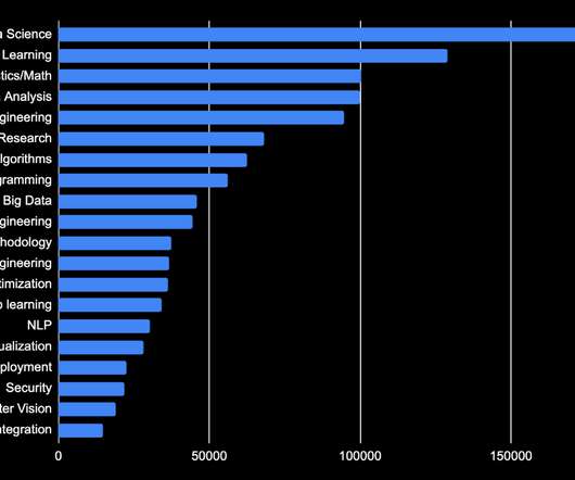
Analytics and Data Analysis Coming in as the 4th most sought-after skill is dataanalytics, as many data scientists will be expected to do some analysis in their careers. Scikit-learn also earns a top spot thanks to its success with predictiveanalytics and general machine learning.
Every Data Scientist needs to know Data Mining as well, but about this moment we will talk a bit later. Where to Use Data Science? Where to Use Data Mining? Therefore, machine learning is of great importance for almost any field, but above all, it will work well where there is Data Science.
Whether it’s datavisualization, natural language processing, or predictiveanalytics, Micro-SaaS products are developed with a razor-sharp focus on providing the best-in-class solutions. These professionals are now looking for streamlined software that can perform a single, complex function exceptionally well.
Having the right data strategy and data architecture is especially important for an organization that plans to use automation and AI for its dataanalytics. The types of dataanalyticsPredictiveanalytics: Predictiveanalytics helps to identify trends, correlations and causation within one or more datasets.
By leveraging AI and machine learning algorithms, they can analyze vast amounts of environmental data, weather patterns, and historical records to provide farmers with real-time insights and predictiveanalytics for informed decision-making.
This data challenge took NFL player performance data and fantasy points from the last 6 seasons to calculate forecasted points to be scored in the 2024 NFL season that began Sept. AI / ML offers tools to give a competitive edge in predictiveanalytics, business intelligence, and performance metrics.
Descriptive Analytics Descriptive analytics focuses on summarizing historical data to gain a better understanding of past events and trends. ” This type of analytics uses various techniques, such as data aggregation, datavisualization , and statistical analysis to provide a comprehensive overview of business performance.
Application of Data Science in Healthcare Data Science in healthcare revolutionizes patient care by enabling early disease detection, personalizing treatment plans, optimizing hospital operations, and enhancing patient engagement. Example: Predicting Heart Disease Heart disease is a leading cause of death worldwide.
If you can analyze data with statistical knowledge or unsupervised machine learning, just extracting data without labeling would be enough. And sometimes ad hoc analysis with simple datavisualization will help your decision makings.
Using the right dataanalytics techniques can help in extracting meaningful insight, and using the same to formulate strategies. The analytics techniques like descriptive analytics, predictiveanalytics, diagnostic analytics and others find application in diverse industries, including retail, healthcare, finance, and marketing.
Offering features like TensorBoard for datavisualization and TensorFlow Extended (TFX) for implementing production-ready ML pipelines, TensorFlow stands out as a comprehensive solution for both beginners and seasoned professionals in the realm of machine learning.
DataAnalytics and Insights AI-powered tools can help collect and analyze large volumes of data, providing actionable insights for informed decision-making. Monday.com excels in datavisualization for project management, sales, and team performance through features like Kanban boards and dashboards.
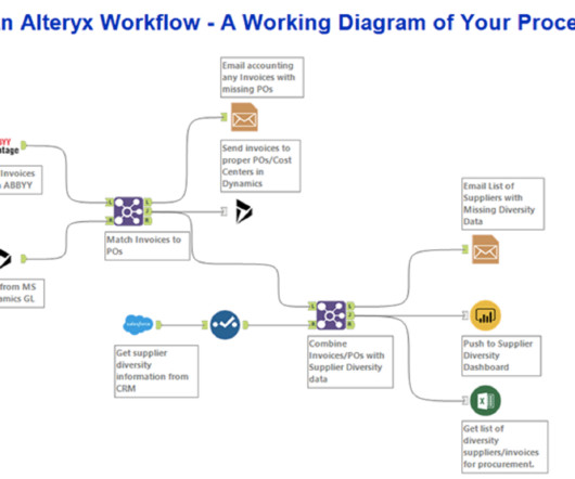
Alteryx’s Capabilities Data Blending: Effortlessly combine data from multiple sources. PredictiveAnalytics: Leverage machine learning algorithms for accurate predictions. Reporting and Visualization: Craft interactive dashboards and reports seamlessly. Is Alteryx similar to Tableau?
Aspiring Data Scientists must equip themselves with a diverse skill set encompassing technical expertise, analytical prowess, and domain knowledge. Whether you’re venturing into machine learning, predictiveanalytics, or datavisualization, honing the following top Data Science skills is essential for success.
Business Intelligence tools encompass a variety of software applications designed to collect, process, analyse, and present business data. These tools enable organizations to convert raw data into actionable insights through various means such as reporting, analytics, datavisualization, and performance management.
It is the process of converting raw data into relevant and practical knowledge to help evaluate the performance of businesses, discover trends, and make well-informed choices. Data gathering, data integration, data modelling, analysis of information, and datavisualization are all part of intelligence for businesses.
The Business Impact Data Science isn’t just a buzzword; it’s a strategic necessity for modern businesses. By making data-driven decisions, organizations can increase efficiency, reduce costs, and identify growth opportunities. DataVisualization Presenting data in a comprehensible manner is an art.
DataVisualization and Data Analysis Join some of the world’s most creative minds that are changing the way we visualize, understand, and interact with data. You’ll also learn the art of storytelling, information communication, and datavisualization using the latest open-source tools and techniques.
For instance, if data scientists were building a model for tornado forecasting, the input variables might include date, location, temperature, wind flow patterns and more, and the output would be the actual tornado activity recorded for those days. temperature, salary).
DataVisualization and Data Analysis Join some of the world’s most creative minds that are changing the way we visualize, understand, and interact with data. You’ll also learn the art of storytelling, information communication, and datavisualization using the latest open-source tools and techniques.
This helps managers visualize which skills are missing and where their workforce needs improvement. Use of predictiveanalytics: One of AI’s biggest advantages is its ability to predict future needs. While AI can provide valuable data on skill gaps, translating the information into actionable strategies is key.
The fields have evolved such that to work as a data analyst who views, manages and accesses data, you need to know Structured Query Language (SQL) as well as math, statistics, datavisualization (to present the results to stakeholders) and data mining.
Read More: Use of AI and Big DataAnalytics to Manage Pandemics Overview of Uber’s DataAnalytics Strategy Uber’s DataAnalytics strategy is multifaceted, focusing on real-time data collection, predictiveanalytics, and Machine Learning.
We organize all of the trending information in your field so you don't have to. Join 17,000+ users and stay up to date on the latest articles your peers are reading.
You know about us, now we want to get to know you!
Let's personalize your content
Let's get even more personalized
We recognize your account from another site in our network, please click 'Send Email' below to continue with verifying your account and setting a password.


Let's personalize your content