This site uses cookies to improve your experience. To help us insure we adhere to various privacy regulations, please select your country/region of residence. If you do not select a country, we will assume you are from the United States. Select your Cookie Settings or view our Privacy Policy and Terms of Use.
Cookie Settings
Cookies and similar technologies are used on this website for proper function of the website, for tracking performance analytics and for marketing purposes. We and some of our third-party providers may use cookie data for various purposes. Please review the cookie settings below and choose your preference.
Used for the proper function of the website
Used for monitoring website traffic and interactions
Cookie Settings
Cookies and similar technologies are used on this website for proper function of the website, for tracking performance analytics and for marketing purposes. We and some of our third-party providers may use cookie data for various purposes. Please review the cookie settings below and choose your preference.
Strictly Necessary: Used for the proper function of the website
Performance/Analytics: Used for monitoring website traffic and interactions
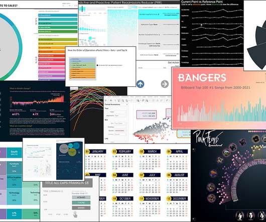
This article was published as a part of the Data Science Blogathon Overview Tableau is a well-known datavisualization tool widely used in the industry and adopted by major firms like Nike, Coca-Cola, Skype, TCS, Accenture, and various other plethoras of companies both large and small.
ArticleVideo Book Objective With Increased use of data, location-based decision making has become an intrinsic part of the Business processes Understand what is Geospatial. The post DataVisualization 101: Geospatial Analysis and Map Visualization in Tableau appeared first on Analytics Vidhya.
This article was published as a part of the Data Science Blogathon This article covers all the basic to intermediate concepts and features of Tableau from scratch. This is the perfect article for you if you are an absolute beginner in Tableau.
There has been a debate in the industry between R and Tableau. Source – Author What is DataVisualization? Datavisualization is an interdisciplinary field that uses visual elements […]. The post Comparing R and Tableau for Data Visualisation appeared first on Analytics Vidhya.
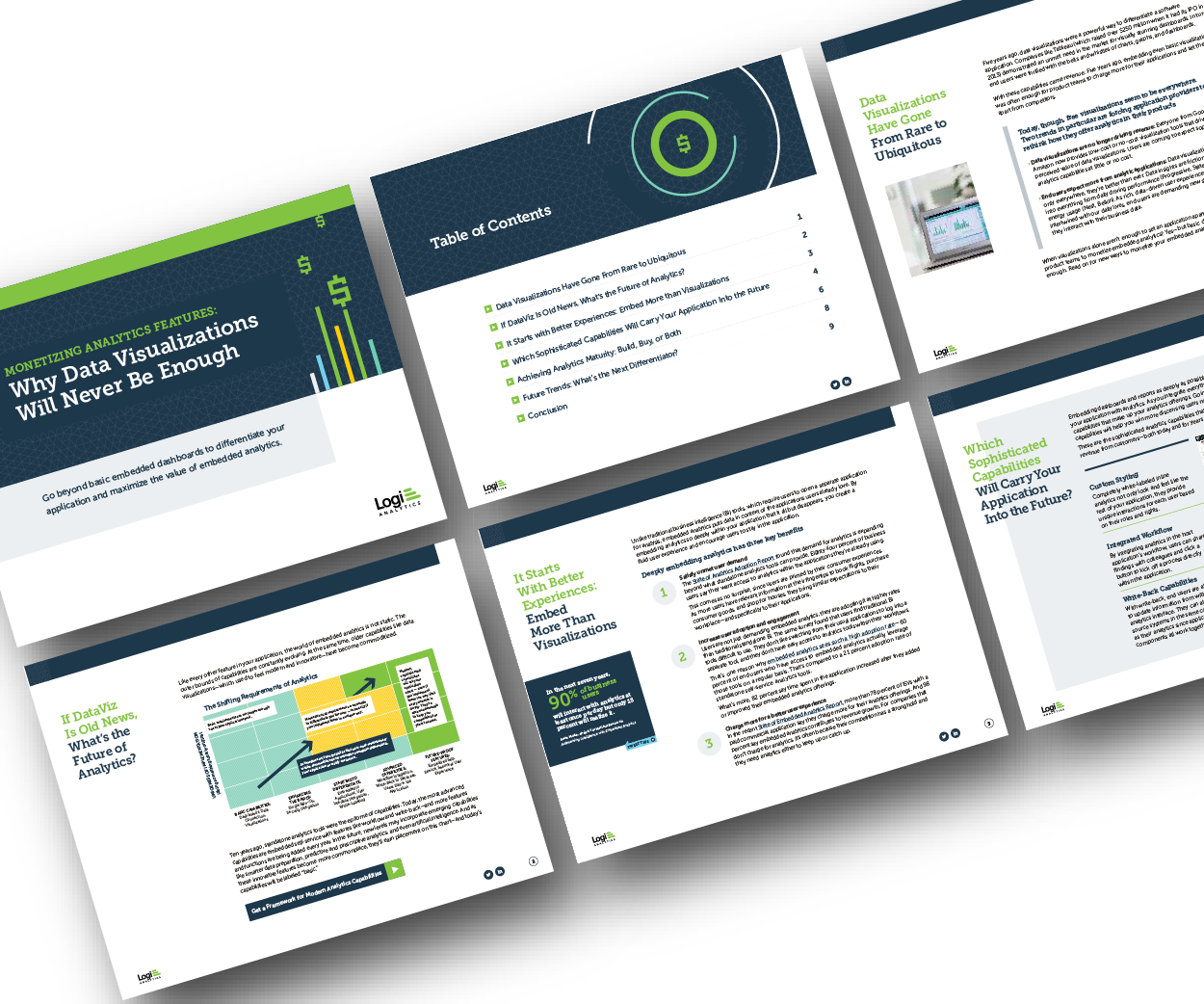
Think your customers will pay more for datavisualizations in your application? But today, dashboards and visualizations have become table stakes. Five years ago they may have. Discover which features will differentiate your application and maximize the ROI of your embedded analytics. Brought to you by Logi Analytics.
Overview A look at 11 mind-blowing and innovative datavisualizations in Python, R, Tableau and D3.js js These datavisualizations span a variety of real-world. The post 11 Innovative DataVisualizations you Should Learn (in Python, R, Tableau and D3.js)
That’s why businesses of all types and sizes are embracing datavisualization, albeit often with a simplified approach. Power BI and Tableau, popular and user-friendly datavisualization tools, help businesses organize large datasets.
Overview Animated visualizations are a work of art and are really easy to create in Tableau We’ll work with open-source datasets here and create. The post Build your own Animated DataVisualization in Tableau in Just 5 Minutes appeared first on Analytics Vidhya.
Introduction Tableau is a powerful datavisualization tool that allows users to analyze and present data interactively and meaningfully. It helps businesses make data-driven decisions by providing easy-to-understand insights and visualizations.
Introduction While Tableau remains a popular choice for datavisualization, its dominance is waning. The increasing importance of data analysis across industries has fueled the demand for versatile tools, leading to a surge in Tableau alternatives.
Introduction In the world of data analytics, where every piece of information holds untapped potential, the ability to transform raw data into actionable insights is a game-changer. Tableau, a dynamic and versatile datavisualization tool, has revolutionized how organizations harness the power of their data.
Introduction Tableau, a powerful datavisualization tool, can sometimes leave users with lingering questions. What’s the best way to display this data? Tableau tackles these issues head-on by leveraging artificial intelligence. Am I missing any key insights?
Introduction Tableau has emerged as a popular datavisualization tool in companies, making it one of the hottest trends in Business Intelligence. In India, people are curious about the Tableau developer salary statistics. We will […] The post What is the Tableau Developer Salary in India?
Introduction Tableau is a powerful datavisualization tool that is crucial in Data Science. Its significance lies in its ability to transform complex data into easily understandable visualizations, aiding in better decision-making processes.
Introduction to DataVisualization The amount of data has changed in the digital age, becoming both a challenge and an opportunity. Datavisualization has become an efficient method for communicating insights and making sense of complex information.
Introduction Tableau is considered one of the most robust datavisualization tools currently in use by companies and individuals globally for efficient data analysis and presentation.
ArticleVideos Objective Tableau is the gold standard for Business Analytics and DataVisualization tools in the industry Learn how to make a Rounded Bar. The post Tableau 101 – Create a Rounded Bar Chart and a Bar-in-Bar Chart in Tableau appeared first on Analytics Vidhya.
Introduction With this Tableau tutorial, you’ll learn how to visualizedata and derive valuable insights from raw data, making dashboards, reports, tables, and more. We will also go through topics like Tableau’s desktop, server, and the various component of Tableau. Tableau is a […].
This article was published as a part of the Data Science Blogathon. Introduction to Tableau Tips! Creating a chart or visual in Tableau is. The post 5 Tableau Tips for Designing a Tidy and Impactful Visualization appeared first on Analytics Vidhya.
This article was published as a part of the Data Science Blogathon. Introduction Tableau is a datavisualization tool created in Salesforce that allows users to connect to any database, like SQL or MongoDB, and interact freely.
This article was published as a part of the Data Science Blogathon. The post Integrate R, Tableau and Excel appeared first on Analytics Vidhya. Introduction There have been many articles online showing how to connect R.
Datavisualization is the art of presenting complex information in a way that is easy to understand and analyze. With the explosion of data in today’s business world, the ability to create compelling datavisualizations has become a critical skill for anyone working with data.
Introduction In today’s data-driven landscape, mastering Tableau has become integral for professionals aiming to extract meaningful insights from diverse datasets.
ArticleVideo Book Objective The dashboard is a powerful concept that allows the user to see the insights hidden deeper in the data. The post Create Your First Dashboard in Tableau appeared first on Analytics Vidhya.
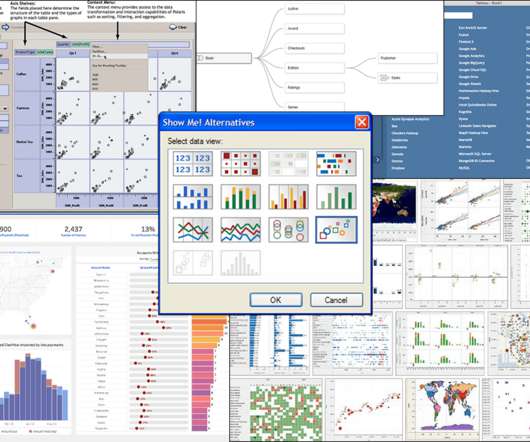
ArticleVideos Introduction I love the wide variety of charts Tableau offers. If we’re ever confused about which chart to design, Tableau offers a ton. The post How to Create a Donut Chart in Tableau appeared first on Analytics Vidhya.
ArticleVideo Book This article was published as a part of the Data Science Blogathon. Introduction Tableau is a powerful DataVisualization software, and much. The post Building a Covid-19 Vaccination Dashboard in Tableau appeared first on Analytics Vidhya.
ArticleVideo Book Note: If you are more interested in learning concepts in an Audio-Visual format, we have this entire article explained in the video. The post Create Dual Axis Charts in Tableau appeared first on Analytics Vidhya.
The post Tableau Tip: Visualize a Single Value Against Others appeared first on Analytics Vidhya. Introduction How often have we all tried to compare a value against a range, with unsatisfying results? Excel is the most common tool for.
ArticleVideo Book This article was published as a part of the Data Science Blogathon. Introduction Datavisualization is the practice of translating data into. The post Top 10 DataVisualization Tools appeared first on Analytics Vidhya.
Overview Tableau vs. Qlik Sense – Each Analytics and Business Intelligence tool has its own distinct set of features We’ll compare Tableau and Qlik. The post Tableau vs. Qlik Sense – Which Analytics and Business Intelligence Tool Should you Use? appeared first on Analytics Vidhya.
This article was published as a part of the Data Science Blogathon. Introduction on Tableau Hi and welcome to this article. Visualization has become a necessary skill that eases the process of communicating with people outside your domain. The post A Step by step on Tableau for Beginner appeared first on Analytics Vidhya.
ArticleVideo Book This article was published as a part of the Data Science Blogathon. Introduction DataVisualization is a graphical way to represent data by. The post Make Your TableauVisuals More Effective – Tips And Tricks appeared first on Analytics Vidhya.
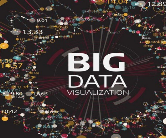
Summary: Big Datavisualization involves representing large datasets graphically to reveal patterns, trends, and insights that are not easily discernible from raw data. quintillion bytes of data daily, the need for effective visualization techniques has never been greater. As we generate approximately 2.5
ArticleVideo Book This article was published as a part of the Data Science Blogathon. Can you tell a story using data? The post From Scratch to a Story – Introduction to Tableau (Part 1) appeared first on Analytics Vidhya. Let us look.
Sam Epley Lead Solution Engineer, Tableau Sarah Molina September 1, 2023 - 3:33pm September 2, 2023 Hello college football fans! My name is Sam and I am a Lead Solution Engineer at Tableau. My journey into the world of datavisualization has led me to embrace a unique passion: college football.
Datavisualization is the perfect solution to get over the headache. Datavisualization is the art and science of representing data in a visual format, such as charts, graphs, maps, and infographics. As a designer and developer, you know the power of datavisualization to increase user conversion rates.
George Peck Success Architect Director Kristin Adderson October 23, 2023 - 2:17pm October 24, 2023 Your first introduction to Tableau Blueprint may have been the Tableau Blueprint Assessment. Or, maybe you’ve gone straight to the main Tableau Blueprint documentation. Tableau Server or Tableau Cloud?
Technical Evangelist Director, Tableau. Welcome to Best of Tableau Web! In just a few days, we’ll all be watching—and I’ll be co-hosting for the fourth time— Iron Viz , the ultimate visualization showdown, at #Data21. Klassen and Tudorancea/Tableau Public]. Calculating the Difference Between Any Two Points in Tableau.
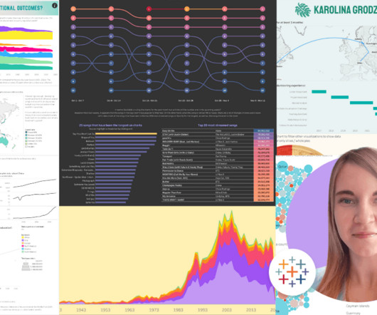
Ateken Abla March 19, 2024 - 9:05pm Larissa Amoroso Vice President, Tableau Community, Tableau When Karolina Grodzinska took the stage at Tableau Conference as part of her Iron Viz: Student Edition award, it felt like the culmination of her data learning, which started in 2021. How did Karolina discover Tableau? “It
Technical Fellow, Tableau. Innovation is necessary to use data effectively in the pursuit of a better world, particularly because data continues to increase in size and richness. I am proud to announce that my History of Tableau Innovation viz is now published to Tableau Public. Jock Mackinlay. Bronwen Boyd.
It’s one of our guiding principles at Tableau and why we support students and instructors around the globe through Tableau Academic Programs. Our mission is to lower the barrier of entry to learning analytics and build data literacy skills in future generations. . Data skills are also interdisciplinary.
National Solutions Engineer, Tableau . If you’ve ever had a conversation with me about datavisualization, you know I’m passionate about color usage. Henry Mark/The Data School UK]. With that, let’s dive into this month’s Best of the Tableau Web and see just what the #DataFam was up to in September! Bronwen Boyd.
Colten Woo November 15, 2023 - 5:12pm Daniel Platt Senior Product Manager, Tableau The quest for timely, accurate, and actionable insights is perennial in the ever-evolving data analytics landscape. Business users and data analysts alike grapple with the challenge of translating vast swathes of data into meaningful narratives.
Chief Product Officer, Tableau. It's more important than ever in this all digital, work from anywhere world for organizations to use data to make informed decisions. However, most organizations struggle to become data driven. With Tableau, any user can visually explore that data in real time.
We organize all of the trending information in your field so you don't have to. Join 17,000+ users and stay up to date on the latest articles your peers are reading.
You know about us, now we want to get to know you!
Let's personalize your content
Let's get even more personalized
We recognize your account from another site in our network, please click 'Send Email' below to continue with verifying your account and setting a password.


Let's personalize your content