This site uses cookies to improve your experience. To help us insure we adhere to various privacy regulations, please select your country/region of residence. If you do not select a country, we will assume you are from the United States. Select your Cookie Settings or view our Privacy Policy and Terms of Use.
Cookie Settings
Cookies and similar technologies are used on this website for proper function of the website, for tracking performance analytics and for marketing purposes. We and some of our third-party providers may use cookie data for various purposes. Please review the cookie settings below and choose your preference.
Used for the proper function of the website
Used for monitoring website traffic and interactions
Cookie Settings
Cookies and similar technologies are used on this website for proper function of the website, for tracking performance analytics and for marketing purposes. We and some of our third-party providers may use cookie data for various purposes. Please review the cookie settings below and choose your preference.
Strictly Necessary: Used for the proper function of the website
Performance/Analytics: Used for monitoring website traffic and interactions
This article was published as a part of the Data Science Blogathon This article was published as a part of the Data Science Blogathon Synopsis of Time Series Analysis A Time-Series represents a series of time-based orders. It would be Years, Months, Weeks, Days, Horus, Minutes, and Seconds A time series is an observation […]. The post A Comprehensive Guide to Time Series Analysis appeared first on Analytics Vidhya.
Big data, specifically with the help of artificial intelligence (AI), empowers insurance companies to make better financial decisions. Data science can help mitigate fraudulent claims, enhance risk management, optimize customer support, and predict future events, among many other benefits. The result is higher profits for insurance companies and lower premiums.
Satoshi Nakamoto introduced the world to bitcoin in 2008. Many people speculated that the virtual currency would never gain traction and become extinct. However, it has grown faster than even some of the staunchest supporters originally predicted. Advances in AI and machine learning technology have been important in setting the trend for bitcoin. It’s been over a decade since the cryptocurrencies were introduced to the world and since it has become increasingly popular.
Speaker: Ben Epstein, Stealth Founder & CTO | Tony Karrer, Founder & CTO, Aggregage
When tasked with building a fundamentally new product line with deeper insights than previously achievable for a high-value client, Ben Epstein and his team faced a significant challenge: how to harness LLMs to produce consistent, high-accuracy outputs at scale. In this new session, Ben will share how he and his team engineered a system (based on proven software engineering approaches) that employs reproducible test variations (via temperature 0 and fixed seeds), and enables non-LLM evaluation m
This article was published as a part of the Data Science Blogathon Overview In this Comprehensive Guide, we are going to be covering the following topics and the end goal is to teach you how to make your own personal intelligent AI chatbot: NLP and its uses in speech interpretation. AI and its uses in […]. The post Complete Guide to build your AI Chatbot with NLP in Python appeared first on Analytics Vidhya.
Artificial intelligence (AI) is transforming every sector and business function, resulting in a growing interest in it, its subcategories, and related areas such as machine learning and data science. While AI and automation might sound like the same concepts to many. But, in terms of procurement, both vary differently. Let’s.
Stacked area charts are a standard chart type that shows how a categorical distribution changes over time. There are packages that can do most of the work for you, but for a recent chart I found myself wanting more control over how the chart was drawn, which led me to drawing from scratch. Become a member for access to this — plus tutorials, courses, and guides.
141
141
Sign up to get articles personalized to your interests!
Data Science Current brings together the best content for data science professionals from the widest variety of thought leaders.
Stacked area charts are a standard chart type that shows how a categorical distribution changes over time. There are packages that can do most of the work for you, but for a recent chart I found myself wanting more control over how the chart was drawn, which led me to drawing from scratch. Become a member for access to this — plus tutorials, courses, and guides.
Artificial intelligence has become essential to modern marketing. Companies are finding newer, more creatives ways to integrate AI into their marketing strategies. This goes for both brand and performance marketing. AI can be useful in both online and offline marketing, but it tends to have greater efficacy in regards to online marketing strategies.
This article was published as a part of the Data Science Blogathon Overview In this article, we will be using OpenCV and dlib to extract faces from a given image and then we will try to mesh both the faces. In short, we will try to mesh the faces from two different images. We will […]. The post Face Mesh Application using OpenCV and dlib appeared first on Analytics Vidhya.
How I learned to stop worrying and love the field This blog covers all the core themes to starting your career in data science: ? Exploration vs Exploitation ? Getting a theoretical edge ? Building your professional portfolio ? Learning how to tell stories with data ❤️ Getting the pulse of the community The demand for data scientists has been steadily rising in the past decade, with industries like retail, medicine and finance claiming the lion’s share.
Welcome to issue #163 of The Process , the newsletter for FlowingData members that looks closer at how the charts get made. I’m Nathan Yau and every month I collect tools and resources to help you make better charts. Here’s the good stuff for October. Become a member for access to this — plus tutorials, courses, and guides.
Speaker: Chris Townsend, VP of Product Marketing, Wellspring
Over the past decade, companies have embraced innovation with enthusiasm—Chief Innovation Officers have been hired, and in-house incubators, accelerators, and co-creation labs have been launched. CEOs have spoken with passion about “making everyone an innovator” and the need “to disrupt our own business.” But after years of experimentation, senior leaders are asking: Is this still just an experiment, or are we in it for the long haul?
Data science careers used to be extremely selective and only those with certain types of traditional credentials were ever considered. While some might suggest that this discouraged those with hands-on experience from ever breaking into the field, it did at least help some companies glean a bit of information about potential hires. Now, however, an increasingly large number of people breaking into the field of data sciences actually aren’t themselves scientists.
This article was published as a part of the Data Science Blogathon Introduction Autoencoders are unstructured learning models that utilize the power of neural networks to perform the task of representation learning. In the context of machine learning, representation learning means embedding the components and features of original data in some low-dimensional structure for better […].
Jason Schumacher. Housing and Homelessness Lead at Tableau Foundation. Doug Minkler. Senior Manager of Product and Technology at Housing Connector. Kristin Adderson. October 29, 2021 - 9:45pm. October 30, 2021. Housing Connector was founded on a belief that no unit should sit vacant while there are individuals in need of a home. Housing Connector helps people like Chauncey Williamson , who spent more than two years applying to over 20 apartments, simply to be turned away each time because of a l
Earth is getting warmer, and the previously abstract concept seems to grow more concrete every day. Probable Futures mapped increasing heat, decreasing cold, and shifting humidity under different warming scenarios. You have the global view shown above, and then when you zoom in enough, you can click on grid cells for the model estimates. Dots on the map point to a handful of short stories on how warming has changed daily life, which I feel like could use more attention.
In this new webinar, Tamara Fingerlin, Developer Advocate, will walk you through many Airflow best practices and advanced features that can help you make your pipelines more manageable, adaptive, and robust. She'll focus on how to write best-in-class Airflow DAGs using the latest Airflow features like dynamic task mapping and data-driven scheduling!
Cloud Computing is the next big thing that is becoming popular all over the world, especially for the bigger Enterprises. People are now open the cloud computing options because they want to save the data for a longer term to make sure that they don’t lose data in case of any emergency. Cloud computing has been in the industry for more than two decades now, and it has been continuously providing competitive benefits to everybody in the industry.
This article was published as a part of the Data Science Blogathon Introduction to Statistics Statistics is a type of mathematical analysis that employs quantified models and representations to analyse a set of experimental data or real-world studies. The main benefit of statistics is that information is presented in an easy-to-understand format. Data processing is […].
Lisa Ginther Huh. Senior IT Audience Expert, Tableau. Spencer Czapiewski. October 26, 2021 - 6:37pm. November 2, 2021. This is the final post in a three-part series about data and analytics governance. In case you missed them, read the first to hear from Tableau’s own data governance team , and the second to learn how good governance accelerates your Data Culture.
Mona Chalabi has a new podcast Am I Normal? and it’s very good: We all want to know if we’re normal—do I have enough friends? Should it take me this long to get over my ex? Should I move or stay where I am? Endlessly curious data journalist Mona Chalabi NEEDS to know, and she’s ready to dive into the numbers to get some answers. But studies and spreadsheets don’t tell the whole story, so she’s consulting experts, strangers, and even her mum to fill in the gaps.
Many software teams have migrated their testing and production workloads to the cloud, yet development environments often remain tied to outdated local setups, limiting efficiency and growth. This is where Coder comes in. In our 101 Coder webinar, you’ll explore how cloud-based development environments can unlock new levels of productivity. Discover how to transition from local setups to a secure, cloud-powered ecosystem with ease.
An interactive analytics application gives users the ability to run complex queries across complex data landscapes in real-time: thus, the basis of its appeal. The application presents a massive volume of unstructured data through a graphical or programming interface using the analytical abilities of business intelligence technology to provide instant insight.
This article was published as a part of the Data Science Blogathon Pose detection is an active field of study in the field of computer vision. You can literally find hundreds of research papers and several models that try to solve the problem of pose detection. The reason why so many machine learning enthusiasts are […]. The post Human Pose Estimation Using Machine Learning in Python appeared first on Analytics Vidhya.
Courtney Jacobsen. Customer Solutions Product Manager. Kristin Adderson. October 23, 2021 - 2:10pm. November 4, 2021. More organizations realized the benefits of being data-driven in the last year—how it fuels business value such as improved performance, competitive advantage, increased productivity, as well as stronger employee retention and customer satisfaction.
The IEEE VIS 2021 conference is running virtually this week, and there’s a lot of work that’s caught my eye but I haven’t had the chance to look through it all yet. One of those things is the alt.VIS workshop that lead into the conference. The papers included such topics as Towards a Theory of B t Visualization , Visualization for Villainy , and Manifesto for Putting Chartjunk in the Trash 2021!
Large enterprises face unique challenges in optimizing their Business Intelligence (BI) output due to the sheer scale and complexity of their operations. Unlike smaller organizations, where basic BI features and simple dashboards might suffice, enterprises must manage vast amounts of data from diverse sources. What are the top modern BI use cases for enterprise businesses to help you get a leg up on the competition?
Data security has become a vital topic of concern for consumers all over the world. Countless people have had to contend with the consequences of having their personal data exposed. Data breaches are most widely publicized when they occur at major corporations, such as Target. Unfortunately, these high profile cases take attention away from the need to invest in data security solutions at home.
This article was published as a part of the Data Science Blogathon What is the need for Hive? The official description of Hive is- ‘Apache Hive data warehouse software project built on top of Apache Hadoop for providing data query and analysis. Hive gives an SQL-like interface to query data stored in various databases and […]. The post Introduction to Partitioned hive table and PySpark appeared first on Analytics Vidhya.
Jason Schumacher. Housing and Homelessness Lead at Tableau Foundation. Doug Minkler. Senior Manager of Product and Technology at Housing Connector. Kristin Adderson. October 29, 2021 - 9:45pm. October 30, 2021. Editor's note: In August 2021, Tableau Foundation made a $550k grant to Housing Connector. This grant will go to supporting Housing Connector's ability to scale outside of the Puget Sound region in Washington state, and the technology that supports their staff's ability to help people fin
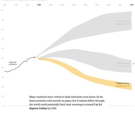
There has been progress since the Paris climate agreement in 2014, but there’s still more to do. Brad Plumer and Nadja Popovich for The New York Times look at the possible paths we could take. Tags: climate change , emissions , New York Times.
Speaker: Mike Rizzo, Founder & CEO, MarketingOps.com and Darrell Alfonso, Director of Marketing Strategy and Operations, Indeed.com
Though rarely in the spotlight, marketing operations are the backbone of the efficiency, scalability, and alignment that define top-performing marketing teams. In this exclusive webinar led by industry visionaries Mike Rizzo and Darrell Alfonso, we’re giving marketing operations the recognition they deserve! We will dive into the 7 P Model —a powerful framework designed to assess and optimize your marketing operations function.
Click to learn more about author Nahla Davies. It’s common for enterprises to run into challenges such as lack of data visibility, problems with data security, and low Data Quality. But despite the dangers of poor data ethics and management, many enterprises are failing to take the steps they need to ensure quality Data Governance. Let’s break […].
This article was published as a part of the Data Science Blogathon Overview Data analysis provides insights from raw data which is used to support decision-making. Microsoft Excel is a simple, powerful, and one of the top tools for data analysis. This comprehensive guide will introduce you to the concepts of data analysis and present […]. The post A Comprehensive Guide on Advanced Microsoft Excel for Data Analysis appeared first on Analytics Vidhya.
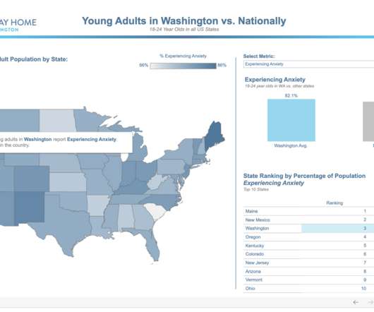
Jason Schumacher. Housing and Homelessness Lead at Tableau Foundation. Kristin Adderson. October 28, 2021 - 1:12am. November 14, 2021. Editor’s Note: At Tableau Conference 2021, Tableau Foundation and the Seattle Seahawks were excited to announce a new collaboration with A Way Home Washington to expand the reach and visibility of A Way Home Washington’s work throughout the state.
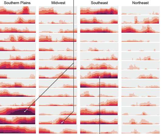
For Scientific American, Cédric Scherer and Georgios Karamanis charted drought extent by region using a grid of stacked bar charts. Each cell represents a year for a corresponding region, and color represents drought intensity. Compare this view to more map-centric ones. This version focuses more on time than it does geography. One isn’t better than the other.
Speaker: Jay Allardyce, Deepak Vittal, Terrence Sheflin, and Mahyar Ghasemali
As we look ahead to 2025, business intelligence and data analytics are set to play pivotal roles in shaping success. Organizations are already starting to face a host of transformative trends as the year comes to a close, including the integration of AI in data analytics, an increased emphasis on real-time data insights, and the growing importance of user experience in BI solutions.
We organize all of the trending information in your field so you don't have to. Join 17,000+ users and stay up to date on the latest articles your peers are reading.
You know about us, now we want to get to know you!
Let's personalize your content
Let's get even more personalized
We recognize your account from another site in our network, please click 'Send Email' below to continue with verifying your account and setting a password.


Let's personalize your content