This site uses cookies to improve your experience. To help us insure we adhere to various privacy regulations, please select your country/region of residence. If you do not select a country, we will assume you are from the United States. Select your Cookie Settings or view our Privacy Policy and Terms of Use.
Cookie Settings
Cookies and similar technologies are used on this website for proper function of the website, for tracking performance analytics and for marketing purposes. We and some of our third-party providers may use cookie data for various purposes. Please review the cookie settings below and choose your preference.
Used for the proper function of the website
Used for monitoring website traffic and interactions
Cookie Settings
Cookies and similar technologies are used on this website for proper function of the website, for tracking performance analytics and for marketing purposes. We and some of our third-party providers may use cookie data for various purposes. Please review the cookie settings below and choose your preference.
Strictly Necessary: Used for the proper function of the website
Performance/Analytics: Used for monitoring website traffic and interactions
PowerBI is a powerful data visualization tool that helps them turn raw data into meaningful insights and actionable decisions. In this blog, we will explore the role of data analysts and how they use PowerBI to extract insights from data and drive business success.
DataCamp offers over 400 interactive courses, projects, and career tracks in the most popular data technologies such as Python, SQL, R, PowerBI, and Tableau. Start today and save up to 67% on career-advancing learning.
Are you geared to create a sales dashboard on PowerBI and track key performance indicators to drive sales success? Creating a sales dashboard in PowerBI is a straightforward process that can help your sales team to track key performance indicators (KPIs) and make data-driven decisions. Excel, SQL Server, etc.).
For a limited time, save up to 67% on a DataCamp Premium subscription and unlock 410+ interactive courses for all levels in Python, SQL, R, PowerBI, and more.
PowerBI Desktop is a wonderful business intelligence tool that has an expansive list of reporting capabilities, but there is one thing that you aren’t able to do with it – create a paginated report, which is a specific style of report that is designed to be exported or printed. What Is PowerBI Report Builder?
In the sales context, this helps monitor sales data in PowerBI reports and trigger alerts or actions based on real-time changes, ensuring that sales teams can respond quickly to critical events. Let’s use SQL operations on this delta table to see if the table is stored. Choose a visual of interest.
Automation : It offers full BI-Stack Automation, from source to data warehouse through to frontend. This includes the creation of SQL Code, DACPAC files, SSIS packages, Data Factory ARM templates, and XMLA files. Frontends : AnalyticsCreator supports PowerBI, Qlik Sense, Tableau, PowerPivot (Excel).
How to Optimize PowerBI and Snowflake for Advanced Analytics Spencer Baucke May 25, 2023 The world of business intelligence and data modernization has never been more competitive than it is today. Table of Contents Why Discuss Snowflake & PowerBI?
Key Skills Proficiency in SQL is essential, along with experience in data visualization tools such as Tableau or PowerBI. Programming Questions Data science roles typically require knowledge of Python, SQL, R, or Hadoop. Prepare to discuss your experience and problem-solving abilities with these languages.
They’ve tried to do this with the existing report created with PowerBI Desktop, and they can only see a small subset of the data from the table visualization when they export the report page as a PDF. In this blog post, we will introduce you to paginated reports in PowerBI and show you how to create one using PowerBI Report Builder.
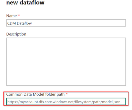
PowerBI Desktop enables the connection and retrieval of data from various sources, followed by data transformation using Power Query. To address this challenge, Microsoft introduced Dataflows within the PowerBI service. What are Dataflows in PowerBI?
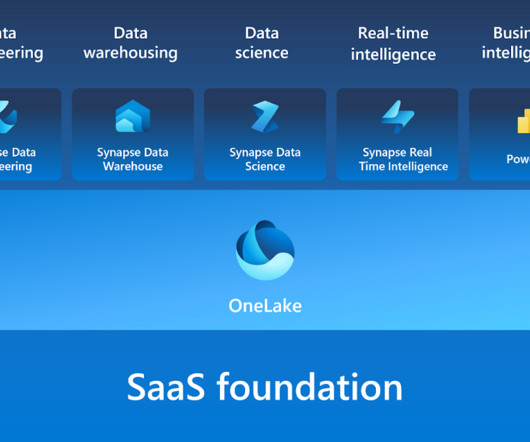
Microsoft Fabric combines multiple elements into a single platform – Image courtesy of Microsoft The contribution of PowerBI The integration of Microsoft PowerBI and Microsoft Fabric offers a powerful combination for organizations seeking comprehensive data analytics and insights.
With the shift towards cloud-based solutions, migrating SQL Server Reporting Services (SSRS) reports to the PowerBI service has become a popular choice for organizations looking to unlock the full potential of their data. Step 1 Open PowerBI Desktop and then click on Get Data to connect to SQL Server.
The ability to create parameters for your data sources in PowerBI is not new; however, there are nuances to parameterizing your Snowflake connections that one should be aware of. What Are PowerBI Parameters? From the Home menu, click on Get Data (or New Source if you’re in Power Query) and simply search for Snowflake.
Summary : Microsoft Fabric is an end-to-end Data Analytics platform designed for integration, processing, and advanced insights, while PowerBI excels in creating interactive visualisations and reports. Key Takeaways Microsoft Fabric is a full-scale data platform, while PowerBI focuses on visualising insights.
The Datamarts capability opens endless possibilities for organizations to achieve their data analytics goals on the PowerBI platform. Before we look into the PowerBI Datamarts, let us take a step back and understand the meaning of a Datamart. What is PowerBI Datamarts?
Summary: PowerBI is a business analytics tool transforming data into actionable insights. Key features include AI-powered analytics, extensive data connectivity, customisation options, and robust data modelling. Supports diverse data sources: Excel, SQL Server, Azure, and more. Why PowerBI?
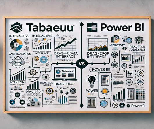
Summary: PowerBI alternatives like Tableau, Qlik Sense, and Zoho Analytics provide businesses with tailored Data Analysis and Visualisation solutions. Introduction PowerBI has become one of the most popular business intelligence (BI) tools, offering powerful Data Visualisation, reporting, and decision-making features.
Summary: PowerBI is a business intelligence tool that transforms raw data into actionable insights. PowerBI enhances decision-making by providing interactive dashboards and reports that are accessible to both technical and non-technical users. What Is PowerBI?
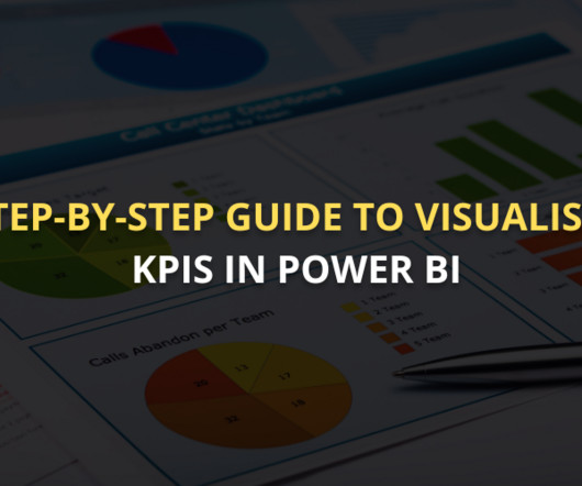
Summary: This guide covers visualising KPI in PowerBI, from setting up the tool and preparing data to selecting the right visuals and enhancing dashboards. PowerBI is an excellent tool for this purpose, offering powerful features to create interactive, dynamic visualisations that bring data to life.
As organizations embrace the power of self-service analytics and interactive dashboards, transitioning from SSRS to PowerBI becomes an enticing and oftentimes necessary decision. The PowerBI Service further enhances collaboration by enabling easy sharing and embedding reports in web pages and applications.
Summary: PowerBI is a leading data analytics platform offering advanced features like real-time analytics and collaborative capabilities. Understanding its significance is vital for aspiring PowerBI developers. Mastering PowerBI can significantly enhance career prospects, given its prevalence in the industry.
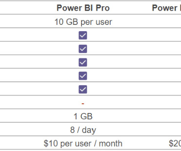
While PowerBI offers flexibility and robust analytics capabilities, it’s easy to get confused with the licensing structure. Is PowerBI Free? Is PowerBI Free? One of the more common questions we get when helping our clients consider their PowerBI licensing strategy is, “Is PowerBI really free?”
Summary: Data Visualisation is crucial to ensure effective representation of insights tableau vs powerbi are two popular tools for this. This article compares Tableau and PowerBI, examining their features, pricing, and suitability for different organisations. What is PowerBI? billion in 2023.
Though both are great to learn, what gets left out of the conversation is a simple yet powerful programming language that everyone in the data science world can agree on, SQL. But why is SQL, or Structured Query Language , so important to learn? Let’s start with the first clause often learned by new SQL users, the WHERE clause.
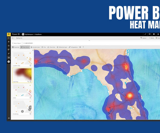
PowerBI Heatmap: Heatmap in PowerBI refers to the type of custom visualisation that businesses analysts utilise for showcasing the relationship between two variables on a map in different colour patches. It helps the user in visualising the patterns which are hidden and observe the changes across each axis.
PowerBI is a user-friendly and powerful data visualization tool that enables individuals to easily create interactive reports and dashboards as well as centralized datasets. In this blog, we will explain the difference between Full Refresh & Incremental Refresh and how to implement Incremental refresh in PowerBI.
Natural Language Query (NLQ) enables users to query databases using everyday language rather than specialized query languages like SQL. For instance, business analytics platforms like Microsoft PowerBI allow users to easily query data related to key performance metrics. What is Natural Language Query (NLQ)?
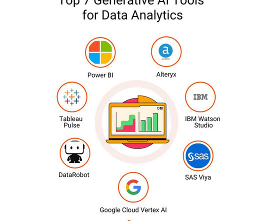
These models process vast amounts of text data to learn language patterns, enabling them to respond to queries, summarize information, or even generate complex SQL queries based on natural language inputs. Generative AI for Data Analytics – Top 7 Tools to Leverage 1. ” and the Copilot will generate a relevant chart or report.
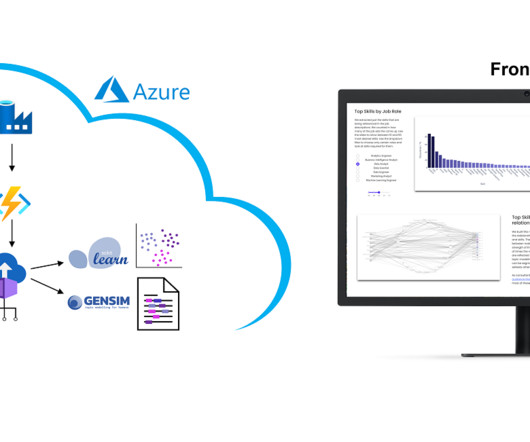
However, we collect these over time and will make trends secure, for example how the demand for Python, SQL or specific tools such as dbt or PowerBI changes. The presentation is currently limited to the current situation on the labor market. Why we did it? It is a nice show-case many people are interested in.
The processes of SQL, Python scripts, and web scraping libraries such as BeautifulSoup or Scrapy are used for carrying out the data collection. Visualization libraries available in Python such as Matplotlib and Seaborn, and tools like Tableau and PowerBI become crucial to telling stories that lead to insights.
PowerBI Datamarts is one of the most exciting features that Microsoft has released for the Power Platform in recent years. If you need high-level information on what a PowerBI Datamart is and some example use cases, check out our other blog, What Are PowerBI Datamarts?
Explore, analyze, and visualize data with our Introduction to PowerBI training & make data-driven decisions. 2. Getting Started with SQL Programming: Are you starting your journey in data science? Then you’re probably already familiar with SQL, Python, and R for data analysis and machine learning.
PowerBI is a versatile and scalable platform that combines self-service and enterprise business intelligence (BI) capabilities. Data Analysis Expressions (DAX) is the formula expression language employed in PowerBI. What is the SWITCH Function? How is the SWITCH Function Different From the IF Statement?
SQL or Structured Query Language has a significant role to play in conducting practical Data Analysis. That’s where SQL comes in, enabling data analysts to extract, manipulate and analyse data from multiple sources. That’s where SQL comes in, enabling data analysts to extract, manipulate and analyse data from multiple sources.
Dashboards, such as those built using Tableau or PowerBI , provide real-time visualizations that help track key performance indicators (KPIs). Descriptive analytics is a fundamental method that summarizes past data using tools like Excel or SQL to generate reports. Data Scientists require a robust technical foundation.
Software like Microsoft Excel and SQL helps them manipulate and query data efficiently. They use data visualisation tools like Tableau and PowerBI to create compelling reports. Key Features: Hands-on Training: Covers real-world Data Analysis methodologies, SQL , Python, and visualisation.
The prompts are managed through Lambda functions to use OpenSearch Service and Anthropic Claude 2 on Amazon Bedrock to search the client’s database and generate an appropriate response to the client’s business analysis, including the response in plain English, the reasoning, and the SQL code.
Microsoft PowerBI. Microsoft PowerBI is a free and powerful business intelligence tool from a world-leading software giant Microsoft. This BI tool allows you to get data and insights in minutes with your smartphone, tablet or laptop. Its typical subscription price is $25 per month per user.
Example Event Log for Process Mining The following example SQL-query is inserting Event-Activities from a SAP ERP System into an existing event log database table. It is therefore hardly surprising that some process mining tools are actually just a plugin for PowerBI, Tableau or Qlik.
Introduction Not a single day passes without us getting to hear the word “data.” It is almost as if our lives revolve around it. Don’t they? With something so profound in daily life, there should be an entire domain handling and utilizing it. This is precisely what happens in data analytics.
In today’s rapidly evolving digital landscape, seamless data, applications, and device integration are more pressing than ever. Enter Microsoft Fabric, a cutting-edge solution designed to revolutionize how we interact with technology.
” Data management and manipulation Data scientists often deal with vast amounts of data, so it’s crucial to understand databases, data architecture, and query languages like SQL. Tools like Tableau, Matplotlib, Seaborn, or PowerBI can be incredibly helpful. This is where data visualization comes in.
Introduction The world is transforming by AI, ML, Blockchain, and Data Science drastically, and hence its community is growing rapidly. So, to provide our community with the knowledge they need to master these domains, Analytics Vidhya has launched its DataHour sessions.
We organize all of the trending information in your field so you don't have to. Join 17,000+ users and stay up to date on the latest articles your peers are reading.
You know about us, now we want to get to know you!
Let's personalize your content
Let's get even more personalized
We recognize your account from another site in our network, please click 'Send Email' below to continue with verifying your account and setting a password.


Let's personalize your content