This site uses cookies to improve your experience. To help us insure we adhere to various privacy regulations, please select your country/region of residence. If you do not select a country, we will assume you are from the United States. Select your Cookie Settings or view our Privacy Policy and Terms of Use.
Cookie Settings
Cookies and similar technologies are used on this website for proper function of the website, for tracking performance analytics and for marketing purposes. We and some of our third-party providers may use cookie data for various purposes. Please review the cookie settings below and choose your preference.
Used for the proper function of the website
Used for monitoring website traffic and interactions
Cookie Settings
Cookies and similar technologies are used on this website for proper function of the website, for tracking performance analytics and for marketing purposes. We and some of our third-party providers may use cookie data for various purposes. Please review the cookie settings below and choose your preference.
Strictly Necessary: Used for the proper function of the website
Performance/Analytics: Used for monitoring website traffic and interactions
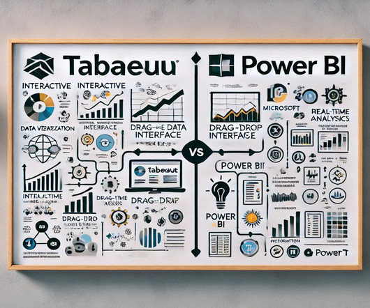
PowerBI and Tableau, popular and user-friendly data visualization tools, help businesses organize large datasets. While both software are crucial for efficient data organization, comparing Power […] The post PowerBI vs Tableau: Similarities and Differences appeared first on Analytics Vidhya.
This guide walks you through the steps that will allow you to create easily updatable, automated and scalable PowerBI / Tableau dashboards. Although dashboards have become quite an integral part of performance tracking in organizations, implementing them can be tricky even for the most experienced analysts.
DataCamp offers over 400 interactive courses, projects, and career tracks in the most popular data technologies such as Python, SQL, R, PowerBI, and Tableau. Start today and save up to 67% on career-advancing learning.
Or regularly build dashboards and visualizations in Tableau or PowerBI? The post Infographic: 11 Steps to Transition into Data Science (for Reporting / MIS / BI Professionals) appeared first on Analytics Vidhya. Introduction Do you often work with reports in Excel? If you answered yes.
Primary Supervised Learning Algorithms Used in Machine Learning; Top 15 Books to Master Data Strategy; Top Data Science Podcasts for 2022; Prepare Your Data for Effective Tableau & PowerBI Dashboards; Generate Synthetic Time-series Data with Open-source Tools.
When thinking about PowerBI , the platform’s visuals and report side immediately come to mind. Data modeling in PowerBI has a major impact on the performance of reports and should be considered a substantial learning milestone for new PowerBI developers. Why Does Data Modeling Matter in PowerBI?
How to Optimize PowerBI and Snowflake for Advanced Analytics Spencer Baucke May 25, 2023 The world of business intelligence and data modernization has never been more competitive than it is today. Table of Contents Why Discuss Snowflake & PowerBI?
Summary: Data Visualisation is crucial to ensure effective representation of insights tableau vs powerbi are two popular tools for this. This article compares Tableau and PowerBI, examining their features, pricing, and suitability for different organisations. What is Tableau? billion in 2023.
TableauTableau is a powerful data visualization tool that allows users to connect to a wide range of data sources and create interactive dashboards and visualizations. Tableau is easy to use and provides a range of visualization options that are customizable to suit different needs.
Frontends : AnalyticsCreator supports PowerBI, Qlik Sense, Tableau, PowerPivot (Excel). Support for Various Data Warehouses and Databases : AnalyticsCreator supports MS SQL Server 2012-2022, Azure SQL Database, Azure Synapse Analytics dedicated, and more. Data Lakes : It supports MS Azure Blob Storage.
Microsoft PowerBI with Copilot Microsoft PowerBI has integrated genAI through its Copilot feature , transforming how users interact with data. The Copilot in PowerBI allows users to generate reports, visualizations, and insights using natural language queries, making advanced analytics accessible to a broader audience.
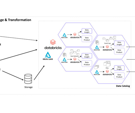
Data Mesh on Azure Cloud with Databricks and Delta Lake for Applications of Business Intelligence, Data Science and Process Mining. Microsoft Azure Cloud is favored by many companies, especially for European industrial companies, due to its scalability, flexibility, and industry-specific solutions.
Key Skills Proficiency in SQL is essential, along with experience in data visualization tools such as Tableau or PowerBI. Their role is crucial in understanding the underlying data structures and how to leverage them for insights.
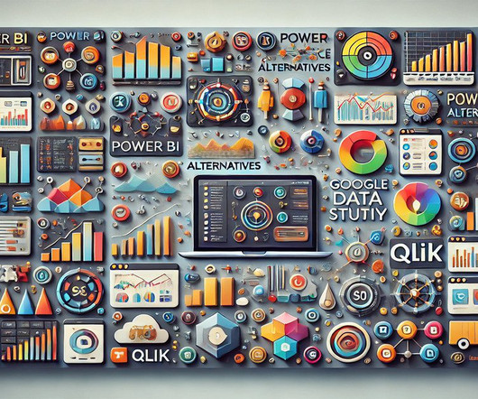
Summary: PowerBI alternatives like Tableau, Qlik Sense, and Zoho Analytics provide businesses with tailored Data Analysis and Visualisation solutions. Introduction PowerBI has become one of the most popular business intelligence (BI) tools, offering powerful Data Visualisation, reporting, and decision-making features.
Ateken Abla July 9, 2024 - 7:30pm Danika Harrod Marketing Manager, Community Content & Events, Tableau How did Paul go from Tableau beginner to winning Iron Viz at his first attempt? Paul Ross is living proof that the Iron Viz title is possible for Tableau users of all skill-levels, from beginners to experts.
By the end of this blog, you should have a decent working knowledge of how Field Parameters can make your life as a PowerBI developer much easier. How to Create a Field Parameter Now that we understand what Field Parameters are and why they are important, let’s run through a quick example of how to use them in PowerBI.
Microsoft PowerBI Microsoft PowerBI offers a free version of their platform, which comes with a 1 GB per user data capacity limit and a once-per-day data-refresh schedule. Nonetheless, Jaspersoft remains a popular choice for businesses that require a flexible and developer-friendly BI platform.
Summary: Data Blending in Tableau is helpful in deriving multiple sources to gain comprehensive insights. Through intuitive drag-and-drop functionality, Tableau enables users to blend disparate datasets effortlessly, facilitating holistic data exploration. What is Data Blending in tableau with an example?
On the same day as Qlik’s roadmap keynote and PowerBI’s Summit in Ireland, Tableau decides to rain on both of those parades. Tableau stole the thunder yesterday with. by Jen Underwood. Read More.
TableauTableau is a leading data visualization tool known for its powerful capabilities and user-friendly interface. Tableau is particularly strong in industries like finance, healthcare, and retail where data-driven decisions are crucial. Real-Time Data Monitoring : Allows users to track metrics in real-time.
Data visualization tools Advanced visualization tools like Tableau and Microsoft PowerBI enable users to interpret data through graphical formats. This capability ensures that users can focus on insights rather than data gathering, significantly reducing time spent on preliminary stages of analysis.
Tableau is a data visualisation software helping you to generate graphics-rich reporting and analysing enormous volumes of data. With the help of Tableau, organisations have been able to mine and gather actionable insights from granular sources of data. But What is Tableau for Data Science and what are its advantages and disadvantages?
Designers can get help from some of the best visual tools like Tableau, PowerBI, and more for performing data visualization with ease. Final verdict Data visualization practices when implemented correctly help you to manage huge amounts of data and represent it in graphs and charts.
Tableau can help! By leveraging Tableau for Data Analyst can boost efficiency, communicate clearly, uncover hidden patterns, and make data-driven decisions. Mastering Tableau elevates an analyst’s value and unlocks career opportunities. Mastering Tableau elevates an analyst’s value and unlocks career opportunities.
Dashboards, such as those built using Tableau or PowerBI , provide real-time visualizations that help track key performance indicators (KPIs). They interpret data using tools like Excel, Tableau, or PowerBI and work closely with stakeholders to align data findings with business objectives.
Overview Analytics and Business Intelligence provide comprehensible view of the company and derive actionable insights. We’ll discuss 6 top business intelligence tools that you. The post 6 Top Tools for Analytics and Business Intelligence in 2020 appeared first on Analytics Vidhya.
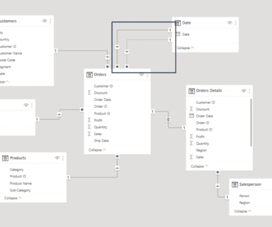
QGIS, Microsoft's PowerBI, Tableau, and Jupyter notebooks also facilitated many interesting visualizations, particularly for solvers with less programming experience. Within PowerBI, we made a simple relational data model from the datasets by linking them together along common coordinates.
There is a plethora of BI tools available in the market today, with new ones being added yearly. Through a comparative analysis of some of the leading BI tools: Google Looker, Microsoft PowerBI, Tableau and Qlik Sense, discover which BI solution best fits your organization’s data analytics needs to empower informed decision-making.
Here are some of the best data preprocessing tools of 2023: Microsoft PowerBITableau Trifacta Talend Toad Data Point Power Query Microsoft PowerBI Microsoft PowerBI is a comprehensive data preparation tool that allows users to create reports with multiple complex data sources.
Microsoft PowerBI. Microsoft PowerBI is a free and powerful business intelligence tool from a world-leading software giant Microsoft. This BI tool allows you to get data and insights in minutes with your smartphone, tablet or laptop. Tableau Desktop. Tableau is not the cheapest tool out there.
Introduction The world is transforming by AI, ML, Blockchain, and Data Science drastically, and hence its community is growing rapidly. So, to provide our community with the knowledge they need to master these domains, Analytics Vidhya has launched its DataHour sessions.
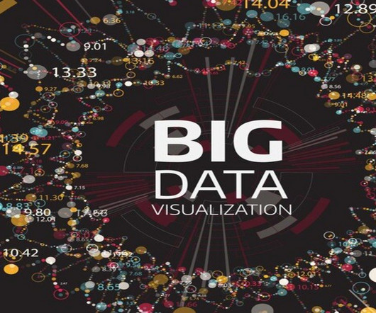
Introduction to Data Visualization The amount of data has changed in the digital age, becoming both a challenge and an opportunity. Data visualization has become an efficient method for communicating insights and making sense of complex information.
They use data visualisation tools like Tableau and PowerBI to create compelling reports. Key Features: Comprehensive Modules: Covers advanced SQL, Tableau, PowerBI , and Machine Learning. The course includes hands-on Excel, R, SQL, and Tableau exposure.
Consider gifting a data visualization tool like Tableau Public or Plotly, which can help them create interactive and visually appealing charts and graphs to communicate their data analysis results.3. Consider gifting them a subscription to a data visualization tool like Tableau or PowerBI.
With a wealth of expertise and an unwavering passion for harnessing the power of data, Rishabh has emerged as a driving force in leveraging cutting-edge technologies to extract valuable insights.
And that is why: with BI you rely on a broader range of data, get deeper insights into the market, have a better vision of your companies strengths and weaknesses, receive trustworthy forecasts on business trends and get data-backed actionable tips on developing your business. Here we present an overview of some of them: Microsoft PowerBI.
Data visualization tools like Tableau and PowerBI can be applied to inform decisions. A6: A Business Analyst commonly relies on platforms like Tableau , PowerBI , and Excel for data visualisation , reporting, and analysis to manage and interpret data across projects effectively. Who Is a Business Analyst?
Popular tools like PowerBI, Tableau, and Google Data Studio offer unique features for Data Analysis. Common tools like Tableau, PowerBI, and Google Data Studio enable businesses to create dynamic visualisations that simplify complex datasets.
It is therefore hardly surprising that some process mining tools are actually just a plugin for PowerBI, Tableau or Qlik. Nevertheless, process mining can be considered a sub-discipline of business intelligence.
Examples include Tableau and PowerBI. Examples include Collibra and Informatica. Data visualization tools: These tools help organizations visualize and analyze data to identify patterns and insights. By using these tools and technologies, organizations can ensure data fidelity and make informed decisions based on reliable data.
Using tools like PowerBI, Tableau, and Grafana, organisations can analyse real-time IoT data, optimise operations, and enhance decision-making while addressing security, scalability, and visualisation challenges. Popular IoT visualisation tools include PowerBI, Tableau, Grafana, Google Data Studio, and Kibana.
Some major business intelligence platforms, like Microsoft’s PowerBI and Tableau , have already integrated NLP features — like semantic search. NLP allows AI-driven technology to more flexibly and intelligently respond to language, which has posed a substantial problem for software-based solutions in the past.
Leverage Tools for Enhanced Data Analysis Evolve beyond basic tools like Excel by exploring advanced platforms such as PowerBI, Tableau, or even Python for more intricate analyses. PowerBI and Tableau can create interactive dashboards that users can easily play with data.
Tableau Public Tableau Public , a powerful data visualization software, empowers users to create interactive and shareable dashboards with ease. What sets Tableau apart is its intuitive, user-friendly, drag-and-drop interface. Other elements make Tableau Public an excellent choice for data visualization experts.
We organize all of the trending information in your field so you don't have to. Join 17,000+ users and stay up to date on the latest articles your peers are reading.
You know about us, now we want to get to know you!
Let's personalize your content
Let's get even more personalized
We recognize your account from another site in our network, please click 'Send Email' below to continue with verifying your account and setting a password.


Let's personalize your content