This site uses cookies to improve your experience. To help us insure we adhere to various privacy regulations, please select your country/region of residence. If you do not select a country, we will assume you are from the United States. Select your Cookie Settings or view our Privacy Policy and Terms of Use.
Cookie Settings
Cookies and similar technologies are used on this website for proper function of the website, for tracking performance analytics and for marketing purposes. We and some of our third-party providers may use cookie data for various purposes. Please review the cookie settings below and choose your preference.
Used for the proper function of the website
Used for monitoring website traffic and interactions
Cookie Settings
Cookies and similar technologies are used on this website for proper function of the website, for tracking performance analytics and for marketing purposes. We and some of our third-party providers may use cookie data for various purposes. Please review the cookie settings below and choose your preference.
Strictly Necessary: Used for the proper function of the website
Performance/Analytics: Used for monitoring website traffic and interactions
There has been a debate in the industry between R and Tableau. The post Comparing R and Tableau for Data Visualisation appeared first on Analytics Vidhya. Which is better is the question. Let us see this in today’s article. Source – Author What is Data Visualization?
Introduction Tableau is a powerful data visualization tool that allows users to analyze and present data interactively and meaningfully. It helps businesses make data-driven decisions by providing easy-to-understand insights and visualizations.
Introduction With this Tableau tutorial, you’ll learn how to visualize data and derive valuable insights from raw data, making dashboards, reports, tables, and more. We will also go through topics like Tableau’s desktop, server, and the various component of Tableau. Tableau is a […].
Introduction Tableau is a powerful and advanced visualization tool. Starting with Tableau Prep Builder, you can effectively clean, transform, and source data under one roof. It covers the whole visual development lifecycle. appeared first on Analytics Vidhya.
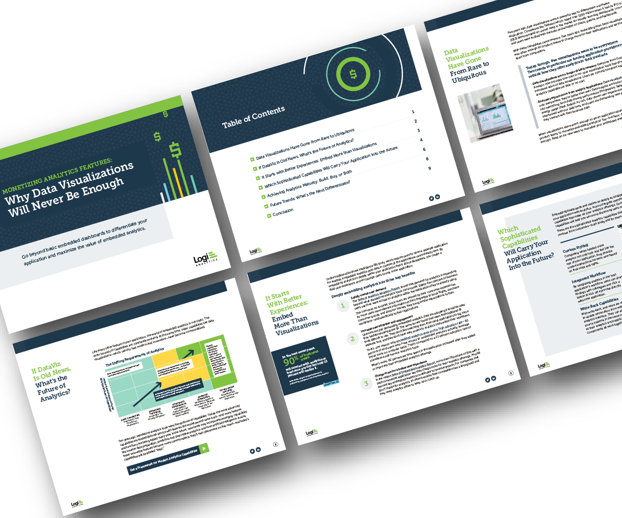
Think your customers will pay more for data visualizations in your application? Five years ago they may have. But today, dashboards and visualizations have become table stakes. Discover which features will differentiate your application and maximize the ROI of your embedded analytics. Brought to you by Logi Analytics.
Power BI and Tableau, popular and user-friendly data visualization tools, help businesses organize large datasets. While both software are crucial for efficient data organization, comparing Power […] The post Power BI vs Tableau: Similarities and Differences appeared first on Analytics Vidhya.
The announcement last week that Tableau’s CEO Adam Selipsky is. The post Is the Tableau Era Coming to an End? ArticleVideo Book This article was published as a part of the Data Science Blogathon. appeared first on Analytics Vidhya.
Introduction to Tableau Tips! Creating a chart or visual in Tableau is. The post 5 Tableau Tips for Designing a Tidy and Impactful Visualization appeared first on Analytics Vidhya. This article was published as a part of the Data Science Blogathon.
Fortunately, with the advent of tools such as Tableau, you get access […] The post Top 10 Tableau Projects for Data Science appeared first on Analytics Vidhya. When it is about communicating and expressing these skills effectively, some people are great at it naturally, while others develop this ability over time.
Tableau, a dynamic and versatile data visualization tool, has revolutionized how organizations harness the power of their data. In this article, we’ll explore a free course for learning […] The post Free Course on Tableau For Beginners appeared first on Analytics Vidhya.
The post Integrate R, Tableau and Excel appeared first on Analytics Vidhya. This article was published as a part of the Data Science Blogathon. Introduction There have been many articles online showing how to connect R.
This article was published as a part of the Data Science Blogathon Overview Tableau is a well-known data visualization tool widely used in the industry and adopted by major firms like Nike, Coca-Cola, Skype, TCS, Accenture, and various other plethoras of companies both large and small.
Excel and Tableau are two popular data handling tools. Here is a comparison of the most relevant points to find the better-performing one among Excel vs Tableau. Excel: Features, Capabilities, […] The post Excel vs Tableau – Which is a Better Tool? They comprise unique specialties and specific advantages.
Introduction While Tableau remains a popular choice for data visualization, its dominance is waning. The increasing importance of data analysis across industries has fueled the demand for versatile tools, leading to a surge in Tableau alternatives.
Introduction Tableau, a powerful data visualization tool, can sometimes leave users with lingering questions. Tableau tackles these issues head-on by leveraging artificial intelligence. What’s the best way to display this data? Am I missing any key insights?
Introduction In today’s data-driven landscape, mastering Tableau has become integral for professionals aiming to extract meaningful insights from diverse datasets. As we delve into Tableau interview questions and answers, […] The post Top 40 Tableau Interview Questions and Answers for 2024 appeared first on Analytics Vidhya.
Introduction Tableau has emerged as a popular data visualization tool in companies, making it one of the hottest trends in Business Intelligence. In India, people are curious about the Tableau developer salary statistics. We will […] The post What is the Tableau Developer Salary in India?
Introduction Tableau is a powerful data visualization tool that is crucial in Data Science. At its core, Tableau transcends the boundaries of traditional data analysis by providing an intuitive platform where users can seamlessly connect to […] The post What is Tableau?
The post Create Your First Dashboard in Tableau appeared first on Analytics Vidhya. ArticleVideo Book Objective The dashboard is a powerful concept that allows the user to see the insights hidden deeper in the data.
The webinar is based on building and operationalizing your ML Model using Tableau Business Science. The post Webinar: Build & Operationalize ML Model Using Tableau Business Science appeared first on Analytics Vidhya.
Introduction Tableau is considered one of the most robust data visualization tools currently in use by companies and individuals globally for efficient data analysis and presentation. With its user-friendly interface and extensive features, Mastering Tableau can significantly improve your capacity to transform raw data into valuable insights.
ArticleVideos Introduction I love the wide variety of charts Tableau offers. If we’re ever confused about which chart to design, Tableau offers a ton. The post How to Create a Donut Chart in Tableau appeared first on Analytics Vidhya.
ArticleVideos Objective Tableau is the gold standard for Business Analytics and Data Visualization tools in the industry Learn how to make a Rounded Bar. The post Tableau 101 – Create a Rounded Bar Chart and a Bar-in-Bar Chart in Tableau appeared first on Analytics Vidhya.
The post Data Visualization 101: Geospatial Analysis and Map Visualization in Tableau appeared first on Analytics Vidhya. ArticleVideo Book Objective With Increased use of data, location-based decision making has become an intrinsic part of the Business processes Understand what is Geospatial.
The post Create Dual Axis Charts in Tableau appeared first on Analytics Vidhya. ArticleVideo Book Note: If you are more interested in learning concepts in an Audio-Visual format, we have this entire article explained in the video.
This article was published as a part of the Data Science Blogathon This article covers all the basic to intermediate concepts and features of Tableau from scratch. This is the perfect article for you if you are an absolute beginner in Tableau.
The post Tableau Tip: Visualize a Single Value Against Others appeared first on Analytics Vidhya. Introduction How often have we all tried to compare a value against a range, with unsatisfying results? Excel is the most common tool for.
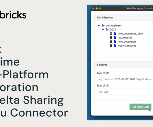
Were excited to announce the General Availability of Explore in Tableau, a new integration that lets you create Tableau Cloud visualizations directly from Unity Catalog.
The post Customer Segmentation using RFM Analysis in Tableau appeared first on Analytics Vidhya. Introduction Customer segmentation is the process by which we divide customers into groups based on common characteristics like demographics (age, gender, income, etc.), geography, psychology, and behavior.
Introduction Tableau is a data visualization tool created in Salesforce that allows users to connect to any database, like SQL or MongoDB, and interact freely. The post Most Frequently Asked Tableau Interview Questions appeared first on Analytics Vidhya. This article was published as a part of the Data Science Blogathon.
Overview Tableau vs. Qlik Sense – Each Analytics and Business Intelligence tool has its own distinct set of features We’ll compare Tableau and Qlik. The post Tableau vs. Qlik Sense – Which Analytics and Business Intelligence Tool Should you Use? appeared first on Analytics Vidhya.
Overview A look at 11 mind-blowing and innovative data visualizations in Python, R, Tableau and D3.js The post 11 Innovative Data Visualizations you Should Learn (in Python, R, Tableau and D3.js) js These data visualizations span a variety of real-world. js) appeared first on Analytics Vidhya.
Introduction on Tableau Hi and welcome to this article. The post A Step by step on Tableau for Beginner appeared first on Analytics Vidhya. This article was published as a part of the Data Science Blogathon. Visualization has become a necessary skill that eases the process of communicating with people outside your domain.
Overview Animated visualizations are a work of art and are really easy to create in Tableau We’ll work with open-source datasets here and create. The post Build your own Animated Data Visualization in Tableau in Just 5 Minutes appeared first on Analytics Vidhya.
This guide walks you through the steps that will allow you to create easily updatable, automated and scalable Power BI / Tableau dashboards. Although dashboards have become quite an integral part of performance tracking in organizations, implementing them can be tricky even for the most experienced analysts.
Introduction Tableau is a powerful Data Visualization software, and much. The post Building a Covid-19 Vaccination Dashboard in Tableau appeared first on Analytics Vidhya. ArticleVideo Book This article was published as a part of the Data Science Blogathon.
The post From Scratch to a Story – Introduction to Tableau (Part 1) appeared first on Analytics Vidhya. ArticleVideo Book This article was published as a part of the Data Science Blogathon. Can you tell a story using data? Let us look.
The post Make Your Tableau Visuals More Effective – Tips And Tricks appeared first on Analytics Vidhya. ArticleVideo Book This article was published as a part of the Data Science Blogathon. Introduction Data Visualization is a graphical way to represent data by.
10 Most Used Tableau Functions • Is Domain Knowledge Important for Machine Learning? • ETL vs ELT: Data Integration Showdown • Free MLOps Crash Course for Beginners • 90% of Today’s Code is Written to Prevent Failure, and That’s a Problem.
Tableau is a leader in the analytics market, known for helping organizations see and understand their data, but we recognize that gaps still exist: while many of our joint customers already benefit from dbt and trust the metrics that result from these workflows, they are often disconnected and obscured from Tableau’s analytics layer.
These courses will cover data analysis with Python, R, SQL, PowerBI, Tableau, Excel, and SPSS. Learn data analytics by taking the best YouTube courses.
We organize all of the trending information in your field so you don't have to. Join 17,000+ users and stay up to date on the latest articles your peers are reading.
You know about us, now we want to get to know you!
Let's personalize your content
Let's get even more personalized
We recognize your account from another site in our network, please click 'Send Email' below to continue with verifying your account and setting a password.


Let's personalize your content